2019 Paint Color Trends
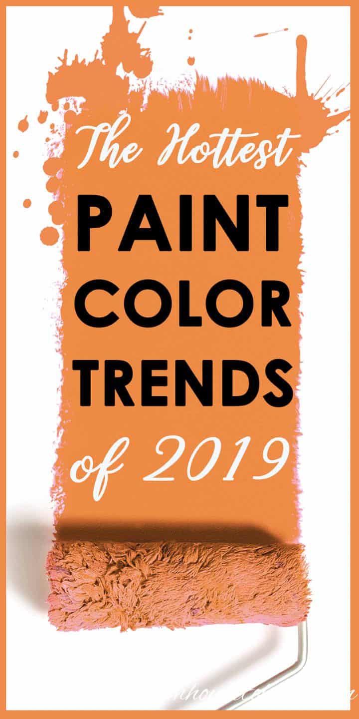


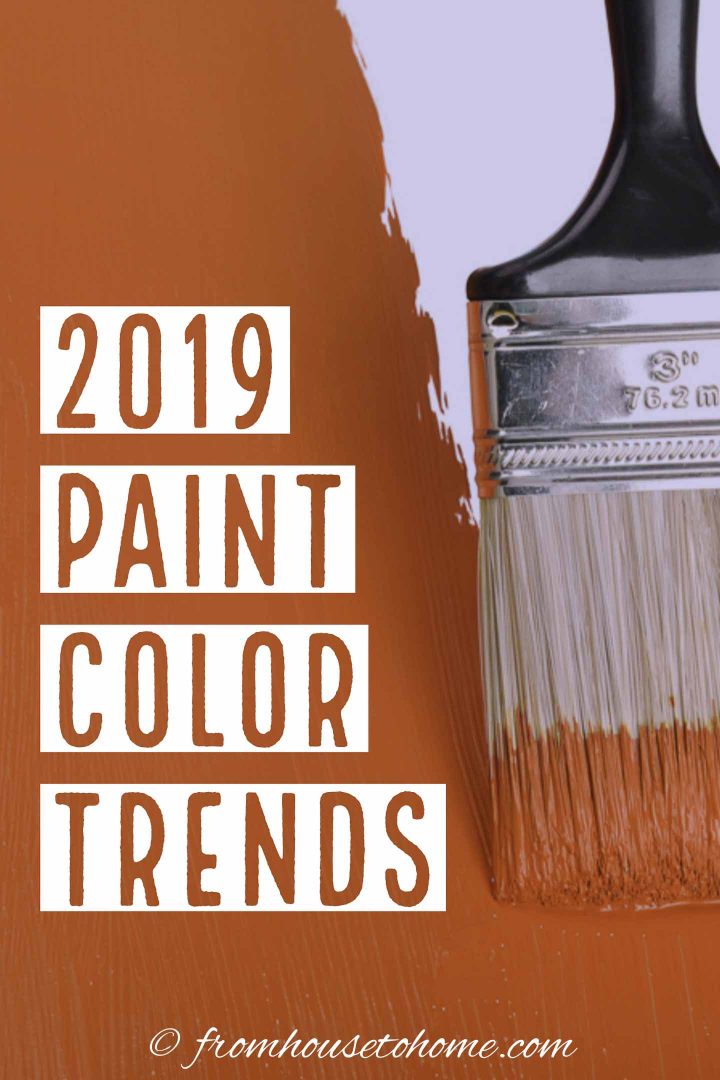

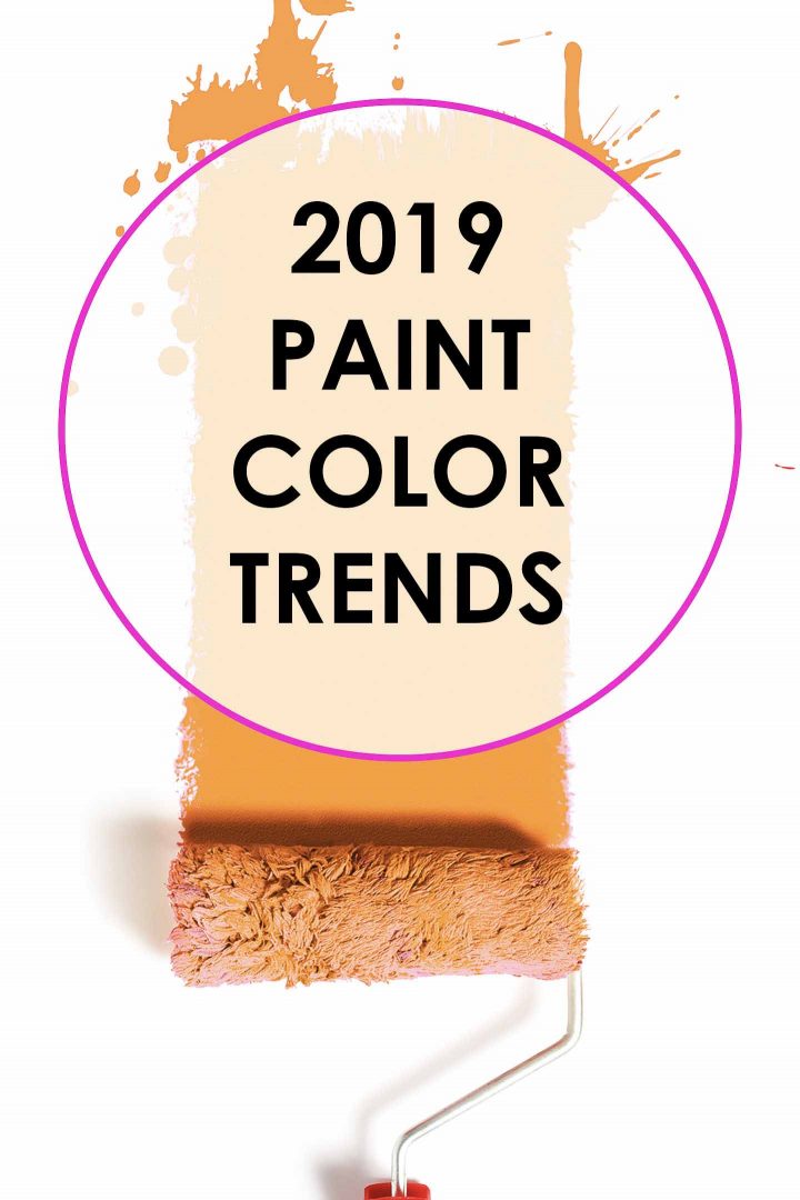
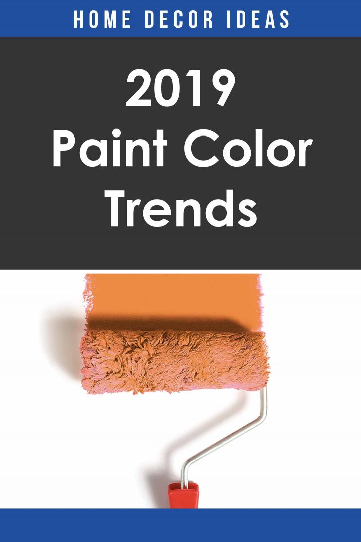
Looking to update your home? Find out the 2019 paint color trends according to all of the major paint companies.
I love to find out the paint color trends that the paint companies think will be popular in the upcoming year. Now that almost all of them have released their picks, here are the 2019 paint color trends. In case you want to refer back, here are the 2017 paint color trends and the 2018 paint color trends.
2019 Paint Color Trends
This post may contain affiliate links. We make a small commission if you buy the products from these links (at no extra cost to you). As an Amazon Associate, I earn from qualifying purchases. But we only recommend products we would use ourselves. For more information, click here to see our disclosures.
I always love to see what the paint companies think the trending paint colors are going to be for the next year.
However, as I’ve said before, I don’t do this because I’m going to go out and immediately paint my house a trendy color.
I don’t recommend that.
UNLESS you happen to love one of the trendy colors. Then it’s a perfect time to makeover that room you’ve been putting off. Because chances are there will be all kinds of home decor furnishings and accessories available in those colors. And decorating a room is so much easier if you can find the colors you are looking for.
This year, it seems like there are 3 main inspirations that run across most of the color selections – mid century modern, American Southwest and nature-inspired. So if you are also inspired by any of those styles, you’re in luck for paint trends this year.
Okay, now let’s get on to what you came for…the 2019 paint color trends of the year!
Now available: Sneak peek at the new paint color trends for 2020.
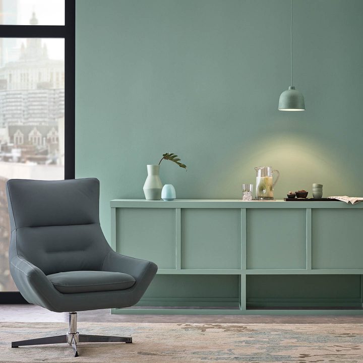
Teal

The first big color trend for 2019 is teal.
Behr is leading the way with their 2019 color of the year called “Blueprint”.
It’s a beautiful, relaxing, ocean-based color. As you’ll see, using nature to inspire colors is a common theme for 2019.

Blueprint looks gorgeous on exterior doors as well.
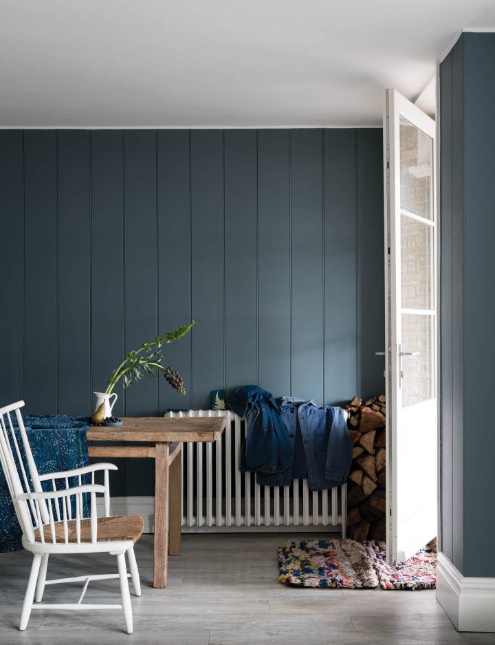
While Farrow & Ball doesn’t have a specific color of the year, they do release color trends.
De Nimes blue is one of the new colors that Farrow & Ball has chosen for this season, and it fits right in with the other teal selections. It has a deeper tone with more grey in it that gives it a moody appearance.
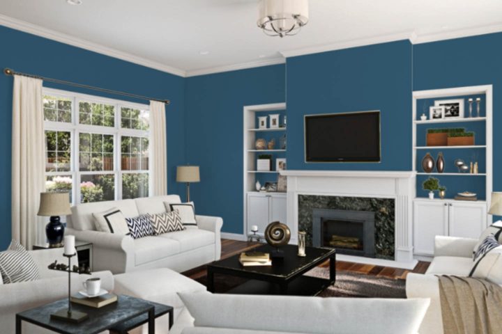
Sherwin Williams included another brighter ocean blue called “Endless Sea” in their 2019 Shapeshifter Color Palette.
via HGTV Home by Sherwin Williams
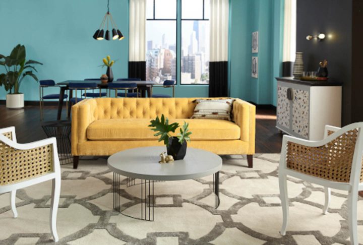
HGTV Home by Sherwin Williams has a similar 2019 color of the year called “Reflecting Pool”. It has more turquoise and a little less grey but is definitely still an ocean-inspired color choice.
Coral Pink
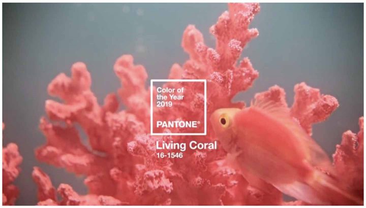
On the opposite end of the sea-inspired colors is Pantone’s 2019 color of the year. If you haven’t heard of the Pantone Color Institute, they’re a consulting firm that forecasts global color trends. In other words, all they do is study trending colors.
Their 2019 color of the year is called Living Coral. But don’t worry, this isn’t your 80’s coral!
It’s an updated version of the rose gold and blush pink that has been popular for quite some time now.
This color is warm yet mellow and promotes optimism and sociability.
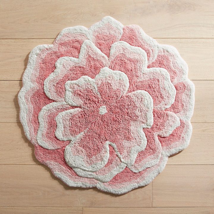
While I’m not sure I would go for a whole room painted in this color, a few accents here and there (like this gorgeous coral bath mat) would really pick up a space.
You Might Also Like: 2019 Home Decor Trends
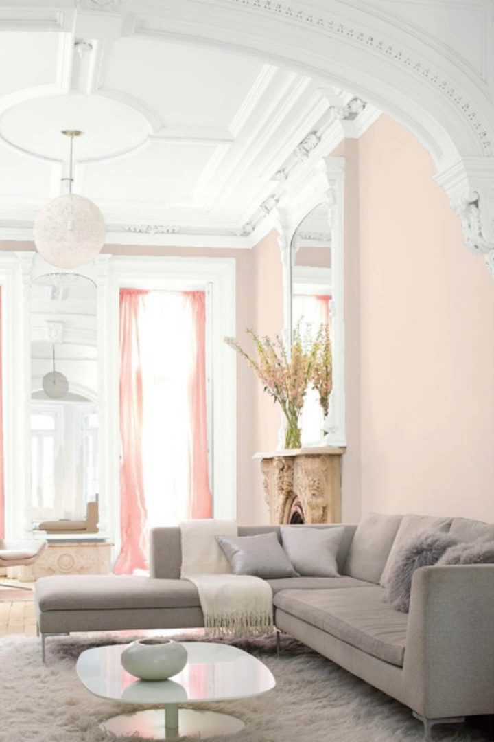
For those who prefer a more toned-down version, Benjamin Moore included a blush pink called “Head over Heels” on their 2019 paint color palette.
It looks beautiful with light grey furniture and white moldings.
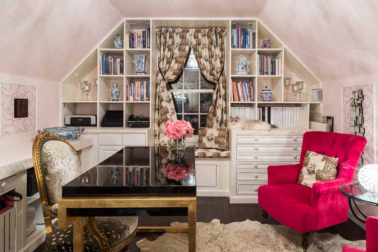
I did a similar color (Farrow and Ball’s Calamine Pink) in my home office makeover a couple of years ago.
So I’m hoping I can pick up a few more accessories this year 🙂
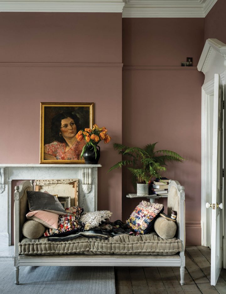
And finally, Farrow and Ball has a dusty rose pink called “Sulking Room Pink” on their new paint colors list. This has more of a grey base and is definitely a modern take on coral pink.
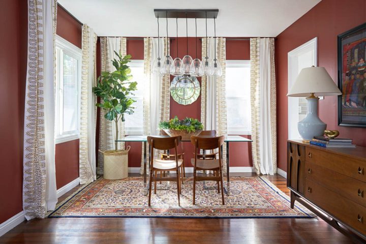
Terracotta
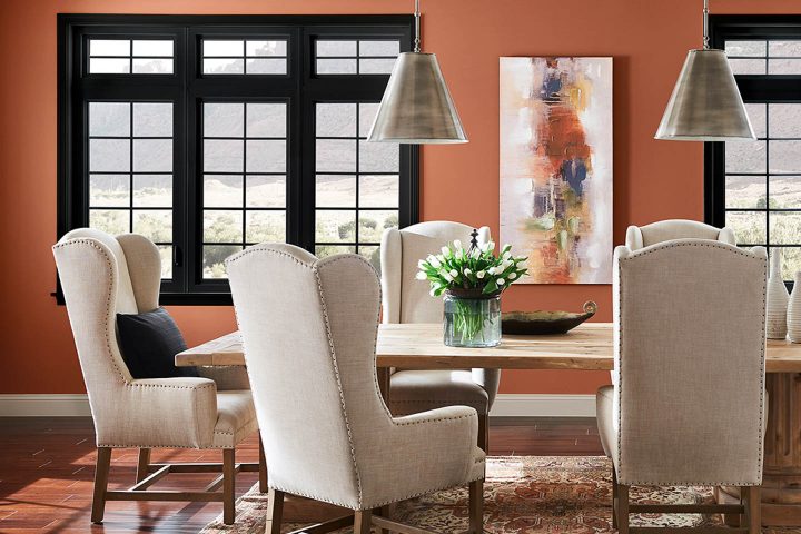
Along the same vein, but with more of an orange tint is Sherwin Williams 2019 color of the year.
“Cavern Clay” is a warm Terracotta orange that is meant to bring the warmth of the outdoors in…think beaches, canyons and the late afternoon sun.
It is a combination of mid century modern and American southwest styles with a bit of a throwback to the 70’s. And it’s definitely a bold color choice!
If you have always wanted to decorate a room in your house with orange tones, 2019 may be your year. It’s a color that doesn’t appear on the trending colors list very often.
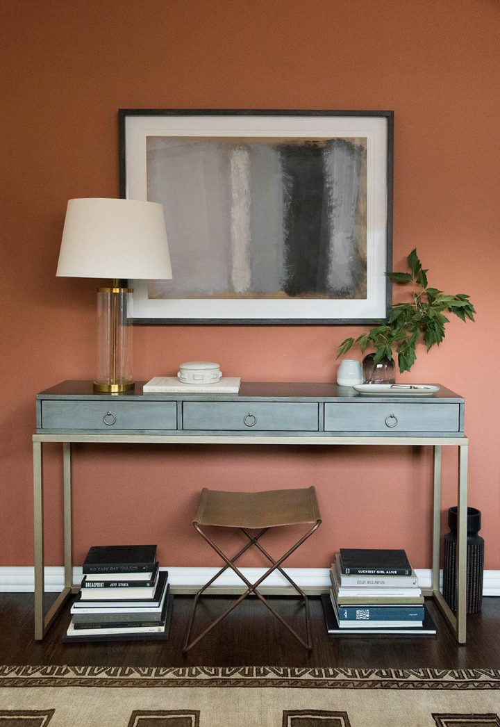
I love the way Sarah at Room For Tuesday combined “Cavern Clay” with a teal console table to get a modern Southwest feel…a good example of combining the two trending colors together.
But Sherwin Williams wasn’t the only one to embrace terracotta for 2019.
Dunn Edwards has a very similar color of the year called “Spice of Life” as their color of the year for 2019. Combining it with white helps to brighten up the room.
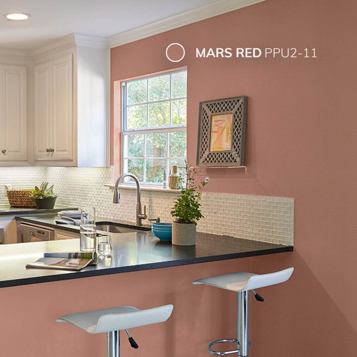
Behr also added a Terracotta-inspired paint color called “Mars Red” in their 2019 Down To Earth Palette which has more of a red base. But still has that warm terracotta feel to it.
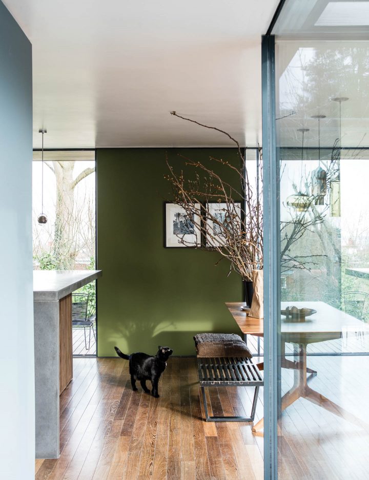
Dark Green
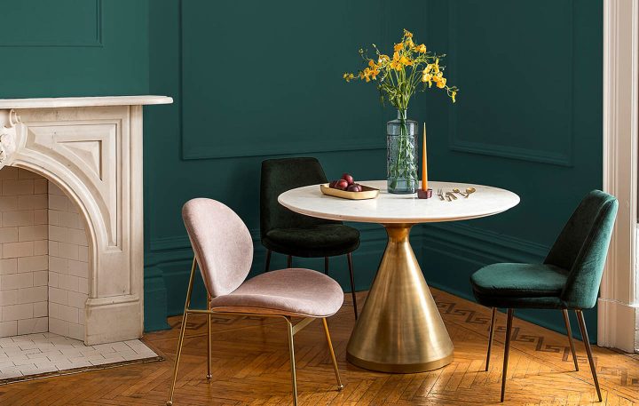
PPG used last year’s blue-black color trend as a basis for their 2019 color of the year selection by going with a very dark green called “Night Watch”.
This color is also meant to bring the outdoors in, but in a more calming and relaxing way. (Are you noticing that nature-inspired theme yet?)
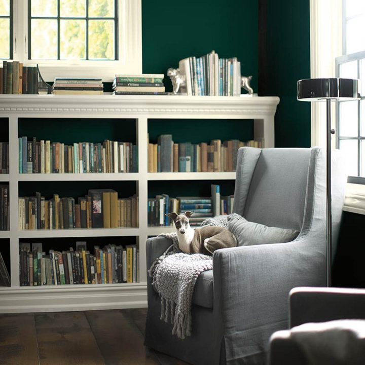
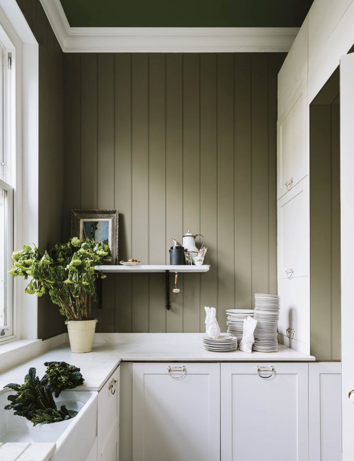
Benjamin Moore actually has two dark green colors (Beau Green and Hunter Green) on their 2019 color trends palette, so you have multiple hues to choose from.
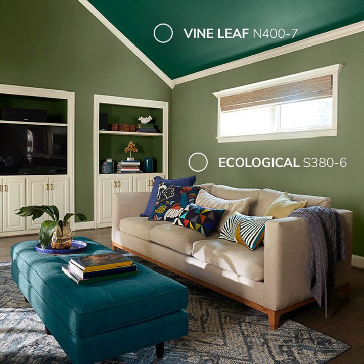
Similarly, Behr is showing Vine Leaf as part of their Inspired Curation color palette for 2019. Not only is it a dark green, but they’re using it on the ceiling! (which you know I love, since decorating the ceiling is one of my things).
Olive Green
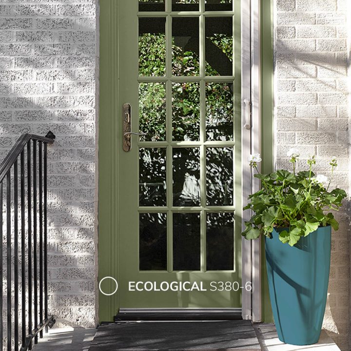
For those who don’t want to go quite so dark, olive green is another color that is showing up on paint color trend lists for next year.
You may have noticed from that last picture from Behr that they also have an olive green called “Ecological” in their Inspired Curation palette. As you can tell from the name, it is yet another one of the nature-inspired colors for 2019.
Farrow and Ball has 2 olive green colors on their latest colors list.
If you want a deeper green, “Bancha” is a bolder mid-century modern green (There’s that mid-century trend again!).
While “Treron” is a grey-based green that could also work as a neutral color in your home.
Both would look beautiful with the light greys that are coming up next on the list.
Valspar is another company that does color trends rather than a specific color of the year.
In case you prefer a green that has more of a blue base than a yellow base, Valspar included a medium green called “Green Water” at Lowes (and “Blue Zinc at Ace Hardware).
Light Grey
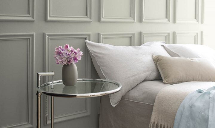
Now that we’ve been through all of the bold colors, light grey is definitely the most neutral of the 2019 paint color trends.
Benjamin Moore chose Metropolitan as their 2019 Color of the Year. It’s a pretty, calming grey that goes well with most other colors. So if you’re looking for an easy-to-use neutral, this may be your choice!
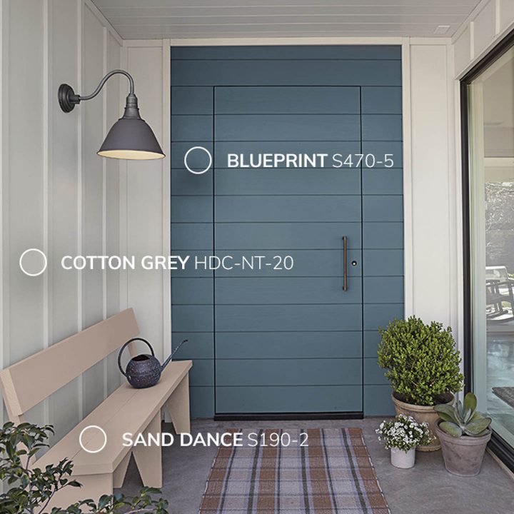
Behr has “Cotton Grey” on its 2019 Soft Focus Palette of trending colors.
It looks beautiful with this door that is painted in Behr’s color of the year – Blueprint.
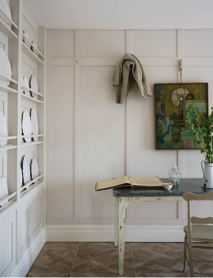
And finally, School House White is another one of Farrow and Ball’s new color options. It’s a beautiful off white neutral. As with most Farrow & Ball paint colors, it has more depth than standard paint colors, which can help to make a neutral color look more interesting.
That’s it for our sneak peak of the 2019 paint color trends. Hopefully, you’ve found at least one that you love!
Other Home Decor Ideas You Might Like
- The Hottest 2020 Paint Color Trends
- The Most Popular 2020 Home Decor Trends
- The Most Popular 2019 Home Decor Trends (according to Pinterest)
Do you have a favorite (or not so favorite) one of the 2019 paint color trends? Tell us in the section below.
Pin It So You Don't Forget It!

[columns] [span4]
[/span4][span4]
[/span4][span4]
[/span4][/columns]
[columns] [span4]

[/span4][span4]

[/span4][span4]

[/span4][/columns]
This post was originally published on November 8, 2018 but was updated with new content on February 2, 2024.
Has anyone seen a stucco home, exterior, in the Blueprint?
Hi Cynthia…I couldn’t find any that were actually Blueprint, but here’s a couple of pictures that are in a similar color tone. This one is a little lighter: https://www.pinterest.com/pin/217509856987174725/ and this one is a little darker: https://www.sharperimpressionspainting.com/recent-projects/blue-stucco-exterior-painting-before-after. Hopefully that helps!
I’d like to redecorate my bathroom. It is not large. Could I use the Cotton grey and Blueprint? What would you use on the floor?
Hi Shirley…yes, I think the grey would work very well with Blueprint. I usually try to keep floors relatively neutral (so you don’t have to change them out if you decide to paint the bathroom a different color at some point in the future). So I think I would go with a ceramic tile that looks like marble. That way you tie in the grey, the blue will look really good with it, and you won’t have the expense or maintenance of real marble.
We just bought our first home and I’m looking to paint the entire interior looking for a color that is neutral with a tint of color possibly silver blue Grace or silver blue greens there are hints of tan cream Brown and yellows more of a gold yellow in my flooring and brick fireplace please help driving myself crazy glad to have found your site just signed up
Hi Gayla…I think the silver blue green should go with the brown and yellow. I would go with a teal-based color. It looks really good with all shades of brown and very pretty with yellow.
I love the gray-based green that typically is called something like “Seaglass.” Can this color be put on a wall next to a light taupe color or should it only be adjacent to a wall that has gray undertones itself? I guess what I’m asking is this–can warm colors and cool colors be side by side? For instance, I would love to do my dining room (which has bachelor’s panels on the bottom) in Benjamin Moore’s Metropolitan AF-690 on the top and then bottom in Mustang 2111-30 but the very next wall (open concept) is the light taupe. Would I need to paint the entire common area color a cool-based tone in order to paint a couple of the adjoining rooms cool colors or does that not matter, even when you’re able to see them all at once? Thanks so much!
Hi Tammy…the easiest way to paint an open concept area (and make sure it looks good) is to do it all in the same color base.
However, it is possible to use warm and cool colors beside each other.
It sounds like your dining area already has some different moldings that set it apart from the rest of the space, so that makes it easier to get away with painting that area a different color.
To make the transition from one paint color to the next a little smoother, I would include the adjacent room colors in a few accent pieces in your common area (eg. add some art, vases, pillows, etc. that contain colors similar to “Seaglass”, Mustang and Metropolitan). That will lead your eye more naturally from one space to the next.
I would also try out your color scheme online just to make sure it looks good. I like Sherwin Williams ColorSnap app. It has both a web version and a mobile app…the mobile app is a little easier to use and has more functions so I prefer it. To convert your Benjamin Moore paint colors into Sherwin Williams colors, you have a few options:
1. Take a picture of the paint chip and use the Sherwin Williams ColorSnap mobile app to match it.
2. Go to https://www.easyrgb.com/en/compare.php to have it tell you similar Sherwin Williams colors.
3. Go to the Sherwin Williams store and ask them to do it for you (or pick out some paint chips yourself that are close)
Then upload a picture of your room into the Sherwin Williams app and “paint” the walls with the colors you want to use. It won’t look exactly as it does in real life but it should give you a good idea of whether or not you’ll like it.
Hope that helps! Good luck with your painting 🙂