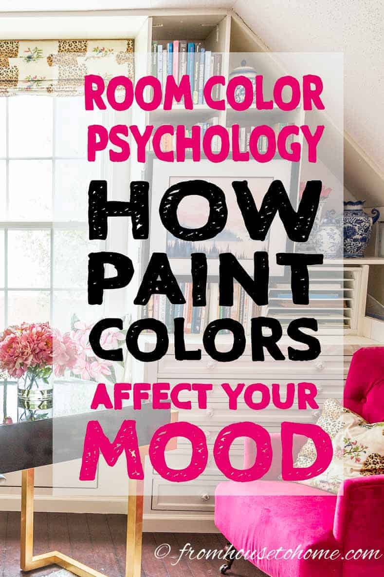
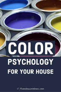
Room Color Psychology: How Paint Color Affects Your Mood


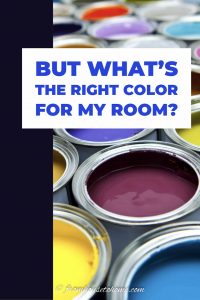
Deciding on a paint color can be a daunting task. Using room color psychology to learn the room color meanings can help you narrow the choices, and make your room feel exactly like you want it to.
One thing that isn’t a surprise for anyone who has seen my house is that I love color!
There are no builder beige walls or white ceilings anywhere to be found (okay, maybe the laundry room…but that’s on my list for a re-do!)
I have always been fascinated by the fact that changing the paint color in a room can totally change the feeling of the space.
And according to scientific studies, it’s a real thing!
There are psychological effects to colors that change the way you feel.
Which means it’s actually a pretty important factor to consider when you’re picking out a paint color.
Who knew you needed to know science and room color psychology to do a room makeover?
So I thought I would do some research and find out how paint colors affect your mood.
Cool Colors vs Warm Colors
This post may contain affiliate links. We make a small commission if you buy the products from these links (at no extra cost to you). As an Amazon Associate, I earn from qualifying purchases. But we only recommend products we would use ourselves. For more information, click here to see our disclosures.
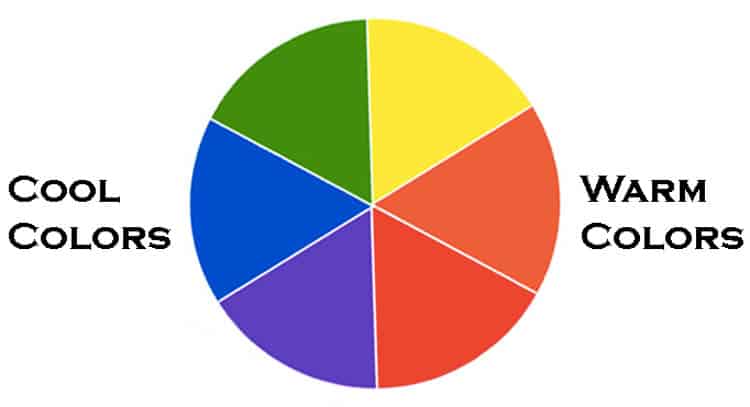
At the most basic level, there are two types of paint colors that affect your mood…warm and cool.
If you look at a color wheel, half of the colors are on the warm side (red, orange and yellow) and half are on the cool side (purple, blue and green).
The names “warm” and “cool” generally describe how those colors feel in a room.
As you might have guessed, the warm tones are the radiant colors that make you feel happy and energized when you enter a room.
While the cool tones are tranquil colors that make you calm down and relax.
So deciding on whether you want your room to energize you or relax you can be an easy way to eliminate half your choices!
Within the warm and cool categories, each individual paint color affects your mood in its own distinct way.
And knowing how they will make you feel is a great way to help you decide on a color direction for your room.
A Note About Pinning
Many of the images below are from houzz.com and cannot be pinned due to their copyright restrictions.
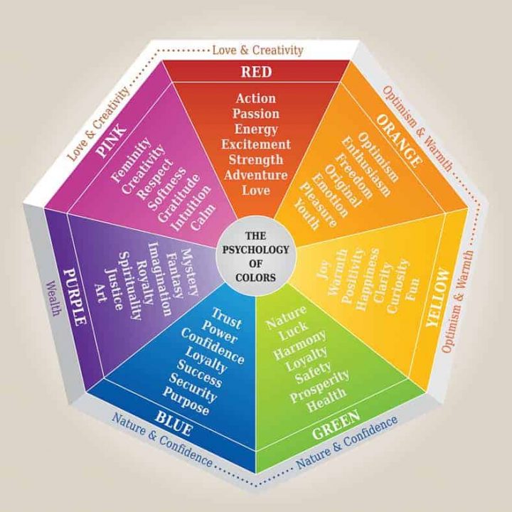
Red Room Color Psychology
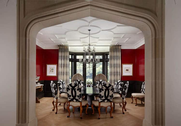
Red is the most intense of the colors and definitely ramps up the energy in a room.
It stimulates the appetite and conversation which makes red a great color for dining rooms and kitchens.
In fact, more restaurants are painted red than any other color (it’s good for business!)
However it also raises blood pressure, heart rate and respiration.
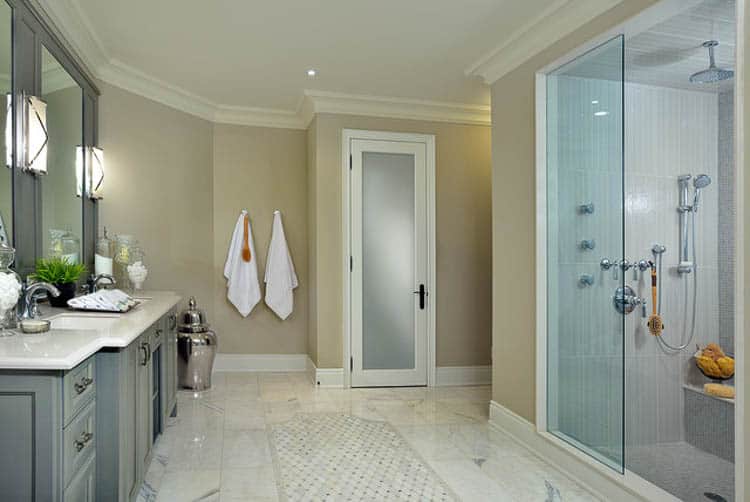
So all that extra energy means it may not be so great for bedrooms or spa bathrooms where you are trying to relax.
Pink Room Color Meaning
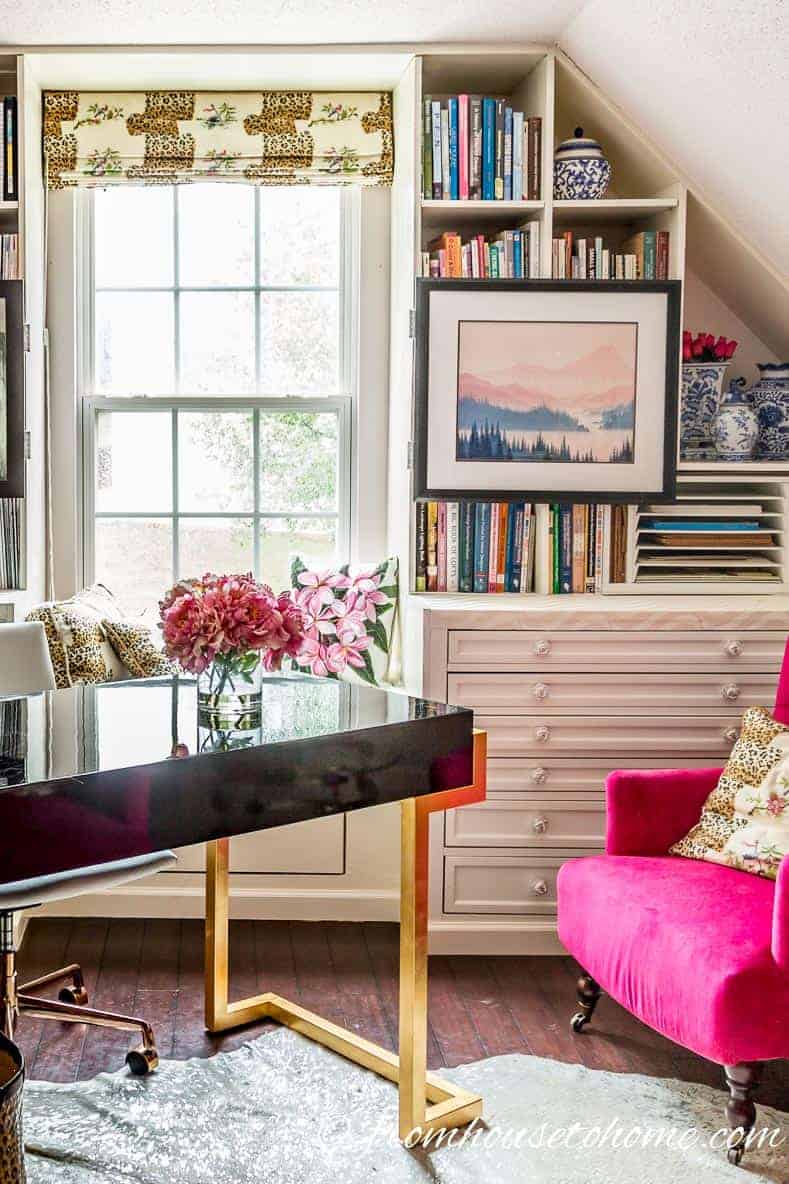
Even though pink is a tint of red, and still has the cheerfulness of a warm color, it has a totally different effect on your mood.
Pink has been shown to promote calmness and reduce aggression.
Apparently it works so well that some football teams have resorted to painting the visitor’s locker room pink in an effort to reduce their opponent’s effectiveness on the field.
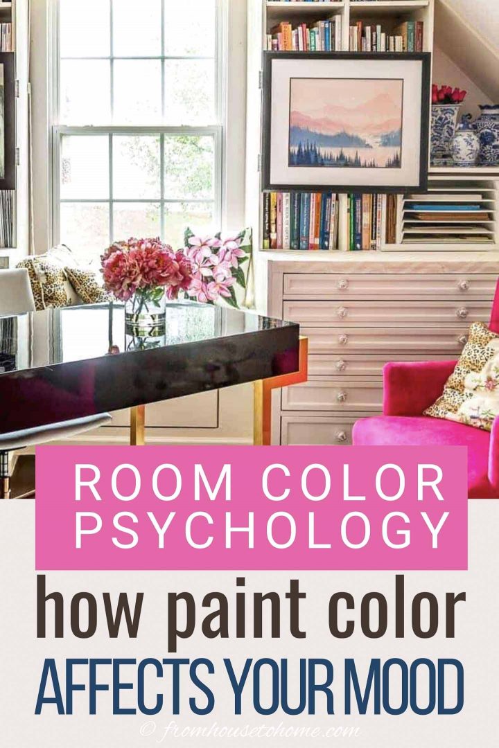
I put that calm but cheerful vibe to work in my home office (which I really love to work in!).
Orange Room Color Mood
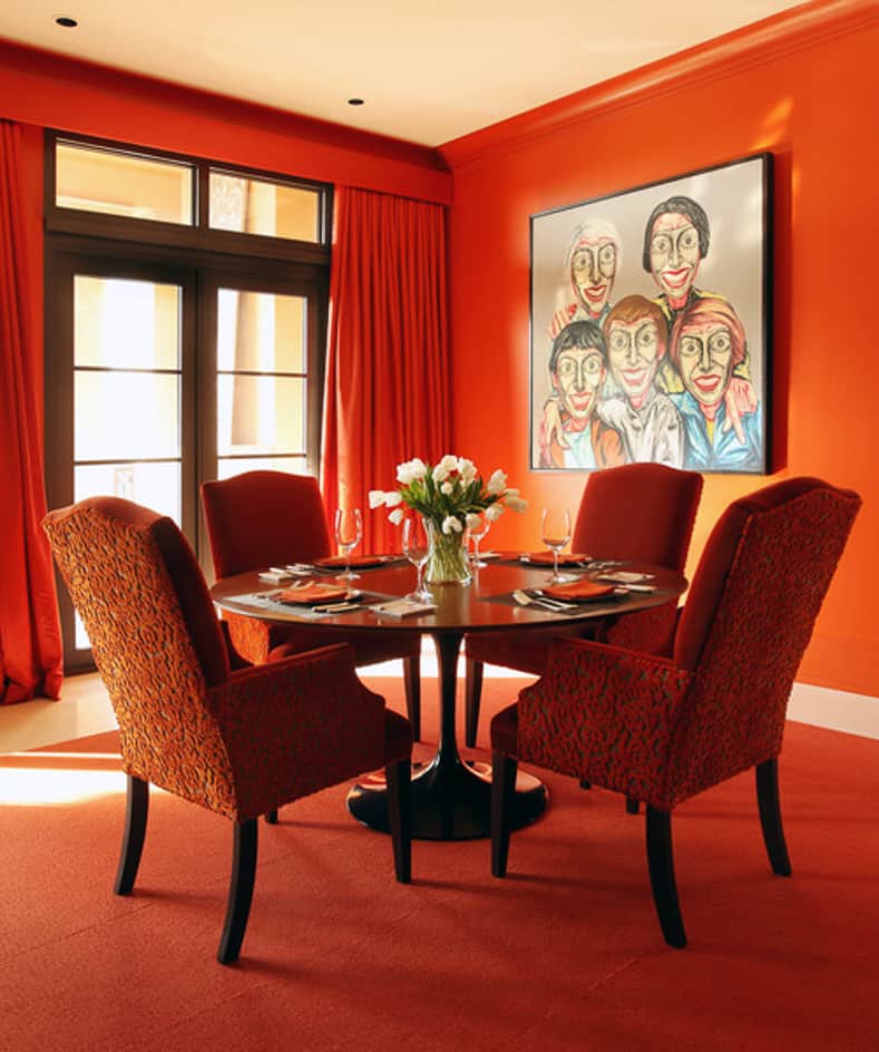
Orange is an energizing and fun color that has a lot of the same characteristics of red, but without the negative side effects (like higher blood pressure).
And some say that it makes you feel younger.
This contemporary orange dining room certainly looks like a place to have some lively dinner conversations.
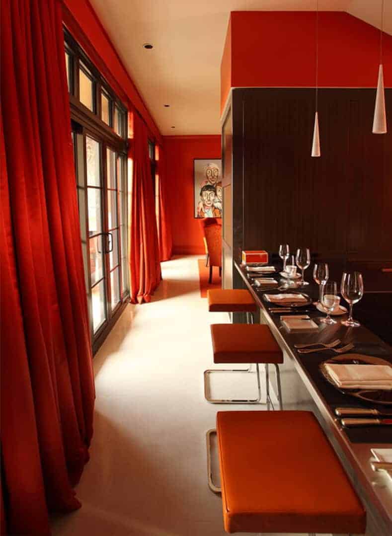
In this home, the orange walls are carried all the way through to the kitchen.
If you know me, you know that I’m not a big fan of orange room decor (I don’t even do orange for fall decor!).
But I love the way it adds warmth to this streamlined room that might otherwise seem a little sterile.
However, that does bring us to one of the drawbacks of orange.
It is the color most likely to be chosen by people as their least favorite color.
So it might not be a good choice if you are planning on selling soon.
…unless you live in a big college football town like I do where a lot of “Game Rooms” are painted orange and purple for our Clemson Tigers.
Yellow Room Color Psychology
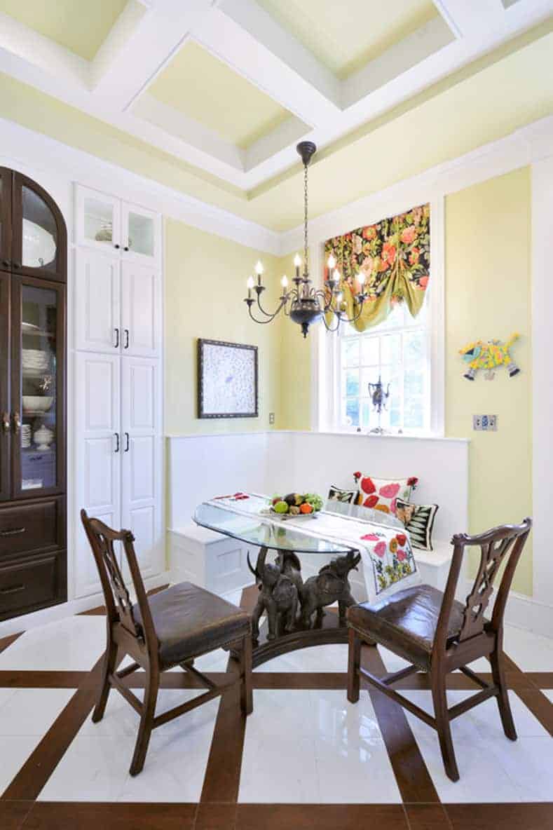
Yellow is a cheerful and optimistic color.
It’s hard to feel down in a happy yellow room like this kitchen eating area.
Yellow is also supposed to help increase your focus…so studying in the kitchen would definitely be a good plan in this house.
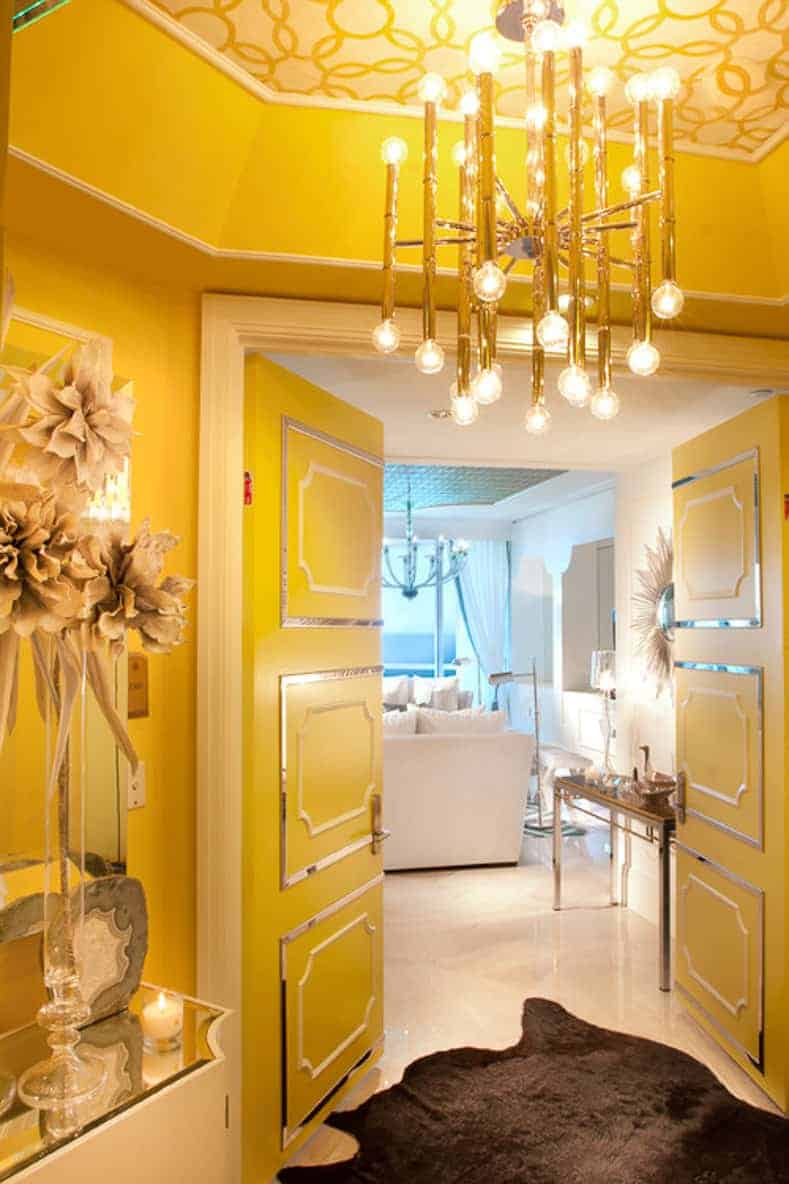
In entryways, yellow is a very welcoming color. It certainly makes a statement in this glam foyer!
One thing to keep in mind: The eye sees yellow before any other color.
So if you are using it with other colors, it will be the one that stands out.
Because of this, strong yellows usually work best as an accent color or in small rooms.
It’s also the color that makes babies cry the most…so you probably want to think twice about using yellow in a nursery.
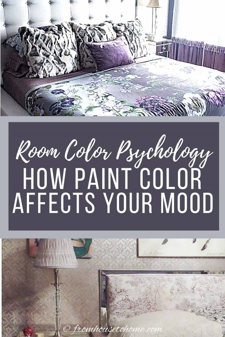
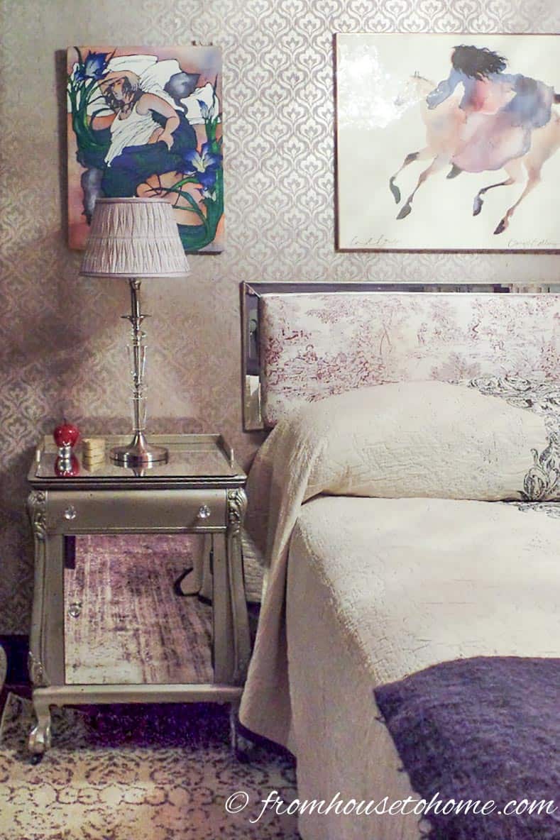
Purple Room Color Meaning
Purple is a spiritual and creative color that people either seem to love or hate.
I have never heard so many vehement opinions about color as when Pantone picked it for the 2018 color the year.
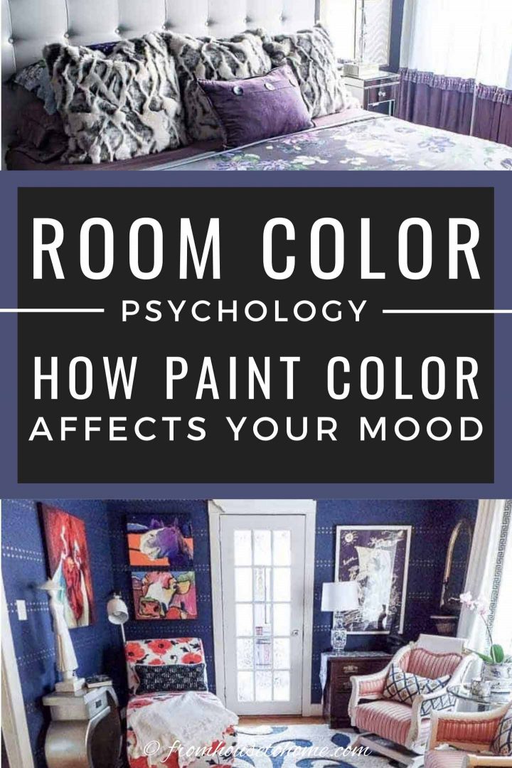
My mother and I both fall on the side of liking it, as you can tell by her purple bedroom makeover above and mine below.
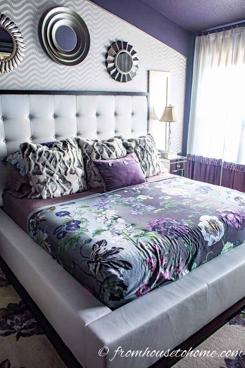
It also symbolizes luxury, wealth and power, and is often associated with royalty.
Maybe that’s why I like it in my new master bedroom so much…it makes me feel like a queen :).
Purple is the darkest of all of the colors and tends to recede in a color scheme.
Blue Room Color Mood
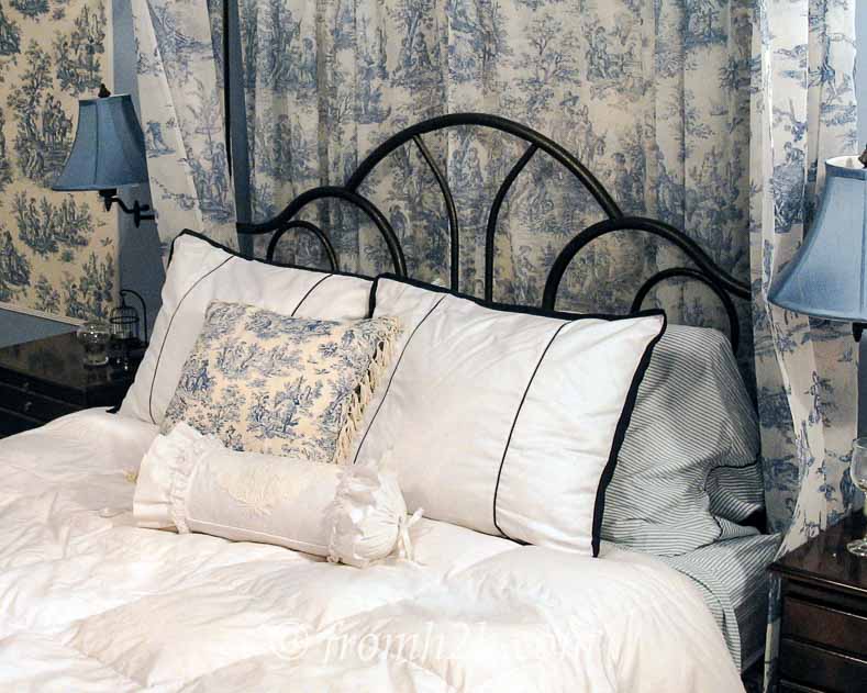
Blue is the most calming of all the colors.
It is said to slow your heart rate and respiration as well as lower blood pressure.
Which is why it is often used in bedrooms (like the original version of my master bedroom).
Blue is also supposed to suppress your appetite, so if you’re on a diet, maybe blue is the right color for your kitchen!
Blue symbolizes trust, dependability and stability which may be why more people choose it as their favorite color than any other color.
It also helps you think more clearly and be more productive, so blue is a great color for a study area or home office.
Blue is the only color that doesn’t have any warm color influence (both green and purple are made up of blue plus a warm color).
So it can make a room seem too cold.
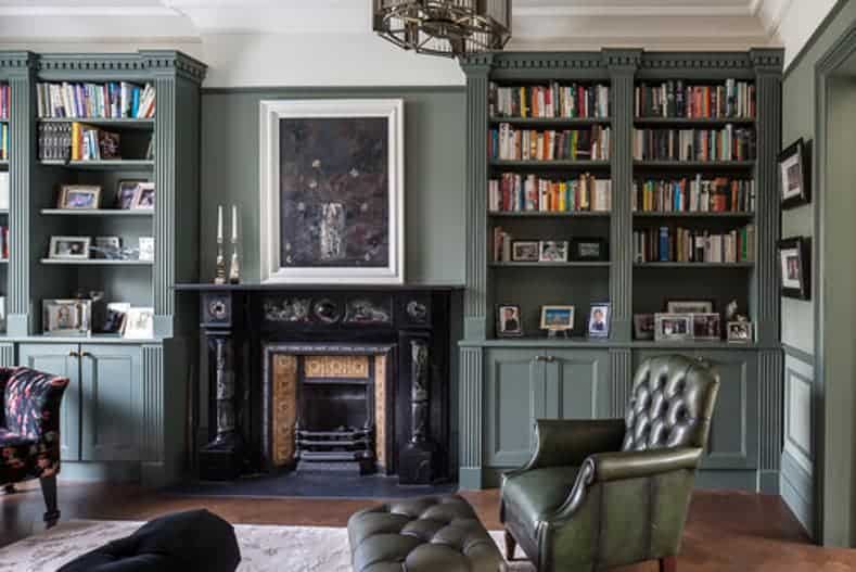
Adding some warm colors and textures (like my mother did in her living room) is an easy way to prevent that from happening.
Green Room Color Psychology
Green is the most relaxing color on the color wheel.
With its serene and tranquil feel, it’s no wonder it gets pick so often for spa bathrooms and restful bedrooms.
Painting your room green is even supposed to prevent nightmares…another plus for a bedroom paint color (especially for a child’s room).
Since green is created from a combination of yellow and blue, it has the calming effects of blue and the cheerfulness of yellow.
This helps to prevent it from feeling too cold like blue sometimes can.
Green is also believed to relieve stress.
Which makes it a great color to use anywhere that you want to sit back and put your feet up.
But What About White and Black?
Technically, true white and black don’t count as colors.
White is created from the combination of all colors, while black is the absence of any color.
However, when it comes to decorating, it’s very rare to be using true white or true black.
The paint usually has an undertone color that makes it fit into either the warm or cool color group.
Which is why you can always find a white or black that will go with your color scheme.
You’ll notice that every one of the rooms above has white and/or black in it.
So they truly are neutral colors that will go with everything.
What Are The Best Colors For Different Rooms?
For quick reference, here are the best colors for different room types, based on room color psychology.
Of course, these are only guidelines. You are always free to pick something else.
At the end of the day, the absolute best color choice is the one that you love!
Best Colors For Bedrooms and Spa Bathrooms
- Green because it is relaxing and prevents nightmares
- Blue because it is calming and slows your heart rate
Best Colors For Dining Rooms and Kitchens
- Red because it stimulates appetite and encourages conversation
- Orange for the same reasons as red
- Yellow because it is sunny and cheerful
Best Colors For Studying or a Home Office
- Blue because it helps you think more clearly
- Yellow because it makes you focus
- Purple because it encourages creativity
Best Colors for a Work Out Room
- Orange because it increases energy and makes you feel younger
- Pink, blue or green if your work out is more yoga than weights because they are calming
For the rest of the rooms in your house, there isn’t really a “best” room color psychology choice because it all depends on how you want the room to feel.
And only you can answer that question.

There you have it, my list of how paint color affects your mood.
So the next time you are having trouble picking a paint color for your room, try choosing the mood you want first.
Then you’ll have narrowed the field to only a couple of colors and can more easily go from there.
Other Color Ideas You Might Like
- How To Choose The Right Paint Color (7 Steps To Help You Decide)
- How To Create A Whole House Color Scheme (Even If You Love Color)
- Sneak Preview of the New 2019 Paint Color Trends
Have questions or comments on room color psychology and how paint color affects your mood? Tell us in the section below.
Pin It So You Don't Forget It!

[columns] [span4]

[/span4][span4]
[/span4][span4]
[/span4][/columns]
[columns] [span4]
[/span4][span4]

[/span4][span4]
[/span4][/columns]
This post was originally published on May 22, 2018 but was updated with new content on January 18, 2021.
The statement that black is the absence of color is confusing. To clarify: White is all lights combined, but it’s the absence of color when referring to paint. Black is all colors of paint combined, but is the absence of light.
Thanks, Gale! That is a better way of describing it.
Recently I remodeled/redecorated my entire home. I followed my intuition, using my fav colors of shades of teal, pink, green and whites. EVERY room is wallpapered so that transition is smooth. ( LOBVE wallpaper and it protects walls. My living room and large kitchen face South and West. My Anthro emerald green velvet and teal sofa faces a peacock chaise sofa with pastel Bergere chairs in soft teas/pinks. For fun, I put a slipper chair in a corner which displays a pink and white deer head. ( SO FUN) I replaced dry backsplash with teal handcrafted mermaid tail tiles which looks FAB w/my swirled brown granite and wraparound almond cabinets w/ pink/gold/ivory pulls from Etsy. I have a white stone and gol;d dinette with oversized floral teal sofa ( perfect) with blush chairs and blush velvet stools under black walnut distressed pie shaped island. My primary bdrm is all in water colored huge magnolias in soft pinks, greens w/ lace and rose border. I use a white background w/ all wallpapers along with a border. Crystal lights or floral shaded table lamps everywhere in rooms. I get raves and entertain a lot more. Christmas Tea Open House is coming up.
Sounds beautiful, Irene!
hey wanda, in another post you mentioned you had black cabinets in your kitchen. have you talked about your kitchen before? if so which article?
i would LOVE to see pics of how you did your kitchen. thanks!
Hi Vicki…I haven’t done a post on my kitchen, but it’s on my to do list 🙂
Hi,
I am an artist and color is my life so I have filled my house with it. I also have a room that has black walls. However, I have a friend who’s house is absent of color and I have seen others like that before. It makes me uncomfortable to be in for very long so my visits are short. These houses have white walls and everything else is shades of brown. None have any dark brown which I like to add with an Orange or Red, just this natural shade of nothingness. Can you tell me what this kind of decor is, what it says??
Hi Cindy…I’m afraid I don’t have much insight into that, other than it is outside the comfort zone for many people to put a lot of color in their homes. I am with you…I can’t imagine myself living in a house decorated like that. But then some people say they can’t imagine living with as much color and pattern as I have in my home. So I guess it’s all a matter of personal taste 🙂
Hi Wanda,
I love reading your advice on color and I too love color. I am hoping you can help me. I have a gold sofa, and two french chairs in an orange-red, and I want introduce two blue chairs, what color of blue would work best? I also like green but don’t want it to look like Christmas. Please help—–Debbie
Hi Debra…I would probably go with a royal or navy blue. Either will look good with both gold and orange-red. Hope that helps!
Great article, thanks for the tips!
Thanks, Seala! I’m happy you found it helpful 🙂
I was wondering if you could use too much of one color in your home; such as grey and white – or black/white. Both my bathrooms are white w/ grey veins in the tile. While my entry way and my sitting room off the entryway is brown and beige.
Hi Diane…I think the main “rule” for how much of one color to use in your home is how much you like it. Some people do their entire homes in one color combination and are very happy with it. While others want more variety. So if you like the colors and want to use them everywhere, go for it!
What about other colors, like Burgundy? Does that fall into red? And what do you do when youRe stuck with apartment building colors like off white walls and beige carpets?
Hi Annie…I think burgundy would generally fall under red, although maybe less forceful since it does have some brown and purple mixed in with it. Apartment building colors are a bit of a challenge. When I lived in an apartment, I tried to ignore the wall color and decorated everything else in the colors I wanted. Curtains that cover a whole wall, large wall hangings or a large bookcase painted in the color you want to use can all help to cover up the beige. Good luck with it!
Great information! I am wondering if grey falls into the same category as black and white? Thanks for the article!
Hi Corrine…Yes, grey is in the same category as black and white. It will have some undertones to it that put it on the warm or cool side of the spectrum, so you just need to pick one that goes with your other colors.
As I embark on yet another house this information is very welcome. This makes move number 40. Yawn.
Glad you found it helpful, Jody. Wow! 40 moves…you must be an expert at setting up a new house 🙂