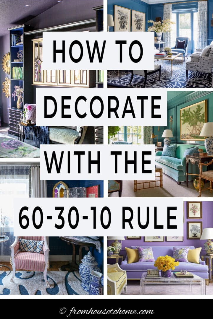
Decorating with the 60 30 10 Rule: An Easy Way To Choose Colors


Choosing the right color scheme for a room can often seem daunting, but it doesn’t have to be. You just need to learn how to use the 60 30 10 rule. It’s one of the easiest ways to create a balanced and pleasing color palette for any room.
Unlocking the secret to a beautifully designed room doesn’t have to be a mystery.
A large part of successful interior design lies in color balance, and the key to achieving that balance might be simpler than you think.
The 60 30 10 rule is a design principle widely adopted by interior decorators to create harmonious color schemes.
But it’s so easy to do, you don’t have to be a professional to make it work for your own interior decorating projects.
We’ll delve into how you can implement this design rule, using the color wheel to select your perfect palette, and tips to adjust it based on your personal style.
Let’s dive in and transform your space into a beautifully balanced masterpiece.
What is the 60 30 10 decorating rule?
But before we start, you may be wondering what exactly is the 60 30 10 rule for decorating?
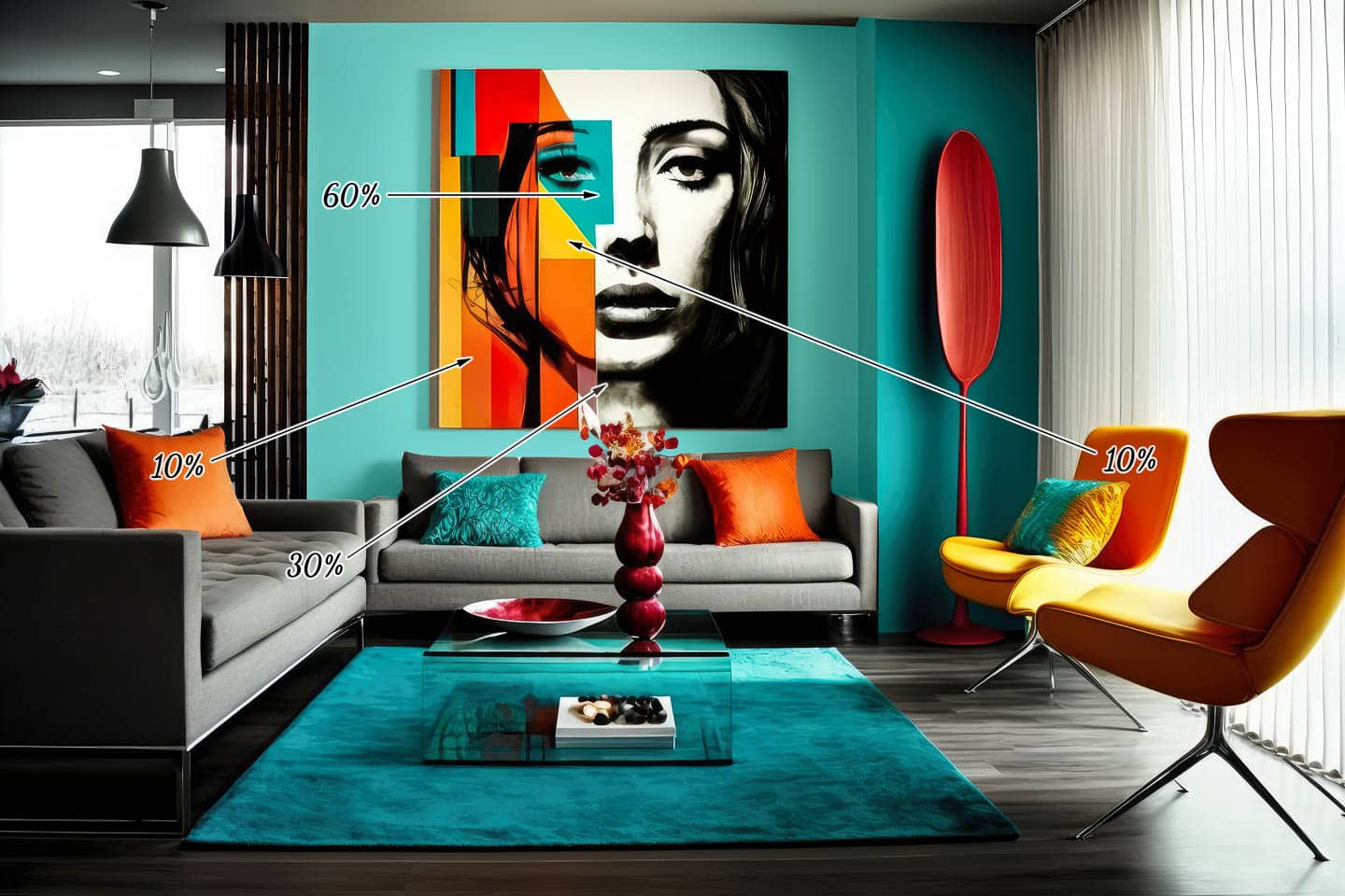
It is a fundamental principle in interior design that suggests dividing a color scheme into 60% dominant color, 30% secondary color, and 10% accent color.
This helps in balancing colors, creating a visually appealing, harmonious room that’s neither too monotonous nor too chaotic.
It also allows for easy updating over time. If you decide you want to change your look, you can simply switch out your accent color with minimal hassle and expense.
How to use the rule
Here’s how to use the 60-30-10 color rule to create color combinations that work.
The dominant color (60%)
Your dominant color should account for approximately 60 percent of the room.
It provides a backdrop that allows the other colors in the room to stand out.
This is usually the color of your walls, ceiling, large decor pieces like area rugs and sofas, or even your flooring.
As it occupies the majority of the space, using a color you love is your best bet.
The secondary color (30%)
The secondary color represents about 30 percent of your room and is often applied to furniture, drapery, bedding or accent walls.
It should complement but contrast with your dominant color to create some interest and depth.
The accent color (10%)
The accent color makes up the remaining 10 percent of your room.
It’s the color that will pop and bring vitality to the space.
This color could appear in accessories like pillows, lamps, artwork, and decorative pieces.
Because it’s used sparingly, this can be your boldest color.
If you’re a color lover like I am, you may have trouble sticking to just 3 colors.
In that case, you might want to go with a variation of the rule – the 60 30 10 10 rule.
Then you can choose 2 accent colors to use in your room.
How to choose colors from fabric or artwork
Now that you know how the rule works, it’s time to figure out exactly which colors you want to use.
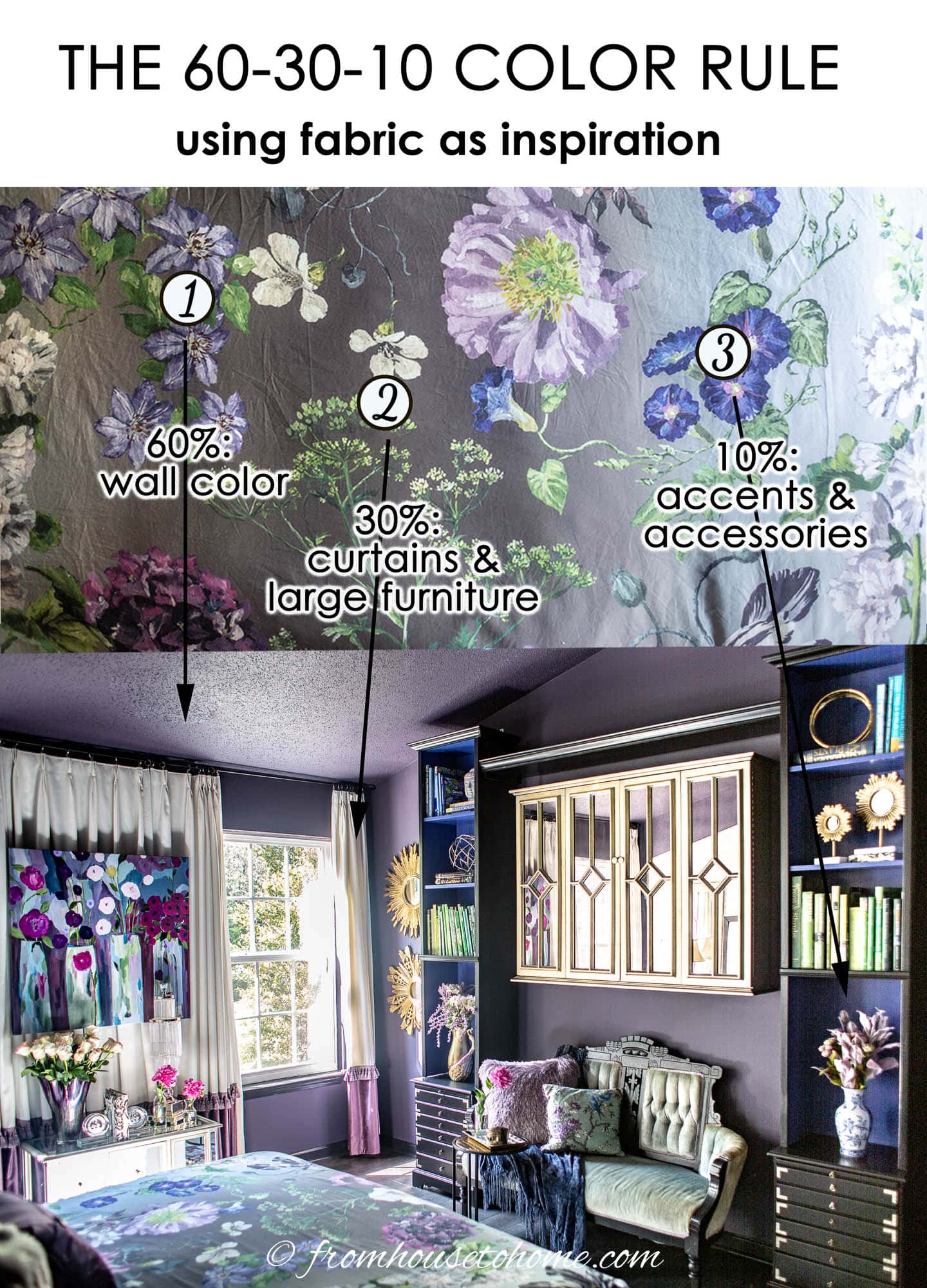
My favorite way to pick colors is use to a piece of fabric, artwork, or area rug that I love.
Then you just have to pick 3 colors out of your inspiration piece to use in your room.
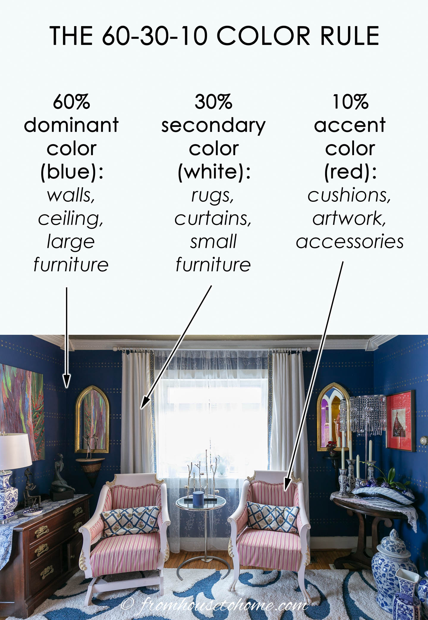
In my bedroom, I used the colors from my duvet as the jumping off point. Then painted the walls and ceiling purple (my 60% color), painted the inside of the bookshelves blue (my 30% color) and used green on the settee as my accent color.
Color wheel combinations and examples
There are several types of color schemes you can create using a color wheel, including monochromatic, complementary, split-complementary, analogous, and triadic.
Here are the definitions and some 60 30 10 rule examples for each of those color schemes.
Monochromatic colors
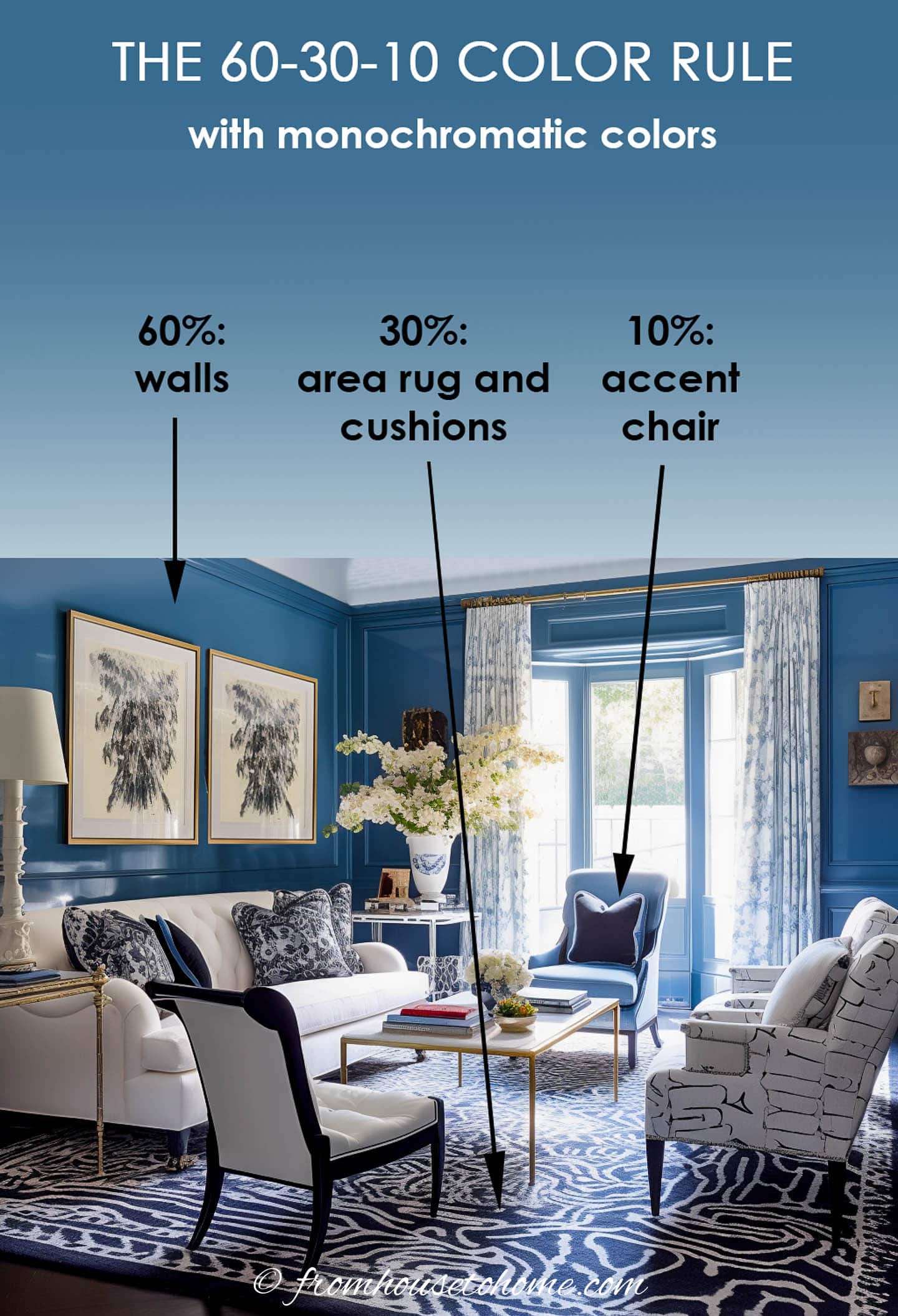
A monochromatic color scheme uses 3 different shades of the same color, such as this living room.
It has 60% medium blue on the walls, 30% dark blue in the rug, artwork and throw pillows, and 10% light blue in the chair and the pattern on the curtains.
This is a very calming color scheme that is almost guaranteed to look good regardless of what color you choose.
Complementary colors

Complementary colors are directly opposite each other on the color wheel, such as purple and yellow or blue and orange.
This scheme offers strong contrast and stands out the most.
To make it work for our color scheme, you’ll need to use two shades of one of the colors, like the living room above that has 60% light purple, 30% yellow and 10% dark purple.
As you can see from this example, walls aren’t always the 60% color. In this case, the ceiling, area rug and all of the furniture are done in light purple so it ends up being the dominant color.
Split complementary
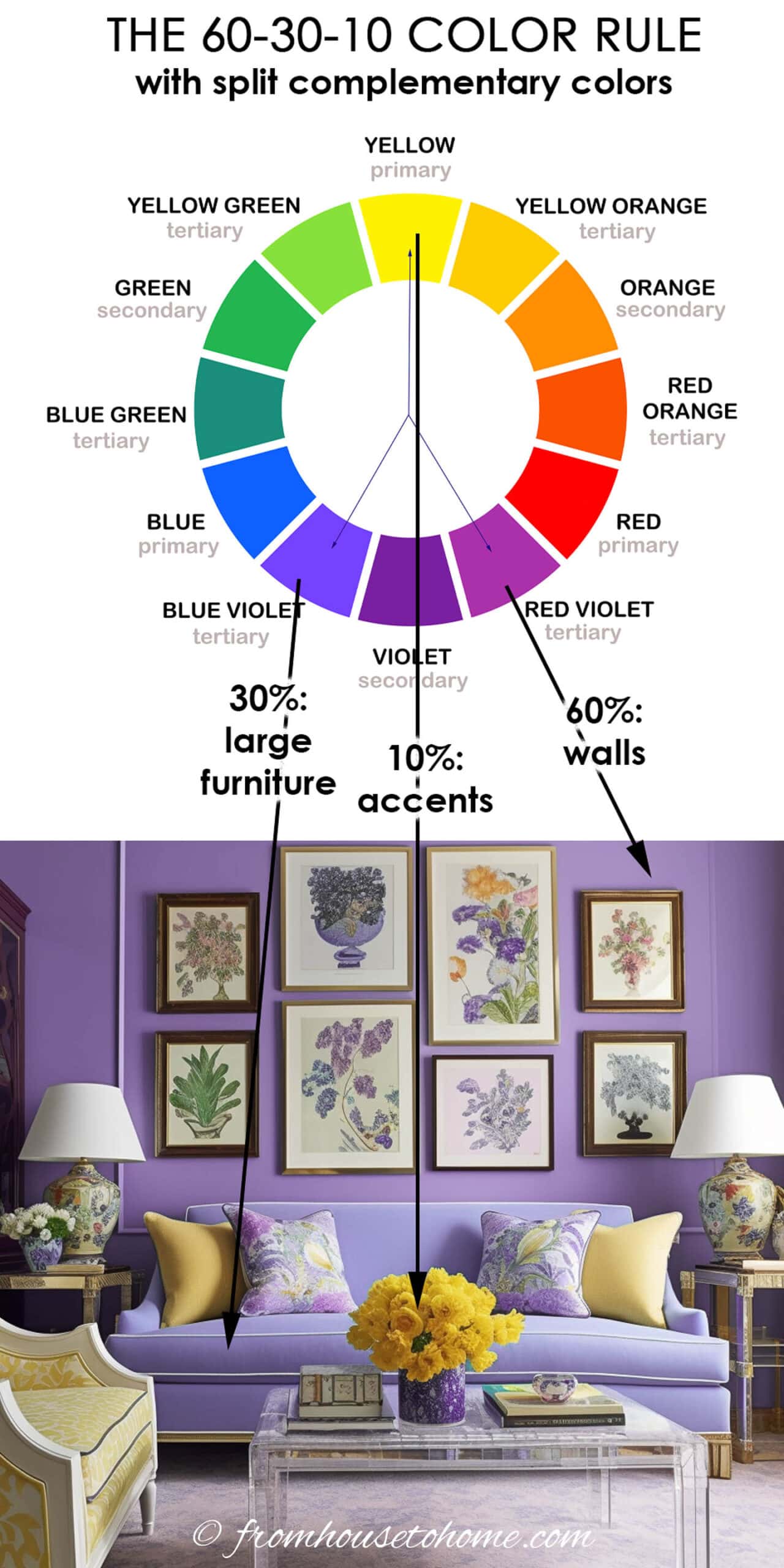
Split-Complementary is a variation of the complementary color scheme that has a little less contrast but still stands out.
In addition to the base color, it uses the two colors on either side of its complement.
In this room, the base color (yellow) is the accent color while the other two colors cover most of the area.
This creates a more relaxing look than using the base color in a bigger role.
But you can select it as the dominant or secondary color if you want to add more drama to your room.
Analagous colors
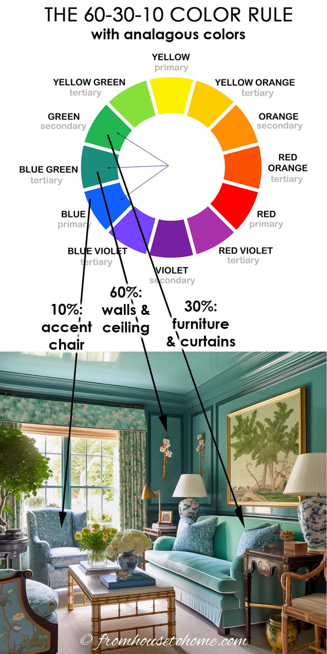
Analogous colors are next to each other on the color wheel, like blue, blue-green, and green.
This scheme is often found in nature and is gives the room a very relaxing and comfortable look.
Triadic colors
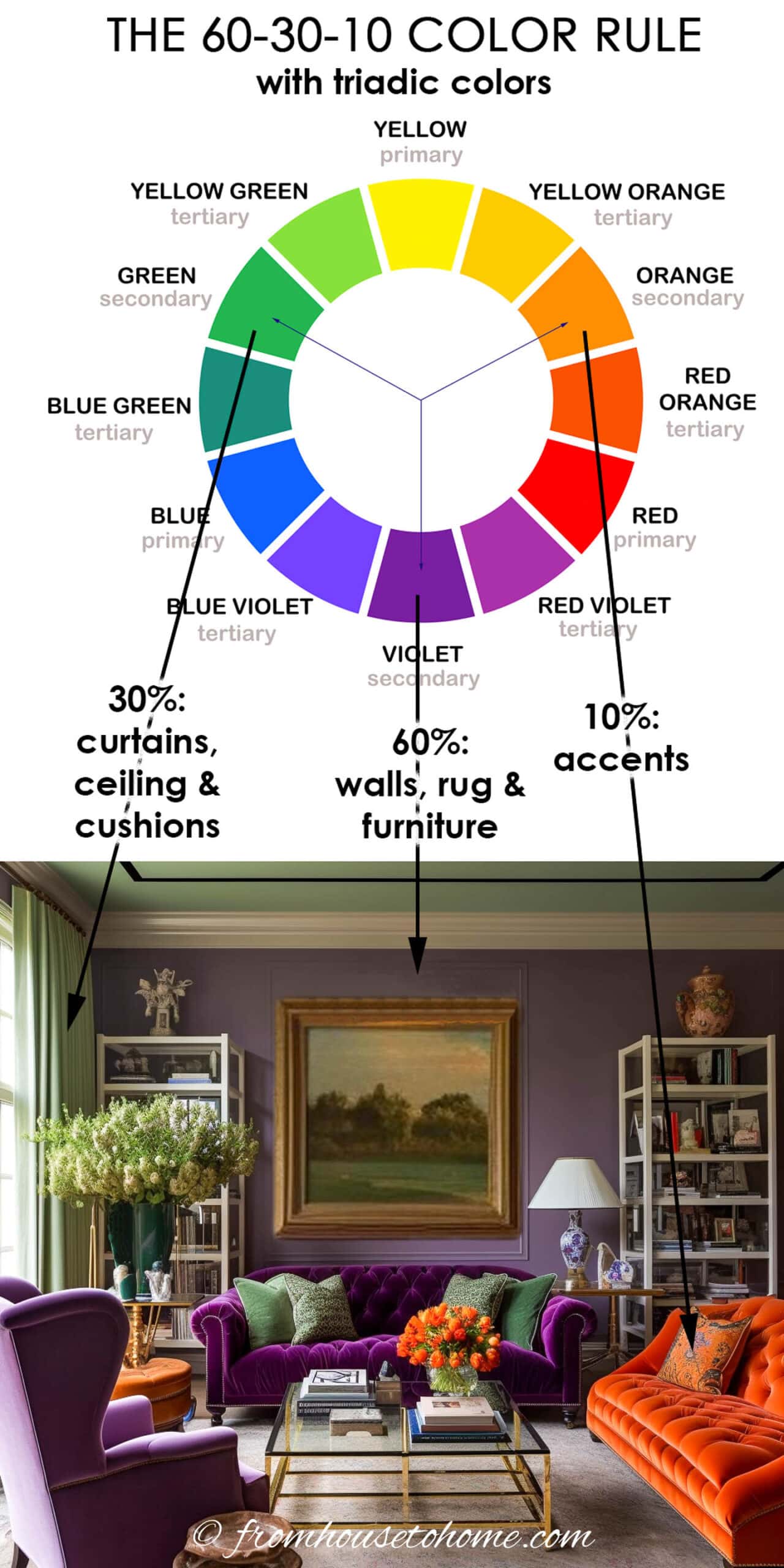
Triadic colors are evenly spaced around the color wheel.
This scheme is high contrast which adds a lot of energy into the room.
As you can see in this purple and green living room with a pop of orange, it definitely is not a boring room.
Color tips
Here are a few more things to think about when you are making your color choices.
Consider color temperatures
Colors are separated into warm colors (reds, oranges, yellows) and cool colors (blues, greens, purples).
Warm colors are energizing and inviting, while cool colors are calming and relaxing.
Balancing warm and cool colors in a room can also contribute to the overall harmony.
Value and saturation
Don’t forget that each color comes in a variety of shades, tints, and tones.
Changing the value (lightness or darkness) or saturation (intensity) of a color can dramatically impact its appearance and the feel of the space.
Color psychology
Remember to consider the psychological effects of colors as well.
Different colors evoke different feelings and moods.
For instance, blues are calming and relaxing, reds are energizing and stimulating, greens are peaceful and refreshing, and yellows are uplifting and cheerful.
Read more about how colors affect the mood of a room.
Final thoughts
As with most principles, the 60 30 10 rule is a guideline, not a hard rule.
It can help you if you’re feeling stuck choosing colors.
But feel free to adjust it as needed to fit your space, taste, and the specific atmosphere you’re trying to create.
Other color decorating ideas you might like
- How to create a whole house color scheme
- The best living room paint colors
- How to pick the perfect paint color
Or browse all of our color decorating tips.