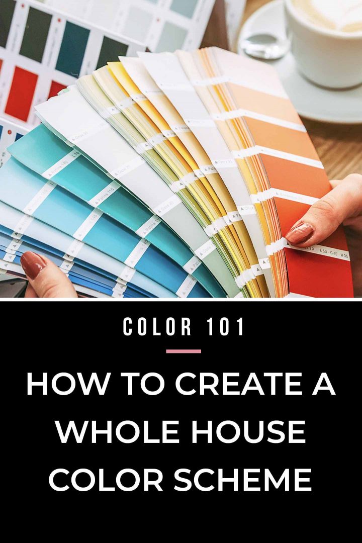
How To Create A Whole House Color Scheme (Even If You Love Color)


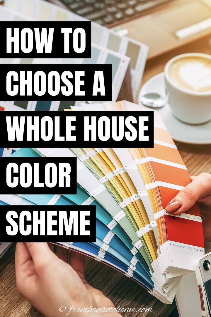

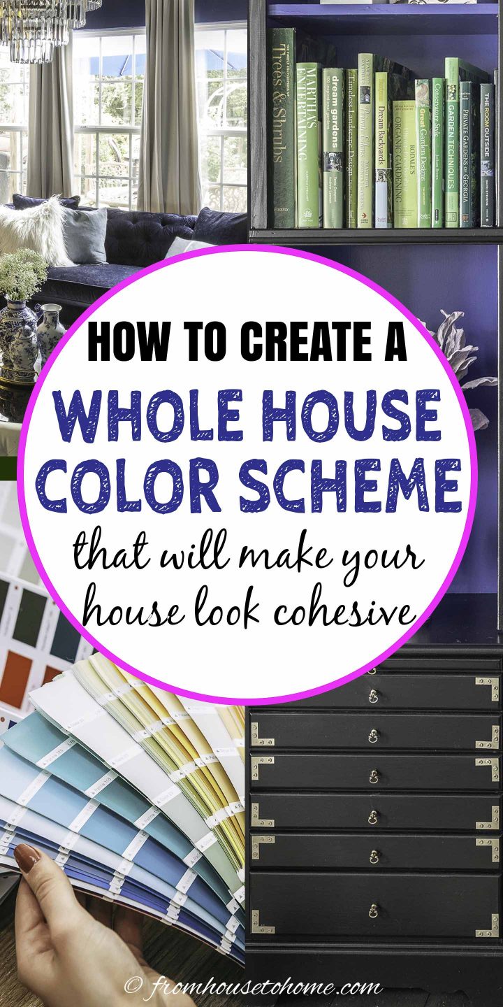


Creating a beautiful, cohesive look for your home isn’t hard to do if you use this one simple decorating technique – a whole house color scheme!
Using a whole house color scheme along with some room color psychology and tips for picking the right paint color helps me select the right colors for my room makeovers every time.
Whole House Color Scheme
This post may contain affiliate links. We make a small commission if you buy the products from these links (at no extra cost to you). As an Amazon Associate, I earn from qualifying purchases. But we only recommend products we would use ourselves. For more information, click here to see our disclosures.
One of the things that people always comment on when they come into my house is how all of the rooms seem to flow from one to the next.
It’s not that hard to do if all of your walls are painted the same color. Or you use the same neutral color palette everywhere.
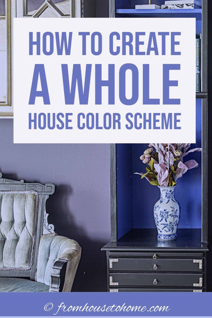
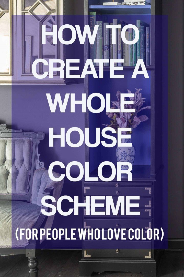
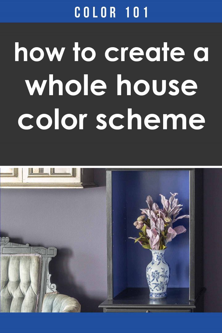
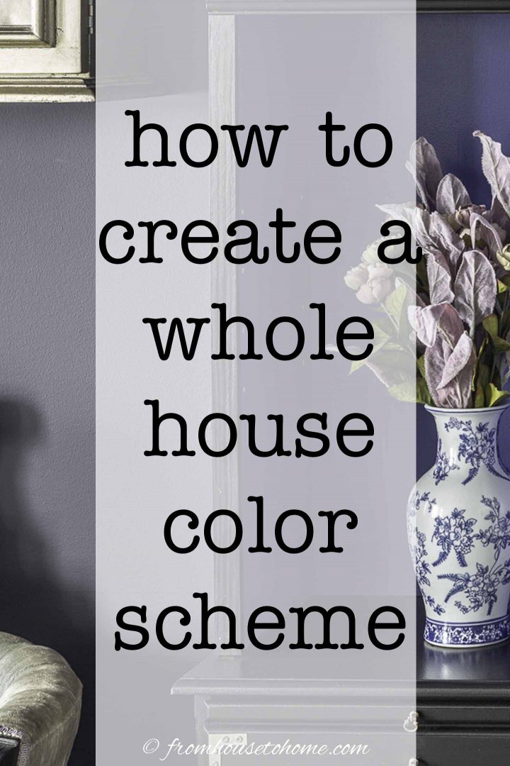
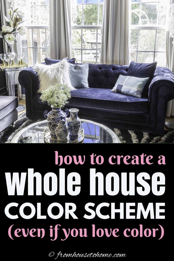
But that’s definitely not the case in my house (my walls are blue, purple, pink, black and silver).
So what makes the rooms in my home look like they belong together even though they aren’t the same?
I have a whole house color scheme.
What Is A Whole House Color Scheme?
Basically, a whole house color scheme is a selection of colors that you use in varying amounts to provide a cohesive look throughout your home.
This repetition of color is what helps to make sure that your house flows from one room to the next.
My version of choosing a whole house color palette doesn’t actually involve picking specific colors. Because I love color so much, I would find that impossible to do for the whole house all at once.
Instead, I pick color families and then use a few rules to apply those colors to my rooms when I’m decorating.
Why Do You Need A Whole House Color Palette?
Besides making your house look good, there are actually a couple of other benefits to having a whole house color scheme.
First, it reduces the number of color choices you have when you are updating a room. When it comes to choosing color, the biggest problem is usually that there are just too many options available. A whole house color scheme makes that process so much easier and faster. However using color families still gives you some flexibility to update your colors as you go.
And, if you like to move your furniture around as much as I do, you get an extra bonus! A lot of your furniture and accessories will “go” in most of your rooms…so you’ll have lots of ways to rearrange them.
How To Choose The Colors For Your Home?
You may be saying this sounds good in theory, but how do you choose which colors to use?
It’s really not as hard as it sounds.
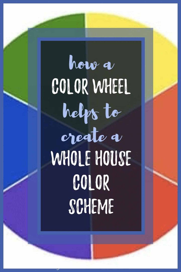
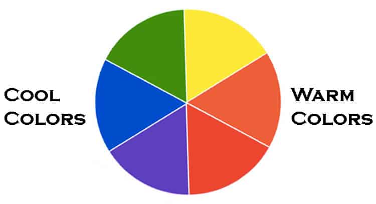
To create your whole house palette, you are going to pick 4 colors from the basic color wheel, using the steps below.
Don’t worry…these are just the color families that you will be using to decorate your house, not the actual colors themselves. For example, choosing the Red color family includes all of the colors that are derived from red such as pink, burgundy and fuchsia.
Also, these aren’t necessarily wall colors…just colors that you will be using in the rooms, so don’t get too worried that it will be too much color. You will NOT end up with bright purple, green and orange walls (unless that’s the look you’re going for).
There are no rules about which colors you can choose at this stage…so don’t limit yourself…it’s okay to choose colors that you think won’t go together at all. You’ll be surprised at what can work!
You will also notice that there are no neutral colors (white, black, gray or brown) in this selection. This is because almost all neutral colors in decorating have a color as a base, so you can choose them later as part of your color selections.
Step 1: Figure Out If You Are a Warm or Cool Color Person
People with different personalities tend to have different ideas about how they want their home to feel. Color can play an important role in providing that feeling. And getting that feeling right is really important to making your home feel “right” for you.
So the first step to figuring out your color scheme is to figure out whether you want your home to be the place you go to get re-energized or to relax.
The warm colors (yellow, orange, and red) tend to be stimulating and can actually make rooms feel physically warmer. They are perfect if you want to come home to feel re-energized.
The cool colors (blue, green, purple) tend to be more calming and relaxing. They are perfect if you want to come home to de-stress.
This is not an “all or nothing” decision but just a guideline to the types of colors you are drawn to and will make you feel the most at home.
You might also like: Room Color Psychology: How Paint Colors Affect Your Mood
Step 2: Choose The Go-To Color For Your Home
Step 2 is to pick your “go to” color. This has to be a color that you love and would be happy using in all of your rooms (because you probably will!).
Ideally, this color should fall into the energizing or relaxing category that you chose for yourself in step 1. If you decided in step 1 that you want to be energized at home, this should be one of the warm colors. If you decided that you want to relax at home, this should be a cool color.
At this stage, we are only choosing from the 6 main families on the color wheel: yellow, orange, red, purple, blue and green so hopefully this is an easy choice.
Personally, I chose my favorite color as my “go to” color since I never get tired of it! If you’ve seen my house, you’ve probably guessed it’s blue.
Step 3: Pick A Warm Color
Just using the colors from the color wheel, pick a warm color (yellow, orange or red) that is not your go-to color.
And again, don’t be worried that you don’t want bright red in your house. This is just the color family…picking red also means you can use blush pink or burgundy or anything in between.
Step 4: Pick A Cool Color
Now do the same thing with the other side of the color wheel. Pick one of the cool colors (green, blue or purple) that is not your go-to color.
Step 5: Pick an Accent Color
Finally, pick one more color that can be used as an accent color.
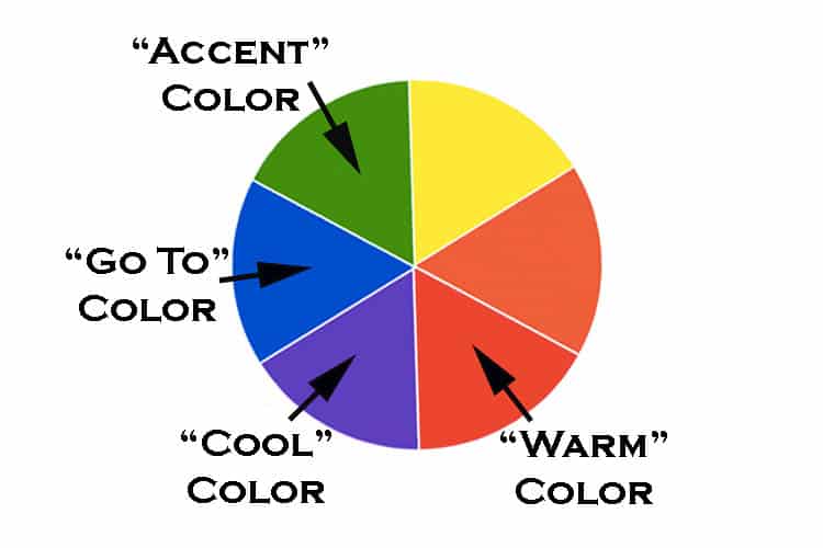
When you are finished, you should end up with 4 color family choices from the wheel.
How Do You Use The Whole House Colors?
So now that you have selected your color families, you’re probably wondering what to do with them.
Here are the “rules” I use to make the whole house color scheme work.
1. Decorate Using Your Whole House Colors
Rule 1 is probably pretty obvious. When you are picking colors for a room, narrow your choices down to only the color families you selected. Believe me, you will still have lots of options!
That doesn’t mean your non-selected colors can’t appear anywhere in your house. If you didn’t choose yellow, but you find a painting you love with some yellow in it, by all means use it. But those colors should not appear often and should never be the focal point of your room.
Now before anyone gets too nervous about having to pick bright colors for everything, you can choose any shade within these color families. So it can be as dark or as light as you want it to be.
Which is where neutrals like black and white come into play. Pretty much all neutrals have a color tint in their base. So you can still use them with this scheme. Just make sure to pick ones that have the right color tint in its base.
2. Use Your Go-To Color A Lot
My next rule is that your “go to” color should be in every room in your house. It doesn’t have to be the main color in every room and it doesn’t always have to be the exact same shade, but it should be there.
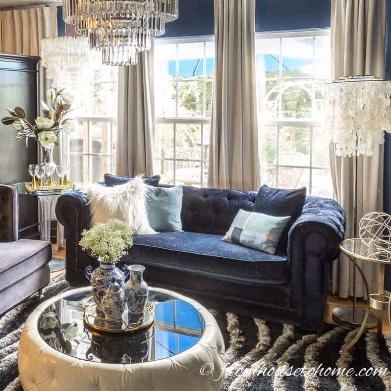
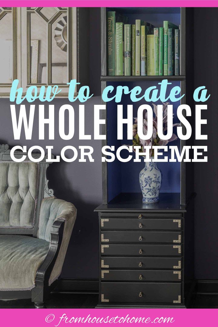
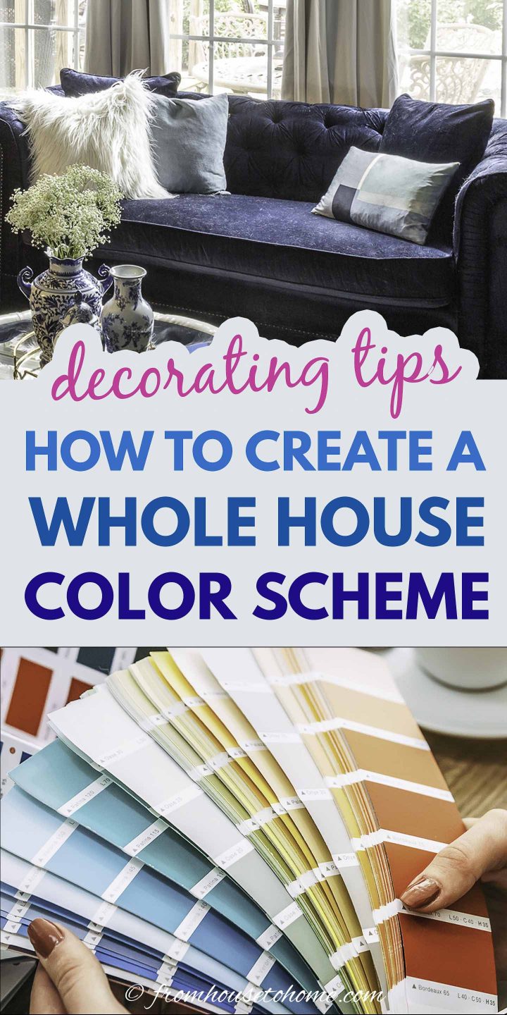
In my living room, blue is the main color.
The walls are blue, the sofa is blue and I have a lot of blue accents everywhere.
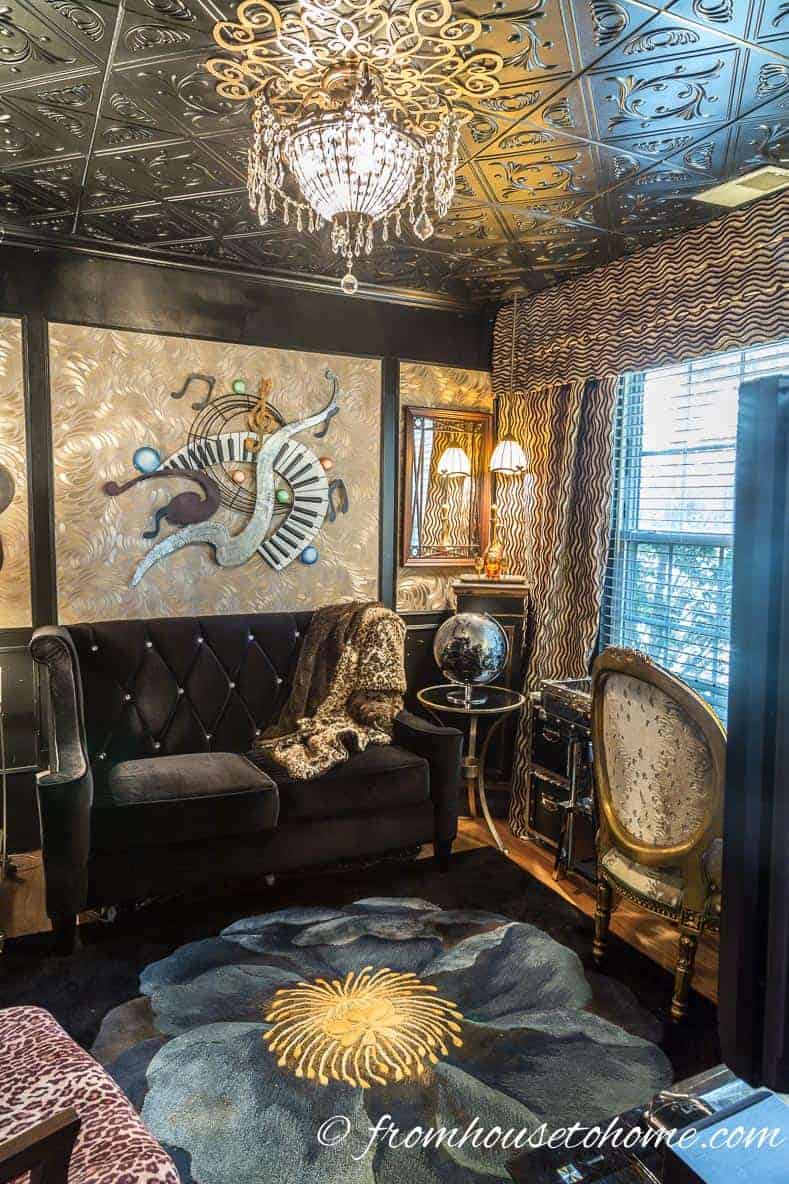
In my downstairs office, the paint is a blue-black, which is why it co-ordinates well with the blue elsewhere in the house.
And the area rug has a big blue flower in the middle of it just to tie everything together.
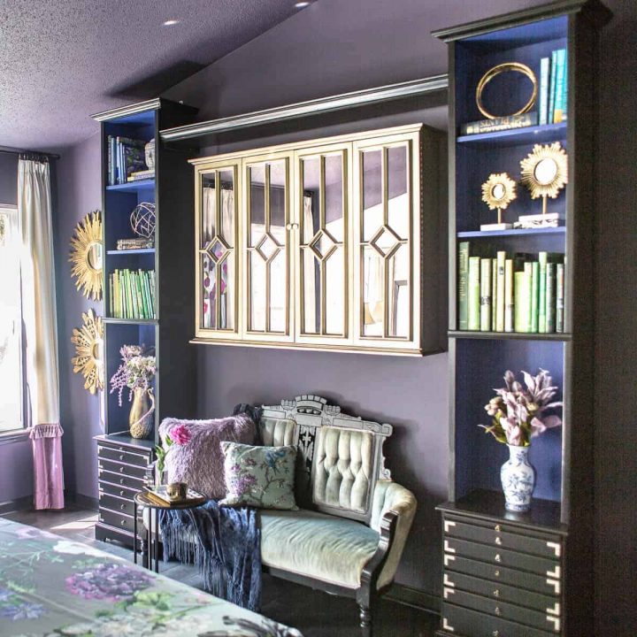
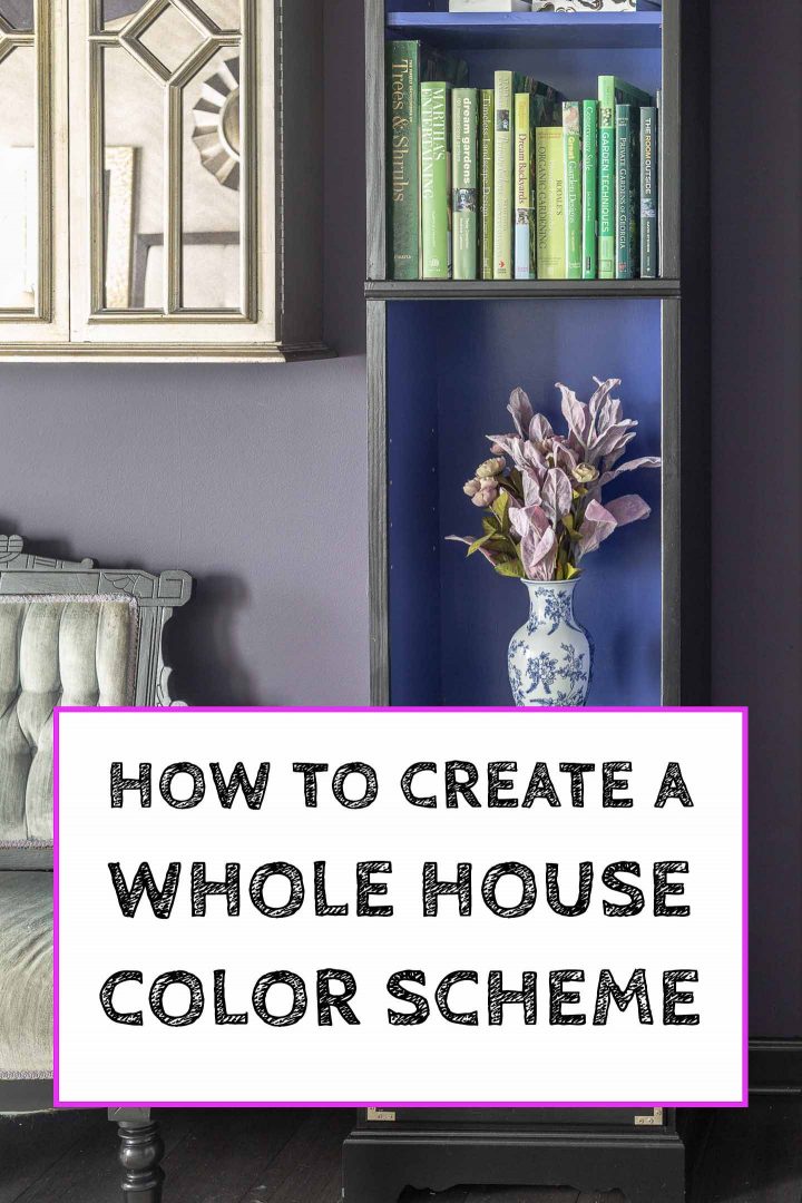
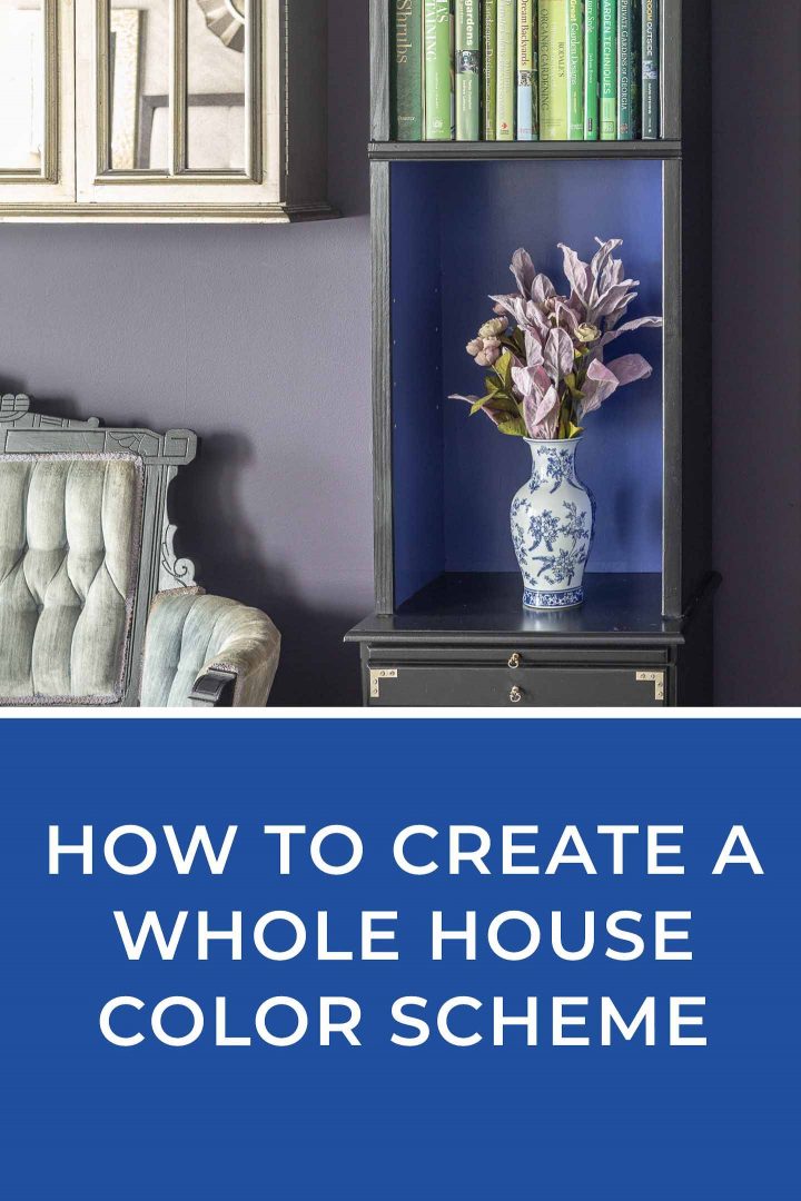
In my purple bedroom, blue plays a support role in the inside of my bookshelves, but is still a focal point in the room.
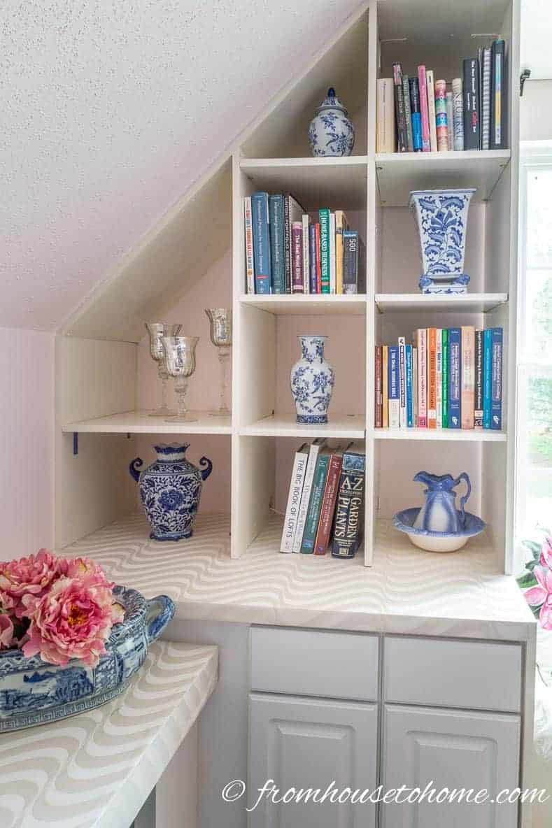
In my pink home office, it is only an accent color in the blue and white ginger jars.
You’ll notice I use those blue and white ginger jars a lot! I love them and they’re an easy way to provide consistent color in the different rooms.
3. Adjacent Rooms Should Share At Least 2 Colors
Rooms that are beside each other need to share some colors in common in order to pull your eye from one room to the next. This is what creates the feeling that they flow.
So make sure that adjacent rooms have at least 2 colors in common.
The repeated colors do not need to be the exact same tone in both rooms, but they should be close enough that the eye seems them as similar.
As an example, using a lighter and darker shade of turquoise in adjacent rooms would work fine. But having turquoise in one room and periwinkle blue in the next won’t be seen as the same color so you won’t get the flow effect you’re going for.
4. Vary How The Colors Are Used
However, the colors don’t have to be used in the same way in every room. It actually makes the rooms look more interesting when they’re not.
The wall color in my living room is what I used to paint the inside of the bookcase in my bedroom.
The gray background of my duvet echoes the silver wall color in the bathroom.
5. Pick Your Wall Colors From Your 3 Main Colors
When it comes to picking your wall colors, the choice should be narrowed down a little further…to only the first three color families that you chose — either your “go to” color, the “cool” color or the “warm” color. Leave the accent color as an accent.
Of course, you don’t have to use all three (like I did). And as I stated before, neutral colors that have one of these colors as a base is another option if you don’t want to go too bold.
6. Use A Warm Color and a Cool Color In Every Room
To keep rooms feeling balanced (not too cold or too hot), I like to include one of my warm colors and one of my cool colors in every room.
They don’t have to be in the same proportion, however…sometimes some pink flowers in my blue living room are all the warmth that is needed to brighten up the whole space.
7. Use The Same Black And White Paint Everywhere
Once you have found a black and/or white paint color that you like, re-using the same color everywhere that you are painting black or white immediately helps to tie things together.
It also makes it really easy to do touch ups later on since you won’t have to worry about getting the right one in the right place. I haven’t always been very good at following this rule and I have the mis-matched black paint touch ups to prove it 🙂
8. Keep Surprise Colors Off The Beaten Path
If you do want to use a wall color that doesn’t tie in that well with the rest of your house, pick a room that can’t be seen from your main living area.
This is what I did with my office. It’s in the bonus room above the garage…the only room on the second floor.
So because it is isolated from the rest of the house, it can be a totally different color and not cause issues with flow in my house.
9. Use Your Whole House Color Scheme To Pick a Room Color Scheme
Hopefully you have figured out your own whole house color scheme and are ready to put it to work!
The next step in the process is to choose a color scheme for your room, which will be so much easier now!
Do you have comments or questions about creating a whole house color scheme? Tell us in the section below.
Pin It So You Don't Forget It!
[columns] [span4]

[/span4][span4]

[/span4][span4]

[/span4][/columns]
[columns] [span4]

[/span4][span4]

[/span4][span4]

[/span4][/columns]
[columns] [span4]

[/span4][span4]

[/span4][span4]

[/span4][/columns]
This post was originally published on June 11, 2018 but was updated with new content on September 30, 2020.
I remodeled/redecorated my home recently and used my fav soft teals, pinks to lavender, green and whites. EVERY room got new wallpaper and I connected rooms using different amounts of these colors.
I do not follow trends. I use my strong intuition which means every room is so ME; romantic, whimsical and elegant. My living room faces South so blue is dominant with pinks,lavendars and green are smaller
I simply used my fav colors of soft teals, pinks and whites…and my strong intuition to rewalllpaper EVERY room in my French Normandy home, redecorated with shades of those fav colors. Replaced kitchen backsplash with teal mermaid tail tiles, added ceramic pink/gold/ivory pulls to my wraparound almond cabinets, blush velvet stools/chairs and Anthro oversized floral teal sofa at kitchen dining. Waincottoing in a darker shade of grieve which blends with my swirled brown granite, new fresh art, all made a huge difference. I drape velvet and lace over shades, chairs, tuck jeweled trinkets about for the children to find, Makenzie reindeer all over the home. It is so me: maximalist, elegant, whimsical and romantic. I get raves and entertain a lot more now.Antiques mix w/ traditional and modern elements. FUN!
It sounds beautiful, Irene! I agree that using colors and patterns you love is the best way to create a home that you love.
Thank you for your article. I am going through a new home build now and this is very helpful to me as I am not an intuitive person when it comes to decorating. I tend to be very minimalist and don’t really want to be. I love a cosey cottage feel, like you have! My question is where does brown play into the above. You speak about black & while but where does brown fit into the color wheel and overall choice. I ask because almost all of my floors will be a dark chocolate/mahogany color (warm?) and I don’t want that to clash with my cool colors or make the overall room decor too warm if my go to color is red or orange.
Hi Katherine…Brown is a neutral, similar to black and white. It will have an undertone (mahogany usually has a red base). If you use that undertone as one of the colors in your color scheme, then you can balance it out just like you would with the other colors in your room. Having said that, with your dark wood flooring color, I wouldn’t be too concerned. It will go with pretty much everything.
Hi Wanda!
I am thrilled to find your website. Such great information!
I am working backwards here so forgive me! There is a 2 story foyer when you enter our home. The one wall is shared with the living room. So…that has been contractor white for 22 years along with the 1st floor hall, 2nd floor hall and bath!
The dining room which you can see when you enter the home is two shades of green separated by a white chair rail. At the end of the hall is the kitchen which you can see from entry and that is yellow. From the living room you can see the family room which is goldish yellow. We desperately need to paint the white- both because it’s silly that it’s been this color for 22 years and the entry way is hard to keep clean as kids shoes make lots of marks on the white walls where they kick them off. I really don’t have the energy or time to repaint the other areas…and I really like them.
Do you think choosing blue as our GO TO color (that’s in almost every room), Yellow as the WARM, Green for COOL and Purple as ACCENT is a good way to go?
What color do you recommend for the halls, foyer and living room? They all share a wall at some point.
The living room sofa and chair fabric is purple and cream. They are on a rug that is sage, purple, blue and cream. The furniture is a mismatched collection of dark wood antiques.
Thank you!!
Thanks, Stacy! Your color palette sounds beautiful. Since blue is your go to color, I would use that in your halls, foyer and living room. You can choose the shade…for a more neutral look, go for a pale blue, for a bolder look a darker blue would look beautiful (My living room and hall way is painted Farrow and Ball’s Pitch Blue and I love it). Or for something in between, I think a periwinkle blue might also work. Hope that helps!
Hi Wanda! I just found your article on whole house color scheme on Pinterest and loved it! My question is could your accent color be used on an accent wall in a room? I have a corner fireplace in my living room that I would love to put a burgundy damask or toile wallpaper around. Green is my go to color, yellow my warm, blue my cool and red my accent color. Although I could swap yellow with red. My living room has a green Chinese toile curtain in it with blue and burgundy accents and my couch is also green.
Hi Sara…Since the fireplace is a focal point, it should be fine to use your accent color on that wall. Especially since it sounds like you already have some of it in the room. I love the idea of the patterned wallpaper 🙂
Thank you Wanda! I love color but also really appreciate pattern and texture. If you have any thoughts or articles on how to use pattern and texture in your rooms with you color scheme I would be interested in reading!
Hi Sara…I have one post on mixing patterns that you might like (You can find it here: https://www.fromhousetohome.com/mix-and-match-patterns/), but I don’t have anything specific to using it with your color scheme. That’s a good idea for a new article 🙂
Hello!
Hope I’m not too late! Do you have any suggestions about how to choose different colors of wood for furniture, bathroom vanity etc. We already have black wood in 2 rooms and a dark brown with red undertone wood furniture in another room. I realize I want cool colors and my go to is blue, cool is green, warm is yellow, and accent undecided. Not sure what color/type of wood to choose for dining table and bathroom vanity. Help?
Hi Shari…Blue and green look good with almost all wood colors so the choice is mostly about how much (or how little) contrast you want in your room. There’s a great article about it here. Hopefully that helps!
Hello! I am thrilled that I found your article today. I am in the process of building a cottage. Unilke the homes I have had in the past, I would like to use lots of color. My sofa, kelly green, chairs, pinks, greens and blues. My go to color is blue and the fireplace tile is dark blue, kitchen island, dark blue, tile behind stove dark blue. Kitchen is open to living room. Twice now I have chosen colors for the walls and have not liked them. Hoping you can help. Thank you, thank you!
Hi Nedra…I love your color scheme! It sounds beautiful. I would look for pieces of fabric, rugs or artwork that you love and have your colors in it. Then take a look at the background colors in them and see what you like. The paint store should be able to match the color.
Good tips! We are moving in a few weeks and I’ve been researching colors because I am buying some new furniture and I’ve just never been confident about my choices until I can see them in place. I think this will help.
🙂
Thanks, Nikki! Good luck with your move 🙂
I live in an apartment. I have just painted one wall in a sage green colour and will be wallpapering the opposite wall I would also like to use the sage green in my hallway the the thing is although I love the colour I have no idea even with your tips what colour would really work with the green. Any suggestions
Hi Angie…Green is a very versatile color. It goes with pretty much any other color (although you might want to avoid red in case it looks too Christmas-y). It really depends on what you like. I would take a look at fabrics or wallpapers that have your shade of green in them. Then you can see what other colors they include and which ones you like the best.
I have a cape chalet.The room are open concept How do Ai paint the or choose color.How do I paint a accent wall? I’m very reluctant as I came from a house with walss/decided rooms?Help! Thanks uncertain.
Hi Jill…sorry for the late response…I missed your question somehow. For open concept homes, I usually use the same color throughout the open areas to keep the house looking cohesive. However, you could paint the big window wall as an accent wall since it is a natural focal point. And with all the light coming in, any color that goes with your color scheme should work.
Thank you for your response Wanda. I’m happy to hear Cobalt and Turquoise can both be used. I loved reading a bit about you. I can relate to growing up on a farm and making things from scratch. I too like to redecorate often so I do almost everything myself to save money. I like to sew and usually make my own drapes, cushions, duvets, etc. The problem I have is finding fabric I love at a reasonable price in the Edmonton area. Fabric stores seem to be a dying breed. Do you know of online fabric stores within Canada? I LOVE your duvet cover in your purple bedroom.
Sorry for taking so long to get back to you, Lorri (I missed this comment somehow). You’re right…fabric stores are hard to find these days. In Toronto, there are still some decent ones in the fashion district, so if Edmonton has an area like that, you might look there. I haven’t tried out any of the Canadian online fabric stores, so I’m not sure what they’re like, but you can try fabricville.com or flarefabrics.ca. If you don’t mind paying duty, my favorite American online store (fabric.com) also ships to Canada. Hope that helps!
Thank you for some names of online fabric stores. I will check them out.
Hi Wanda,
Thankyou for a very informative article. And thank goodness your idea of a Whole House Color Scheme involves color!
My Go-To color is Blue
My warm is Fushia
My cool is Plum
My accent is an Olive green.
My question is this… If my prefered blue is Cobalt to Navy can I use that color in one room and a Turquoise in another?
Hi Lorri…I’m happy you found it helpful. I love your color choices! Yes, you can use cobalt in one room and turquoise in another. I would go for a turquoise that has more blue than green in it. Then add a couple of cobalt accents (like vases, candles or cushions) to the turquoise room for some continuity. And you should be good to go 🙂
Hope I’m not too late! I LOVE this site! I’ve been in my house for 8 years, but I’m just now trying to really make it a home. This is so helpful, but I have a question… can the 2 colors join the adjacent rooms be neutrals, like brown, grey or white? My house is very small and I’m having a hard time getting 2 colors in adjacent rooms.
Hi Danielle…yes, you can use two different neutrals in adjacent rooms. I would try to keep them in the same “temperature” (eg. both with either “cool” or “warm” undertones) which will help them blend together.
I really love what u wrote❤️❤️
And i
Choose go to color:green
*i won’t using it in furniture only in decorating*
Warm color:red
Cool color:purple
Accent color:blue
so now i need to understand how to use them and sorry but i like gray and i need to use as go to color how can i fix this problem i like gray in rooms and living and dining 🤷🏻♀️
Hi Rawan…there’s no problem using gray as your go-to color. It goes with everything 🙂 If you’re going to use green as your main furniture color, I would look for a gray that has a green base to it. That way, it will tie in with your furniture and look beautiful! And it is only paint. So if you do make a mistake with the color, you can always paint over it…much easier to change the color of your furniture!
But my go-to color is gray it is my favorite color how can i follow steps??
Iam really so nervous 😩 that I can’t paint my new big apartment well i feel bad please help me
Hi Wanda this was a very informative article. My question is different but I thought you could help me after reading this article. The kitchen and livingroom are open floor plan. My wood furniture is espresso I have aqua and brown checked accent chairs a gray couch but looks so much like brown we put it in the living room. There are white shelving units on both sides of the fireplace. I have a beautiful darker teal table in front of the window. The rug is brown and aqua. It’s so dark in the livingroom but I dont know what to do. I bought the furniture 10 years ago when we had this house built. Those colors were in at the time. My problem is I have to make use of the accent chairs but I can replace the rug. My color scheme is aqua red brown. We want to paint the walls a lighter aqua. What color would you suggest I use to get rid of the brown. The couch is ok pillows will make that work. We can always paint the dark furniture white or cream our kitchen cabinets are white. I hope I havent confused you. I’m just so desperate to change our livingroom but dont know how. We spent alot of money on those chairs they recline and noone knows it. They are very nice chairs. I just wish there was no brown. Any help you can give me will be great I love the color of aqua its my favorite color. The red is just an accent color so I can change that too.
Thank you
HUGGS Terrie
Thanks, Terrie!
Sorry…I hit send before I was finished 🙂 I also had the brown and aqua a few years ago so I know where you are coming from 🙂 Would it be possible to go with a gray that goes with your couch instead of the brown? If the couch goes with the brown now, you might be able to lighten up the room by going with a lighter shade of gray in a similar tone. That way the chairs would still go but wouldn’t be the main color. In any case, I think I would look for an area rug that has the colors in it you want and use that as the inspiration for the rest of the room…once you find something you like, then you can use it as the jumping off point to help you decide what to do with the rest of the room. Hope that helps!
Thank you for this amazing article! My husband and I are buying our first house, and I’m so excited to have a whole house to decorate! For my colors I am considering-
Go to color: Yellow
Warm:Orange
Cool:blue
Accent:green
I absolutely love yellow and teal together. But I know that can teal be a greenish and bluish color. So how does that work with the color scheme? I know I’m probably over thinking this! Thanks!! 🙂
Hi Victoria…congratulations on buying your first house! Since you love the yellow and teal combination, I would use the teal as your main cool color and go with a different shade of green as your accent color. Generally, you would use the “go to”, “warm” and “cool” color selections more often throughout your home than your accent color. Hope that helps!
Hi Wanda, Such an amazing article! Thank you so much for sharing this knowledge..
I had a lot of questions about selecting a color scheme for the entire house and after reading your article i have got confidence in proceeding with the challenge 🙂
I have selected the colors
go to color – blue
warm color – orange
cool color – purple
accent color – yellow
Ours is an open floorplan – living and dining in one rectangular room
In living room, our furniture is in cognac and navy blue..
I would like to go with orange color curtains in the living room
1. i dont want the same color curtain in the entire room (living and dining), i thought of taking a printed orange fabric for dining and solid orange fabric for living but its again the same color.. i am not sure how it would look like..
kindly let me know your comments..
2. I have also thought of peach or turquoise color curtains in the living room but they are not in my color scheme
Hi Deepthi…I think your idea to have printed orange fabric in the dining room and solid orange in the living room would work well. Using the same color orange will tie the two spaces together but not have them totally matching.
Also, it is possible that peach or turquoise would work, too. Peach is a lighter tone of orange and turquoise is a shade of blue. You would just need to make sure that the other oranges and blues that you are using the room have similar tones–leaning more towards the red/pink side of orange to go with peach, and learning more towards the green side of blue to go with turquoise. And then you would probably want to use the peach or turquoise in a couple of other places in the room (like vases, candles, etc.) to tie the curtains in. I have seen some stunning rooms that use both navy/peach and navy/turquoise combinations so it is definitely possible!
Barbara Anderson here again. Colors chosen were :Green(main color)yellow (warm color)blue(cool color) Red(accent color)
Problem: open floor plan, furniture I ordered is taupe(looked greenish in photo). Other furniture is green and brownish in open floor plan. Carpet has red and green in it in one area over my hardwood floors. Haven’t brought carpet for other dining and living room sections. How do I get my green, blue, yellow and red tided into my open floor plan? Kitchen is near also with reddish brown cabinets and brown&black granite. Help! 4 sections need help. 1 dining, 2 living room areas and kitchen. Then bedrooms come next. How do I send you pictures of everything?
Hi Barbara…Open floor plans can be a bit tricky 🙂 As a first step, (if you haven’t already) find an inspiration piece that has the colors in it you want to use in your room. It doesn’t necessarily have to be something you will actually put in the room…could be a piece of fabric, area rug, artwork, piece of clothing, a picture of another room…anything that you like the color combination. Then we can use that to pull out the colors for your space. You can email the pictures to me: [email protected].
Thanks for a wonderful article about using colors in a home. Here are my chosen colors.
Green(go to color)
Yellow(warm color)
Blue(cool color)
Red( accent color)
My walls will all be beige for now. I’ll try to post pictures later after furniture arrives. Oh, I followed you on Instagram too.
Thanks, Barbara! I would love to see your pictures when you get it put together!
This is very helpful. Now I just need to settle on colors! One question—as a renter I’m stuck with off white walls and beige carpets. (And I HATE Browns). Any ideas how I can work around it and still use colors I love. For example my bed frame is black and gold—how do I combine the two neutrals and make them work? And not like I’m just trying to ignore the beige?
Hi Annie…You could put some area rugs down on top of the carpet so that the beige is less noticeable. It tends to become a background (like wood floors do) if you put something on top of it. Since it is a neutral, you can combine it with most other colors. If you’re having trouble visualizing it in the room, try to find a piece of clothing, some fabric or a picture that has some beige and the colors you are using in it. That way you can see how the colors work together. Then look for accessories like cushions, throws and candles with those same colors to pull it all together. So for your black and gold bed frame, it shouldn’t be too hard to find 2 or 3 black and beige pillows to put on the bed. Then maybe add a couple of black and gold candle holders with beige candles on the bedside table, an ivory vase that has black or gold trim and a picture that has the colors in it. Usually if you can add 3 things to the room that include the color you are trying to work in, that is enough to make it feel like it belongs.
Hi Wanda. Thank you so much for this article. Amazing info. Itmakes so much sense. I understood about a colour scheme to tie your whole house together, but I was concerned this might make it all too borning. Your article has made it so much clearer and given such great tips and tricks and the reasons behind certain choice. Following with keen interest. Melissa
Thanks, Melissa! I love color too much to follow the “paint all your walls the same neutral color” advice that a lot of people give for whole house color schemes…so I had to come up with a different way. I’m glad you found it helpful 🙂