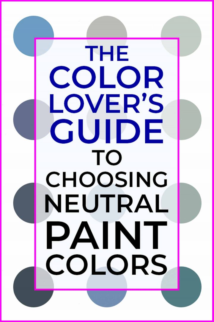
The Color Lover’s Guide To Choosing Neutral Paint Colors
When I first bought my house, all of the walls were painted builder beige (just like most new builder-grade homes).
If you’ve been around here for even a little while, you’ve probably figured out that I am not a big fan of beige. (I mean…I even painted over my beige patio furniture!)
So as you may have guessed, my number one priority was to get some other color up on the walls!
The problem was that I didn’t have a decorating plan for any of the rooms yet (yes, I already knew I was going to be adding some DIY upgrades).
But I wanted to paint before I moved in. (It’s MUCH easier to paint when you don’t have to worry about moving furniture around.)
So I needed to come up with a neutral color that I liked, would go with my existing furniture and would work with my new room designs when I got to them.
I could have gone with white or gray, but being the color lover that I am, I really wanted to have a color on the walls.
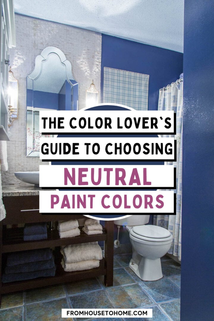
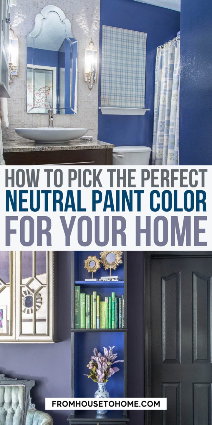
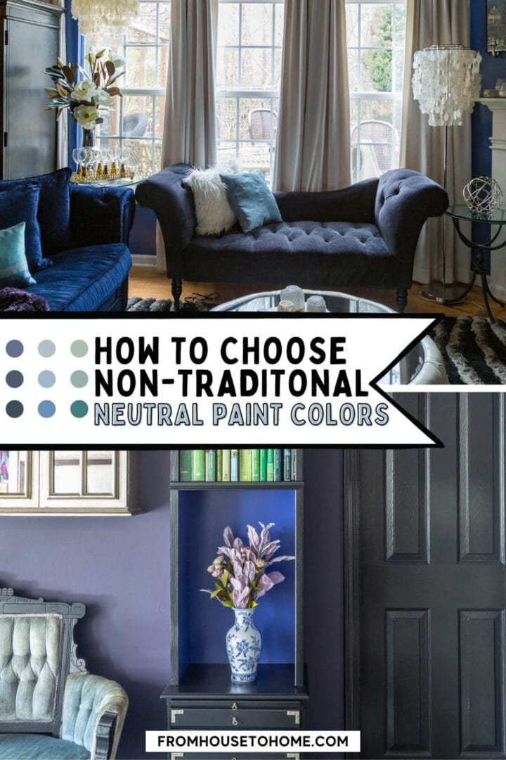
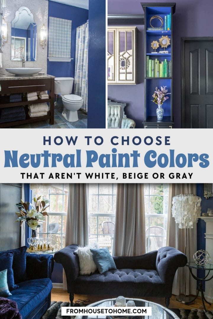
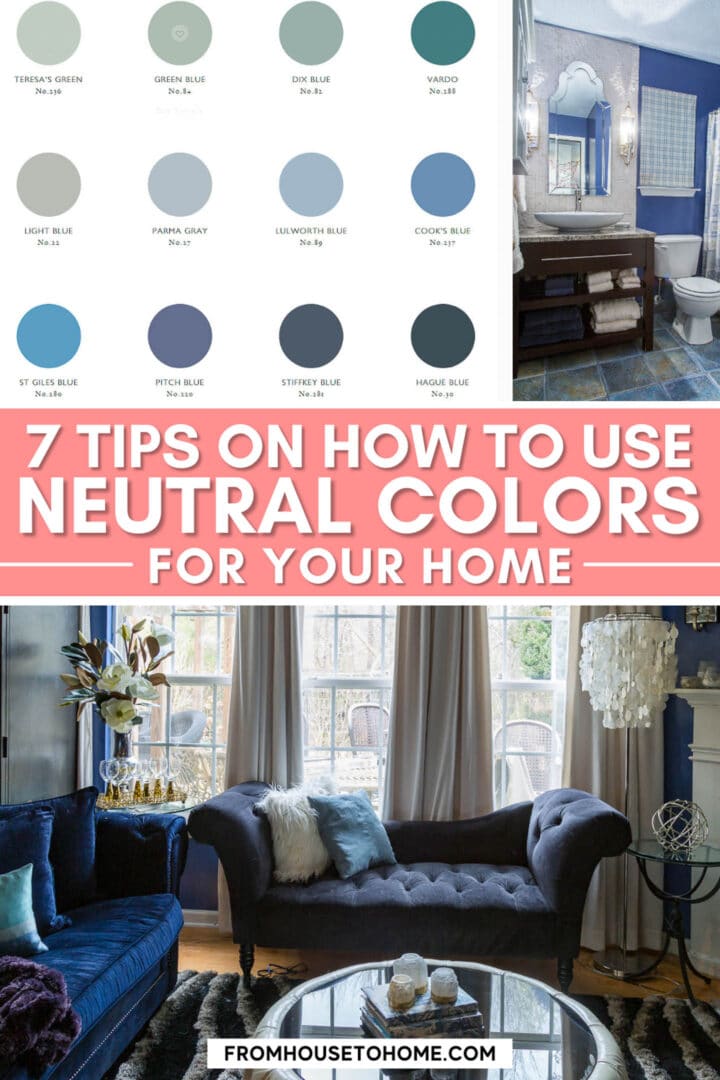
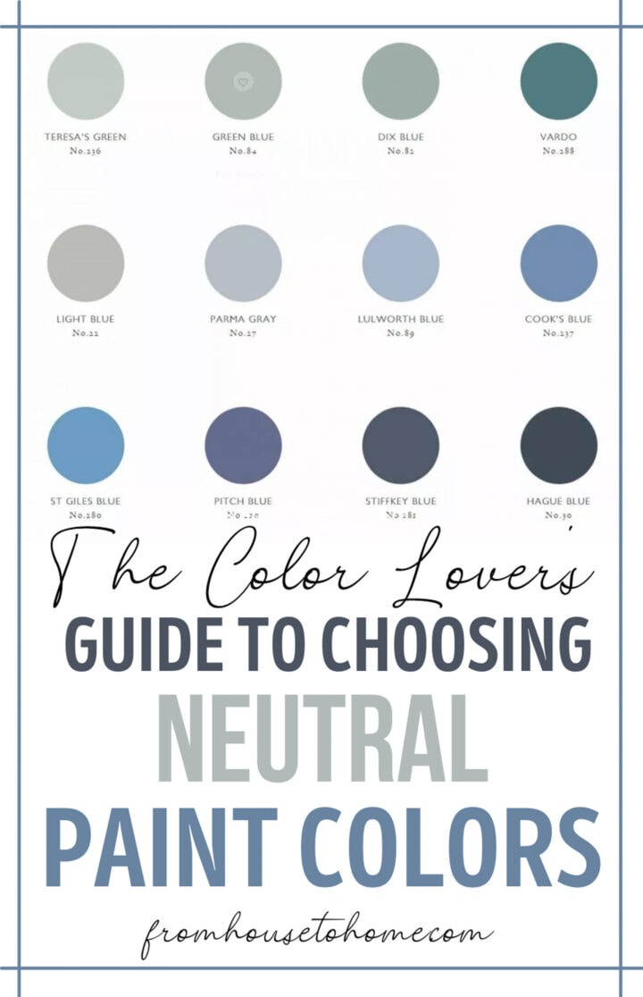
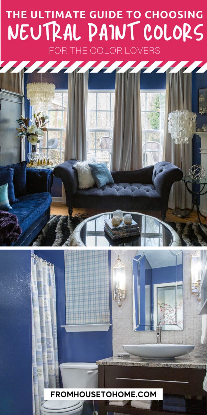
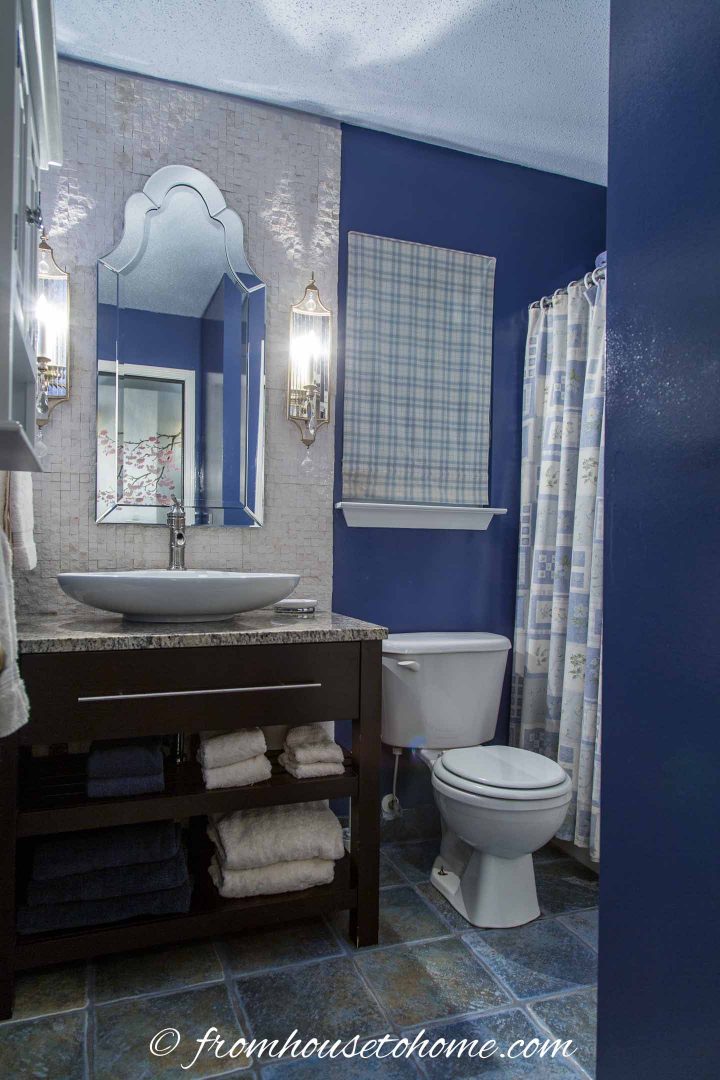
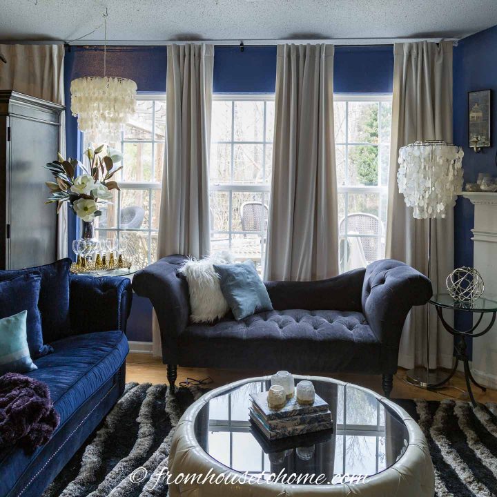
So I went with Periwinkle Blue. Which doesn’t sound like a neutral…but surprisingly, it worked!
And now, a few years later, I’ve replaced the periwinkle with an even darker shade of blue…which also works very well as a neutral.
The moral of the story? It is possible to use a color (even a dark one) as a neutral for your home.
So What Is A Neutral Color?
This post may contain affiliate links. We make a small commission if you buy the products from these links (at no extra cost to you). As an Amazon Associate, I earn from qualifying purchases. But we only recommend products we would use ourselves. For more information, click here to see our disclosures.
The technical definition of a neutral color is one that doesn’t have a color at all. In other words all the colors that don’t appear on the color wheel – white, black, gray, and brown (and derivatives like beige, greige and tan).
However if you’ve ever watched them mix paint at the paint store, you’ll notice they almost always add some color to the paint even if it is supposed to be one of those neutrals. (Pure neutrals are very hard to find).
So you’re not really getting a pure neutral…it has a tint of another color.
Which is why in interior design, a neutral is really any color that works well with other colors and can be used as a background for the rest of your decor.
In my books, that means you don’t have to stick to the traditional neutrals if you don’t want to!
Here are my tips for making it work.
A note about pinning: Some of the images below are provided by houzz.com and cannot be pinned due to their copyright policy.
1 | Choose A Color You Love
This may be obvious, but…If you’re going to choose a color as the neutral for your home, make sure you love it!
It’s going to be everywhere, so you’ll need to choose a color that you aren’t going to get sick of.
In my case, that was blue. It’s my favorite color and has been for years. So it was a pretty safe bet for me.
2 | Pick The Right Paint Tone
The best way to make sure a color will work as a neutral on your walls is to choose one that has a gray base.
Choosing a color that is too bright or too crisp will make it stand out on the wall. Since a neutral color’s job is to provide a unifying background, this isn’t what you want.
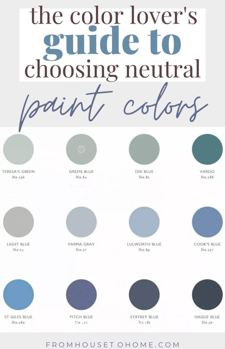
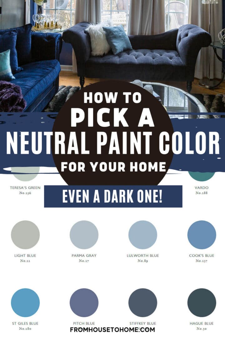
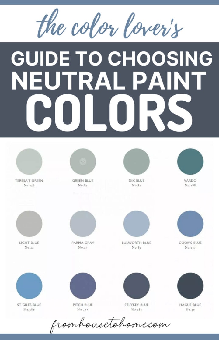
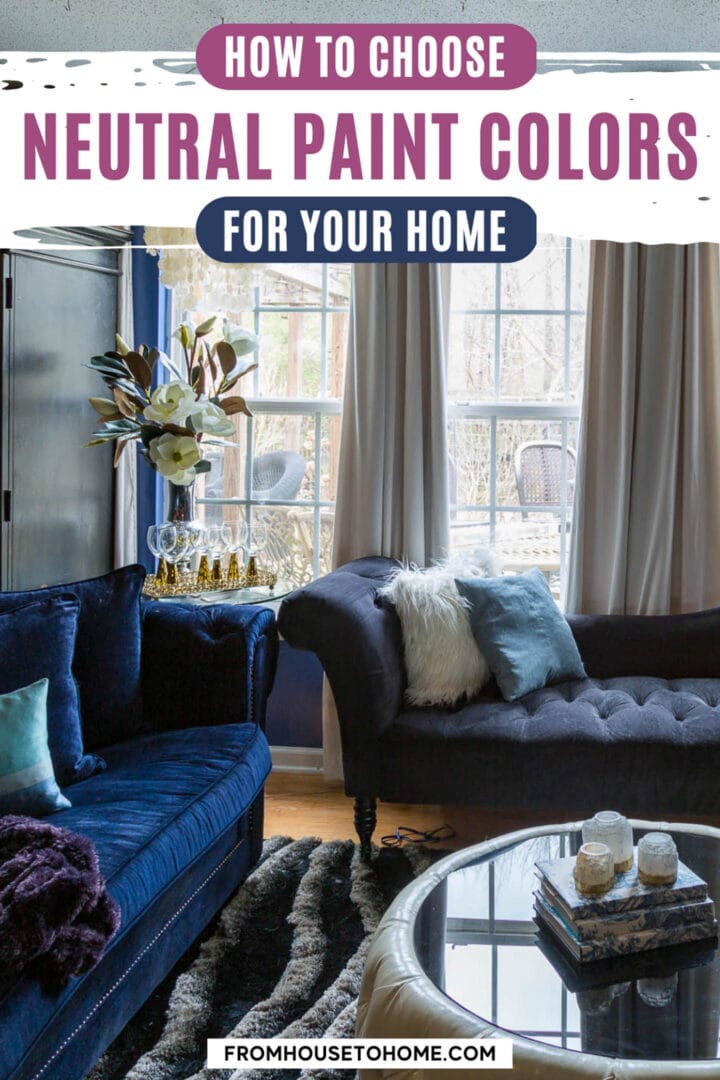
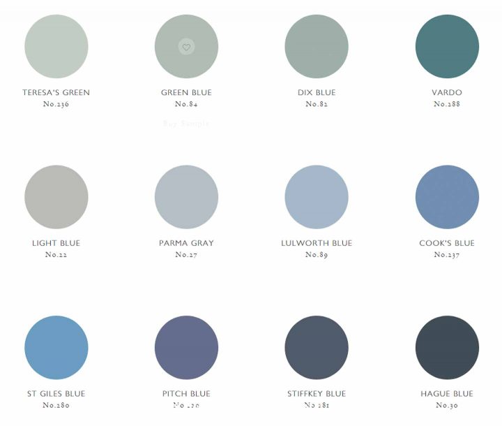
I find that most of the colors in Farrow & Ball’s paint line work very well. They have a clay base that seems to take the edge off the colors. (Pitch Blue is the one that I have in most of my house).
3 | Use Lots Of It
The next way to make a color work as a neutral is to use lots of it.
The more surfaces and moldings you have in that color, the more it acts like a neutral. Since there isn’t a lot of contrast, everything blends together to create a unifying look.
Adding a couple of cushions or a chair in the same color will help to pull it off the walls and into the room.
4 | Buy Low Sheen Paint
Low sheen paint, such as a flat, matte or eggshell finish works best for neutral surfaces.
Gloss paint tends to reflect the light and the other colors in the room (especially if you are using a light paint color). Which makes more of a statement than you might want for a neutral.
The matte texture of the purple paint in my bedroom makes it recede even though it is a fairly strong color. Painting the moldings and the furniture with glossier paint also helps to grab your attention.
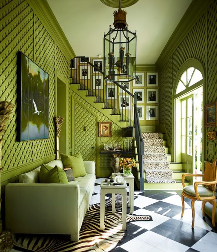
5 | Use Nature As Inspiration
If you think about it, nature uses saturated colors like yellow, green and blue as neutrals all the time.
Green leaves, blue skies, golden sand and turquoise tropical oceans all act as colorful backgrounds. And no-one ever questions that they look beautiful.
So using nature’s neutrals as inspiration for your own color choices is a great way to go.
Like this room that matched their wall color to the pool water outside.
6 | Match The Color Intensity
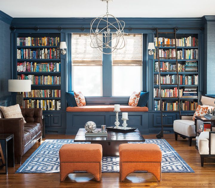
If you want to use a dark color on your walls, it helps to match the color intensity with your furnishings.
As an example, the orange stools and bench cushion in this picture definitely draw your attention.
Otherwise, the wall color might have overpowered the rest of the room…which is definitely not what you want from a neutral.
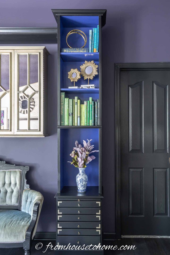
7 | Use Black As A Mediator
Black is a great way to ground any color scheme.
It goes with all colors and helps to cut the color without clashing or competing.
In my house, black plays a central role in tying everything together. From flooring, to furnishings, to the kitchen cabinets, every room has some black.
But you could also add it in the accessories. Think of a gallery wall with all of the pictures framed in black, a small black side table or black lamp with an interesting silhouette.
That’s it for my tips on how to use color as a neutral. Hopefully, you’ve found some inspiration to try out your own daring neutrals!
More Color Decorating Tips You Might Like
- How To Choose The Right Paint Color (7 Steps To Help You Decide)
- How To Choose A Color Scheme For A Room in 5 Easy Steps
- How To Create A Whole House Color Scheme (Even If You Love Color)
Have comments or questions on the color lover’s guide to choosing neutral paint colors? Tell us in the section below.
This post was originally published on July 25, 2019 but was updated with new content on November 2, 2021.
I saw a paint color that I love in my Vet,s office. Walls were a flat light blue with a tint of purple. I was afraid that the flat paint would be hard to clean yet you talk about using flat paint on walls. Why?Our kitchen is a dark blue and ifelt this blue with touch of purple would be a good way to extend the blue but be lighter and brighter.
Hi Kerry…Sorry for the late response (I’m a little behind). Flat paint adds a beautiful, textural look to your walls that can provides depth and interest in a room. However, I wouldn’t use it in any area that requires a lot of scrubbing (like a kitchen or bathroom) because it tends to rub off. (As you mention, it isn’t as easy to clean.) And it isn’t a good choice if you want to bounce light around a room to brighten it up. I think your paint color choice in a semi-gloss or satin finish would probably be a better choice in your situation.