The Most Popular Neutral Paint Colors
If you’re looking for the best white, gray, beige or greige paint color to use on your walls, you’ve come to the right place! We asked bloggers what they used in their homes and came up with this list of the most popular neutral paint colors.
If you’ve been here before, you know I love color!
And traditional neutral paint colors (like white, gray, beige and greige) aren’t really my thing. The only walls in my house that are still the original builder beige are in the laundry room. They’ll be getting a makeover at some point!
However, I often get asked what the best neutral paint colors are. And I don’t really have a good response, since I’ve never used them myself.
So to answer that question, I decided to poll some of my blogging friends (who use neutrals in their homes all the time) to find out what the most popular neutral paint colors are.
The only problem?
It can be hard to tell whether these neutral colors are warm or cool. Which is important since that changes how the room will feel (Find out more about how colors affect the mood of a room HERE.)
A few color selection tips
To help with the decision making process, I researched a couple of technical values for each paint color. These will hopefully make it easer for you to select the color that will work best in your room.
You’ll see these values specified under each of the specific paint colors.
LRV
LRV stands for Light Reflective Value.
It’s a number between 1 and 100 which does exactly what it says – lets you know how much light a particular paint color will reflect.
Colors with high LRVs are less saturated and will look white in rooms with a lot of light. These tend to be light and airy colors.
Colors with low LRVs are darker and won’t get washed out even with lots of light. These tend to be colors that will make more of a statement in your room.
RGB
RGB stands for Red, Green, Blue.
It is comprised of three numbers ranging between 0 and 255 that determines how much red, green and blue are added together to make the chosen color.
This value is often used in graphic design to specify the exact colors to be used.
But it can also be helpful when you are choosing paint colors:
- The closer together all 3 numbers are, the closer the color is to a pure gray, and the less of an obvious undertone the color will have.
- If the red number (the first one) is greater than the green number (the second one), the color is usually warm. If the green number (the second one) is larger than the red number (the first one), the color is usually cool. There are some exceptions to this rule when you get into colors that have very high blue values (the third number) combined with very low red and green numbers. But since those aren’t neutral paint colors, you won’t find any of those in this list.
- The higher all three numbers are, the lighter the color is. Pure white is 255,255,255. Conversely, the lower all three numbers are, the darker the color is. Pure black is 0,0,0.
Test, test, test
In all cases, you definitely need to test the paint colors in your room. This applies to all paint colors, but is especially important with neutrals that can look very different based on their surroundings.
The type of light and the color of your floors, curtains and furniture will all have an impact on how the color will appear in your space.
For the most accurate reading, use an actual paint sample rather than a paint chip.
Then look at it during the day and at night, with and without the lights turned on. And even on different walls. If the room tends to get used most at a specific time of day, make sure you like the way the paint looks at that time. That way you’ll have the best chance of getting a color you love.
Find out more on how to choose the right paint color HERE.
A note about pinning: Since these pictures are not mine, you won’t be able to pin them from this page. Please click the link immediately under the image to go to the original source if you wish to save them.
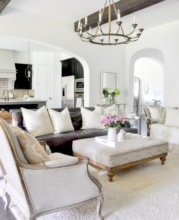
The best white and off-white paint colors
If you want to have a light and bright room, painting your walls white is definitely one way to do that.
However, true white can look harsh, especially in a sun-filled room. So all of these paint choices have a bit of a tint to help soften them.
When looking at LRV values, anything at 75 or above will be very light and airy. Similarly, RGB values of 225 and up will result in very little color saturation (the closest colors to pure white).
Benjamin Moore | Chantilly Lace
LRV: 92
RGB: 245,247,242
Benjamin Moore “Chantilly Lace” is a slightly cool white that is very reflective and instantly fills a room with plenty of light.
With its high LRV and RGB values, it is pretty close to pure white, but still has enough of a tint to prevent it from feeling too bright.
Jennifer at Décor Gold Designs used it in her living room as a backdrop to the neutral decor and textures that she prefers in her interior designs.
Sherwin Williams | Alabaster
LRV: 82
RGB: 237,234,224
Another great option, Sherwin Williams “Alabaster” is a warmer white than Chantilly Lace.
This is the color that Joanna Gaines uses the most often in her farmhouse-style renovations. Which may be why it is one of Sherwin Williams top 50 paint colors.
At Bless This Nest, Carissa used Alabaster in her bedroom where the slightly off-white color goes perfectly with the rest of her gray and white decor.
Sherwin Williams | Dover White
LRV: 83
RGB: 240,234,220
For an even warmer white, try Sherwin Williams “Dover White”.
While it is still bright and airy, it has some yellow undertones making it into a more of a creamy white, rather than an off-white.
Jennifer Maune painted most of her house with this color. It looks beautiful paired with the pink, blue and gold accents that she has in her living room.
Benjamin Moore | Classic Grey
LRV: 75
RGB: 228,225,216
Next up on our list of popular neutral paint colors is Classic Gray from Benjamin Moore.
This is the first example of why you shouldn’t look at the name of a paint color to determine what color it actually is.
Because this color is called Classic Gray. But it’s part of Benjamin Moore’s Off White collection.
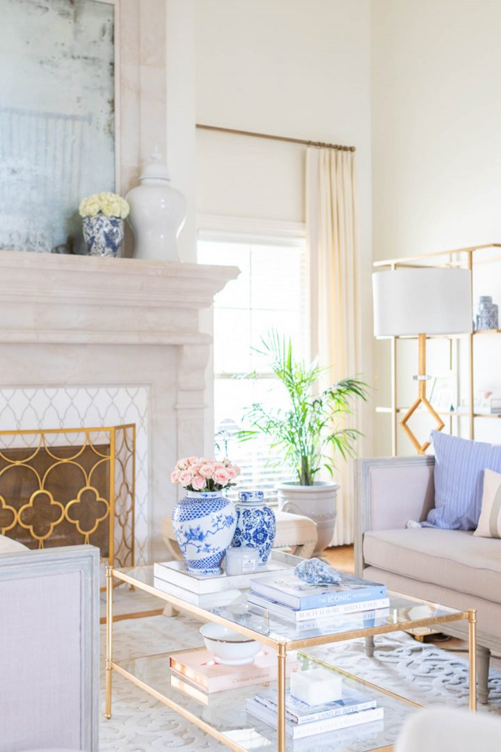
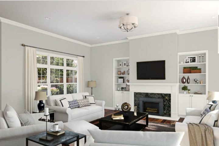
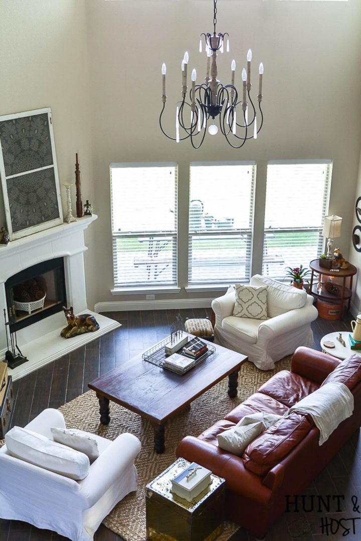
And while it does have a gray tint, I would definitely put it in the off-white category. Especially in a room with a lot of light, like Kim’s living room from Tidbits & Twine
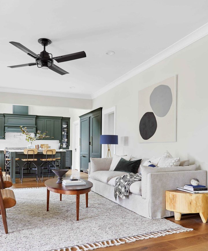
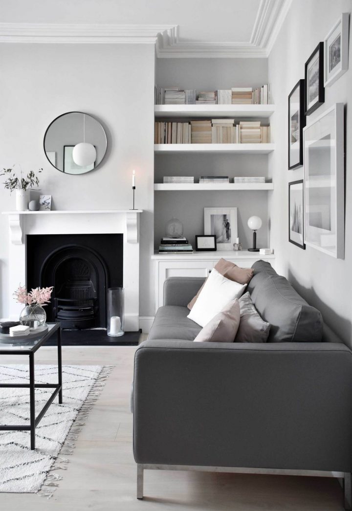
Sherwin Williams | Oyster White
LRV: 72
RGB: 226,221,208
“Oyster White” from Sherwin Williams is a little difficult to categorize.
It’s a little darker than white, and a little lighter and grayer than beige. So you might call it a very light greige.
Whatever you call it, this color still has an airy feel to it that will fill your room with light.
Emily Henderson used Oyster White in her mid-century modern family room design. It pairs equally well with the dark green cabinets, natural wood floors and the dark blue lamp shade.
The most popular gray paint colors
All paint colors look different in different lighting conditions and gray is no exception.
Cool grays have a tendency to look blue or green. And warm grays can look purple or beige. Which may or may not be a problem depending on the look you are going for.
So the idea is to get a gray with the right undertones, using that RGB trick I mentioned earlier.
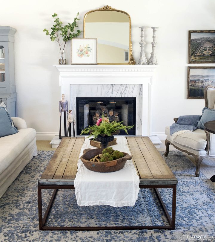
Farrow & Ball | Cornforth White
LRV: 73 (estimated)
RGB: 209,203,195
Another paint color with a misleading name, Farrow and Ball’s Cornforth White is actually an understated gray.
Like all of Farrow and Ball’s paints, the color has a lot of depth to it and tends to change throughout the day as the light changes. Which makes it a very interesting wall color.
Abi from These Four Walls used Cornforth White to give their living room an elegant look. Painting the trim white makes the gray tones stand out.
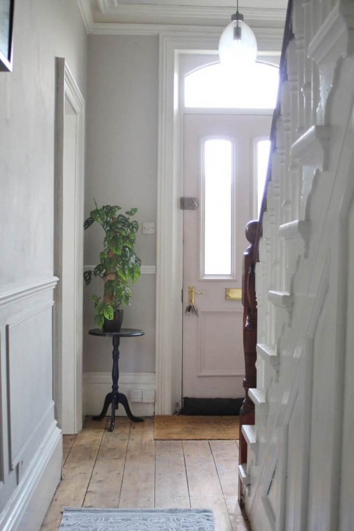
Jo from Life With Holly painted a lot of her house in Cornforth White. I love how it looks with her light pink front door that is painted in another Farrow and Ball color called Calamine.
Sherwin Williams | Repose Gray
LRV: 58
RGB: 204,201,192
Sherwin Williams “Repose Gray” is a warm gray with taupe undertones, that has no hints of the blue you often see with cooler grays.
That means you can even use it in north-facing rooms and it won’t feel cold.
But it’s not warm enough to cross into the “greige” zone, so it won’t look beige or purple either.
If you like the color but don’t want it to be as dark, try mixing it at 50% like Jenna Kate At Home did in her living room.
Behr | Silver Marlin
LRV: 57
RGB: 200,200,192
Now let’s look at a couple of the cooler grays.
What’s great about Behr’s Silver Marlin is that it’s pretty close to a true gray (the Red, Green and Blue values are almost the same). But it has a hint of color to it.
Its blue-green undertones become more visible when it is paired with warmer colors, or used on walls in darker rooms.
You can see the bluish hint in the photo above from Aratari At Home.
Sherwin Williams | Online
LRV: 45
RGB: 176,181,181
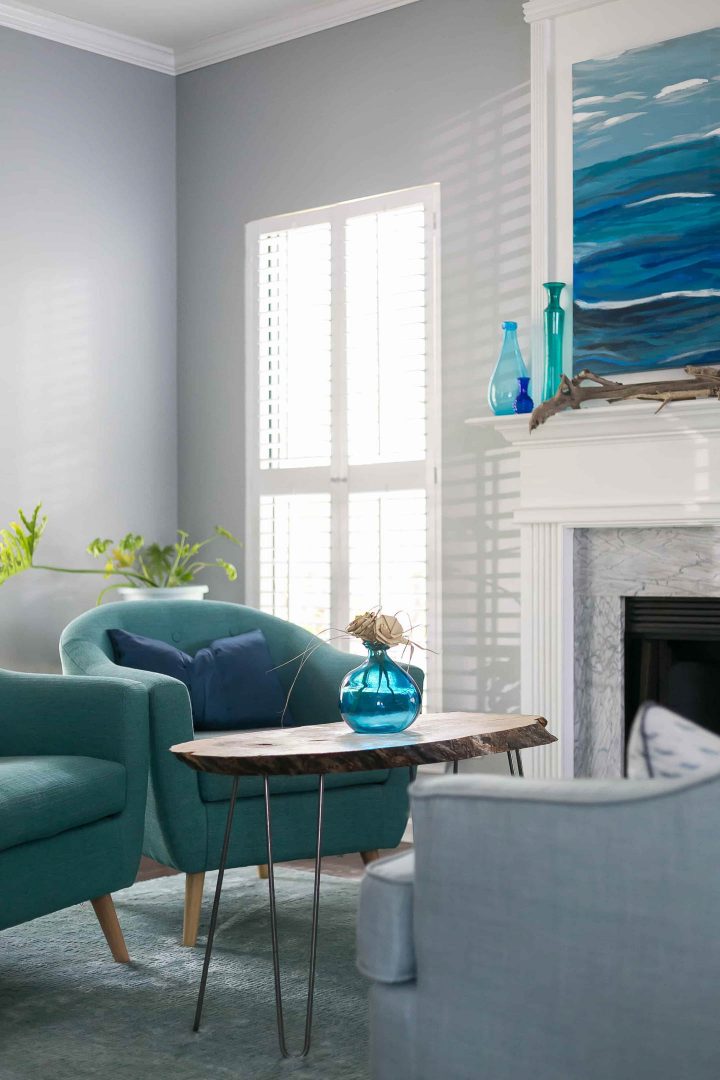
Sherwin Williams Online is a slightly darker cool gray with even more of a blue-green tint.
Which is why it looks so good with the ocean-inspired colors in this living room by Sean and Morgan from Charleston Crafted. The white trim makes the color stand out even more.
The most popular beige paint colors
Beige has been a popular neutral paint color for decades.
By definition it is a warmer color than gray.
But these modern beiges are toned down from the gold ones that were popular in the past.
Benjamin Moore | Manchester Tan
LRV: 64
RGB: 220,211,189
“Manchester Tan” from Benjamin Moore is definitely a modern beige.
While it is a warm neutral color, it has a taupe base with a hint of green that keeps it from looking old-fashioned. And allows it to play well with both cool and warm colors.
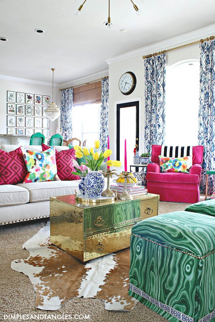
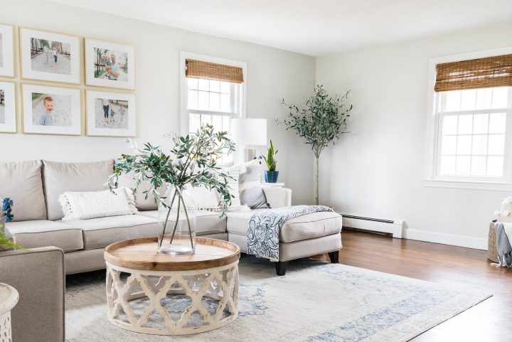
If you like the warmth of Manchester Tan but want a lighter look, you can have it mixed at 25% like Jennifer from Dimples and Tangles. Which turns it into a very pretty creamy white.
Sherwin Williams | Accessible Beige
LRV: 58
RGB: 209,199,184
Sherwin Williams “Accessible Beige” is another warm neutral that will appear even warmer in color with overhead lighting.
It also has some green undertones that keeps it from looking too yellow. Which is why it is a popular choice among bloggers as well as being one of Sherwin Williams top 50 colors.
Jessica from House Homemade uses Accessible Beige as the main color throughout the home to bring continuity from room to room.
Kim from Salvaged Living uses it in her living room where you can see a bit of the green coming through.
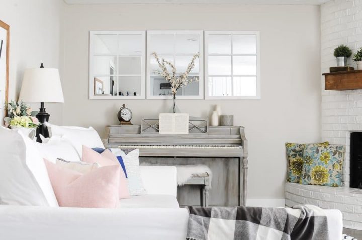
Behr | Aged Beige
LRV: 63
RGB: 215,207,192
Behr’s Aged Beige is another warm neutral paint color. It’s lighter than Accessible Beige but still has a little green in it that keeps it from looking too yellow.
At Joyful Derivatives, they used Aged Beige in their family room where it creates a warm ambiance, pairing especially well with their uniquely painted piano.
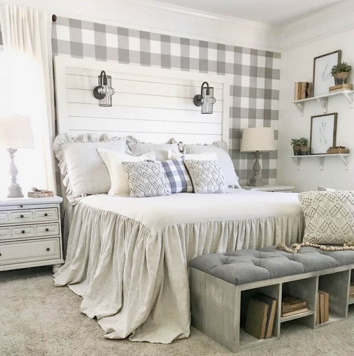
The best gray beige (“greige”) paint colors
To get the best qualities of both gray and beige, many people prefer greige.
It’s a modern mix of a little warmth with a balanced color profile that doesn’t have too many undertones.
Because of this it is a chameleon color that can really change how it looks depending on the type of light in the room. So you’ll need to test it to see how it looks in your environment.
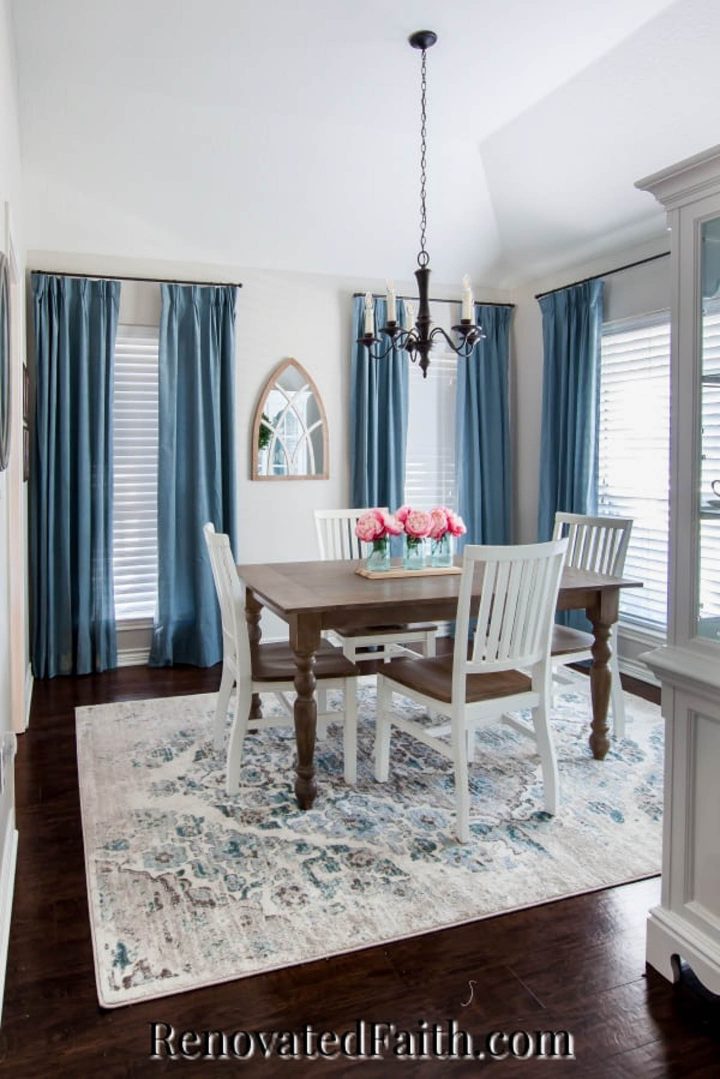
Sherwin Williams | Agreeable Gray
LRV: 60
RGB: 209,203,193
Of all the neutral paint colors on this list, Sherwin Williams “Agreeable Gray” was by far the most popular with bloggers. And everyone else apparently, since it’s one of Sherwin Williams top 50 colors.
You will definitely see the chameleon-like nature of greige paint when you take a look at these pictures. It looks different in every room!
In the picture above, Karin from Renovated Faith used it in her bright dining room with pops of blue and it looks like a creamy white.
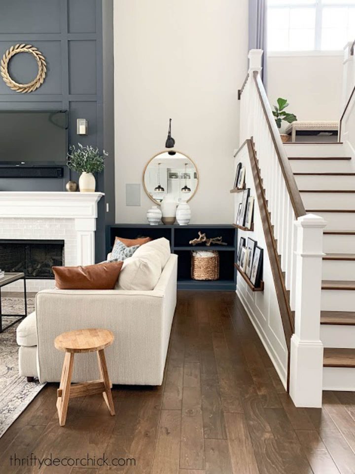
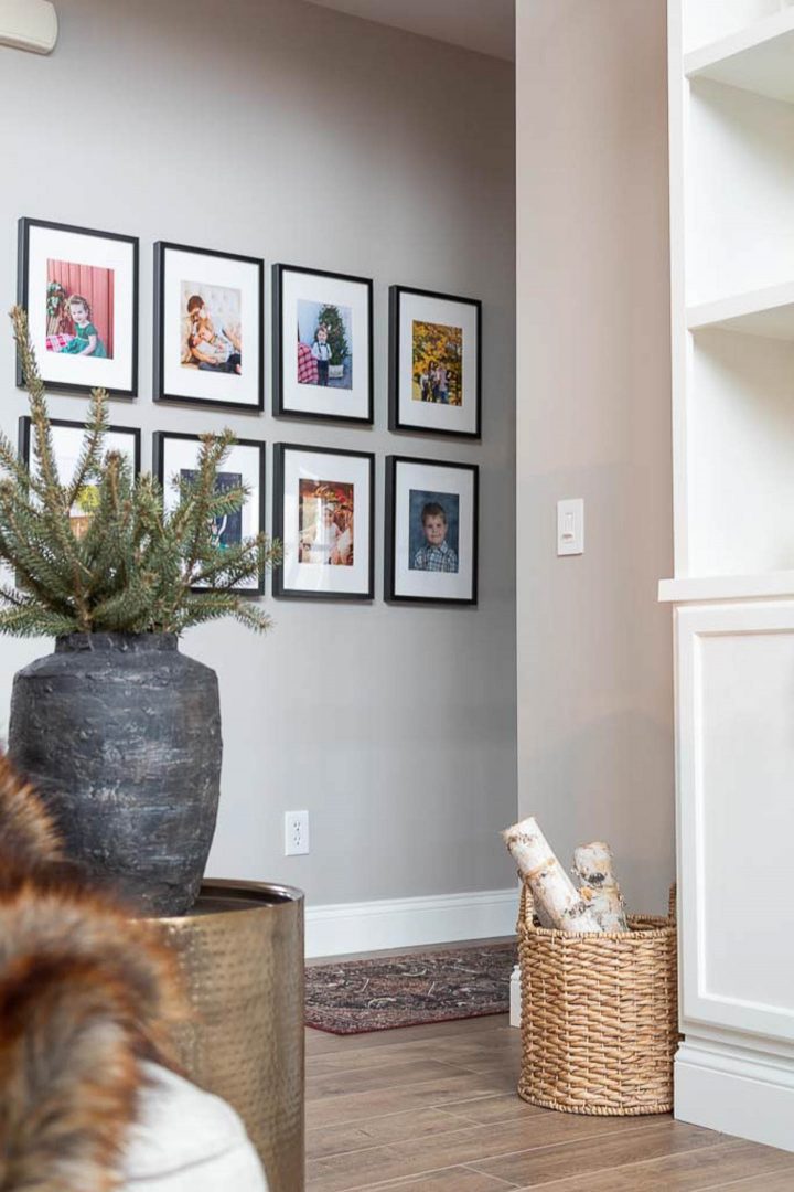
Sarah from Thrifty Decor Chick used it in her living room along side dark grey built-ins and it looks like a light beige.
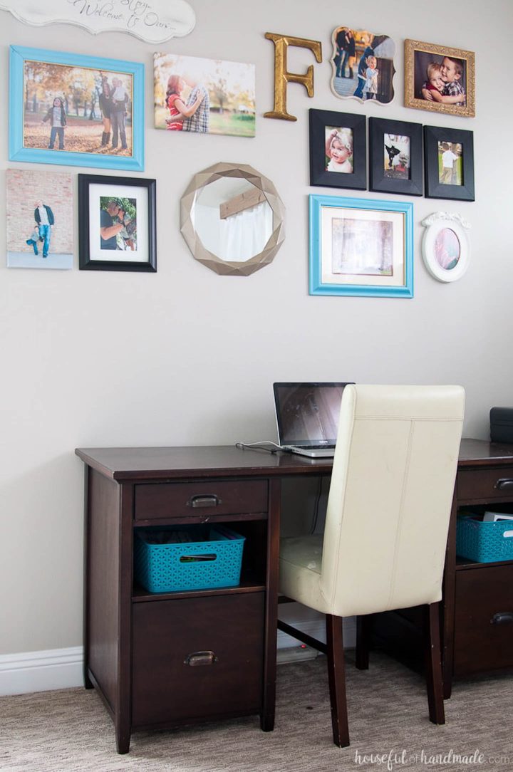
Kati from Houseful of Handmade used it in her office and it looks like a neutral light grey.
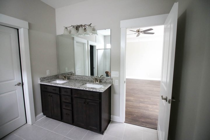
Sean and Morgan from Charleston Crafted painted their bathroom with Agreeable Gray and it looks like a fairly dark warm gray.
So now you know why it’s so hard to choose the right paint colors!
Sherwin Williams | Collonade Grey
LRV: 53
RGB: 198,192,182
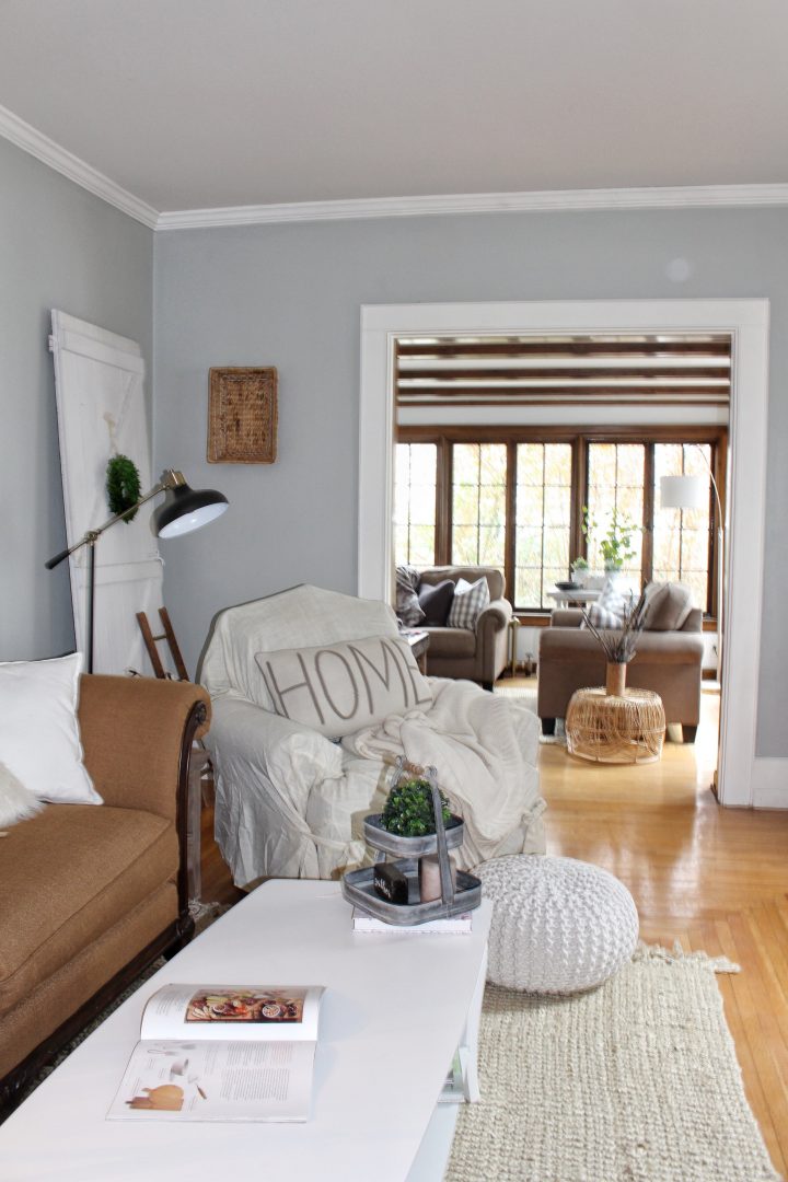
Sherwin Williams “Collonade Gray” is a darker greige color that has very similar characteristics to Agreeable Gray.
Because of its lower LRV number, it won’t look as white in light-filled rooms. But it does have the same color-changing capabilities.
In this picture by Martina from The Lived In Look, the wall beside the bookshelf looks like a warmer gray than the wall with the pictures, even though they’re the same paint color. Which illustrates how different light affects the way it looks, even in the same room.
Sherwin Williams | Analytical Gray
LRV: 47
RGB: 191,182,167
The last neutral paint color on our list is Analytical Gray. Which really isn’t that gray (see how far apart the RGB numbers are?)
With it’s relatively high red value (compared to the green and blue values), it’s definitely on the warm, greige side of gray.
This is also one of the least reflective paint colors we’ve seen so far. Which means it won’t wash out in rooms with lots of light.
So if you’re looking for a warm neutral that will hold its own in bright conditions, this may be the color for you. Which is why Sarah from Thrify Decor Chick chose it for a good portion of her house.
That’s it for our list of paint colors. Hopefully you’ve found one that is perfect for your room.
Other color decorating tips you might like
- How to choose neutrals for color lovers
- The best living room paint colors (that are not neutrals)
- How to create a whole house color scheme
Have comments or questions about our most popular neutral paint colors? Tell us in the section below.
Pin It So You Don't Forget It!