
How To Make A Room Look Bigger With Paint
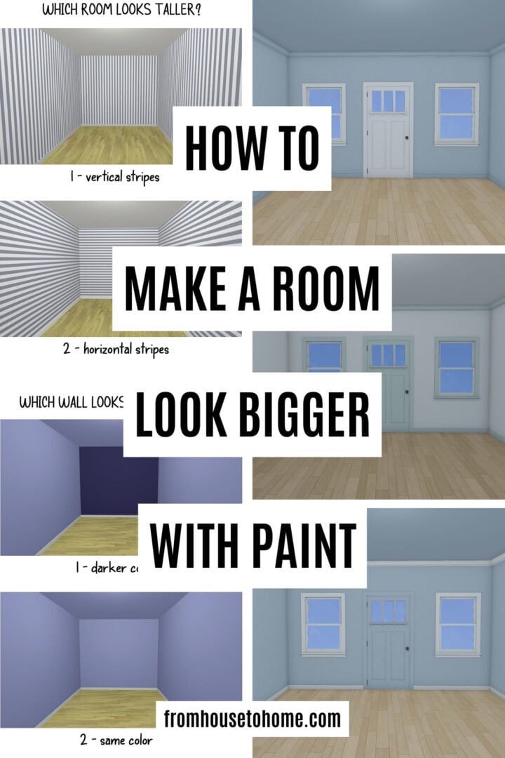
These paint tricks show you how to make a room feel bigger with paint. No major renovations or knocking down walls required! If your space feels tight or closed in, these simple color and placement ideas can help it look brighter, taller, and more open.

If you’ve ever stood in a room and wished it felt just a little bigger, you’re not alone.
I’ve lived in plenty of small spaces over the years, and while I can’t magically raise the ceilings or bump out a wall, I can pull out a paint can.
Paint is one of the easiest ways to change how a room looks and feels, and the right tricks can make even the tiniest space feel larger.
Whether you’re dealing with a narrow hallway, a low ceiling, or a room that just feels a bit “closed in,” there are simple paint illusions that make a surprisingly big difference.
These are the techniques I’ve used again and again to help small spaces live a little larger.
Here’s everything you need to know about using paint to create the illusion of more space.
Looking for more small room decorating tips? You'll love How To Make A Small Room Look Bigger and How To Make A Low Ceiling Look Taller.
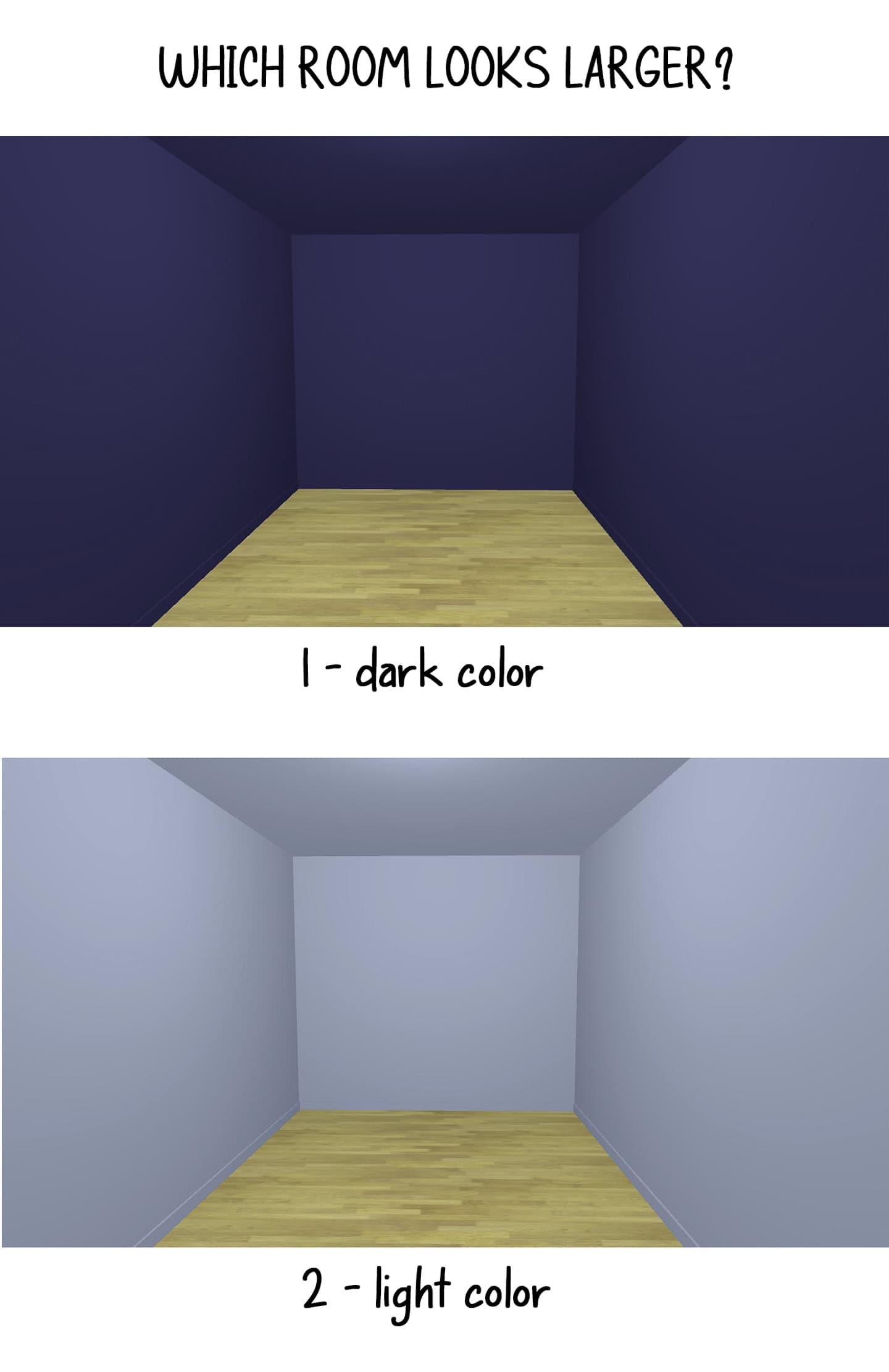
1 | The Color Debate: Light vs. Dark for Creating Space

People always say: “You have to use light colors in small rooms”.
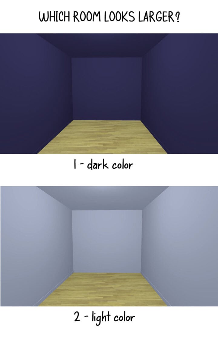
But the truth is both light and dark colors can make a room feel larger. They just do it in different ways:
The Case for Light Colors
Light colors reflect more light, creating an airy, open feeling. They work particularly well in rooms with good natural light.
The Case for Dark Colors
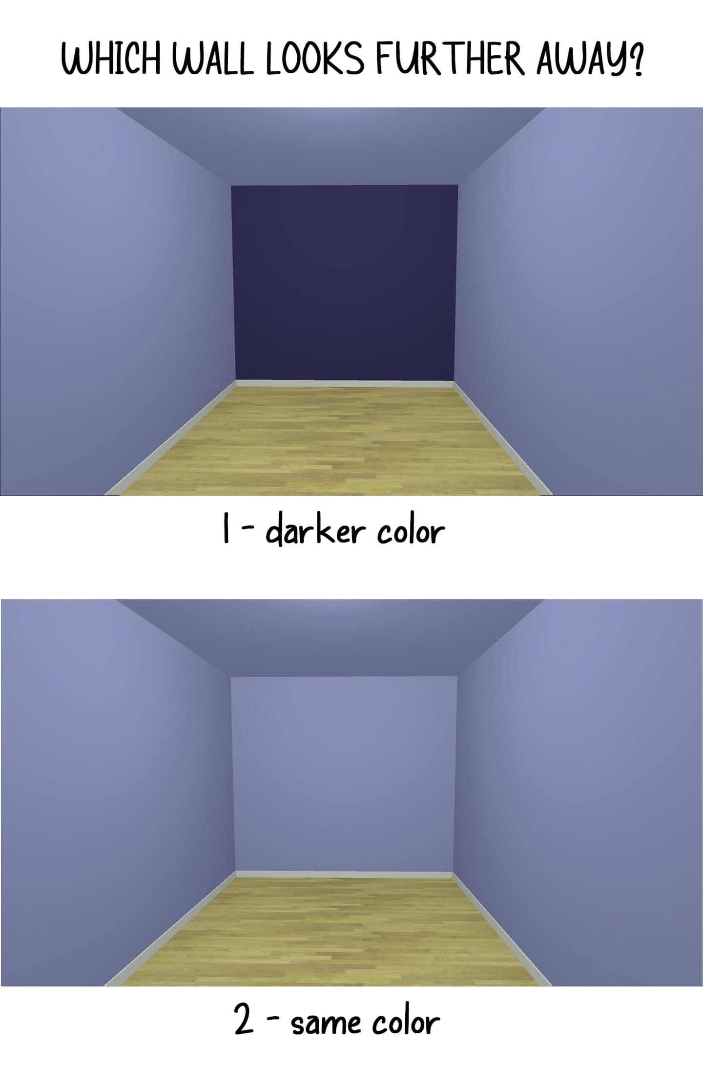
Dark colors absorb light and create depth, making it harder to perceive where walls actually are. This “infinity effect” can make rooms feel larger by blurring spatial boundaries. The key is having good lighting. Dark colors without light can slide from “cozy” to “cave” pretty quickly.
I also believe there is some personal preference involved in this decision. If you look at the picture above of the all-dark room vs the one that is all light, which one do you think looks bigger?
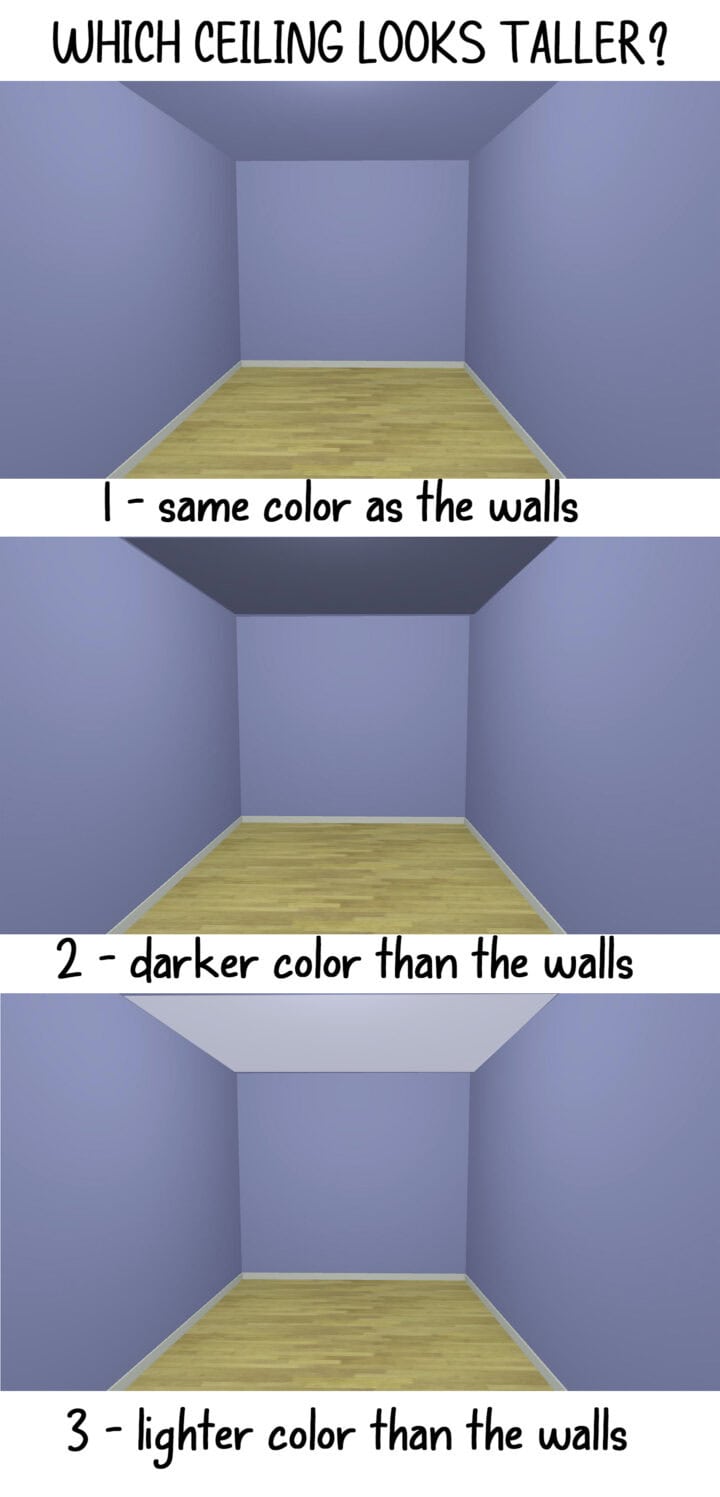
2 | Paint Your Ceiling Strategically

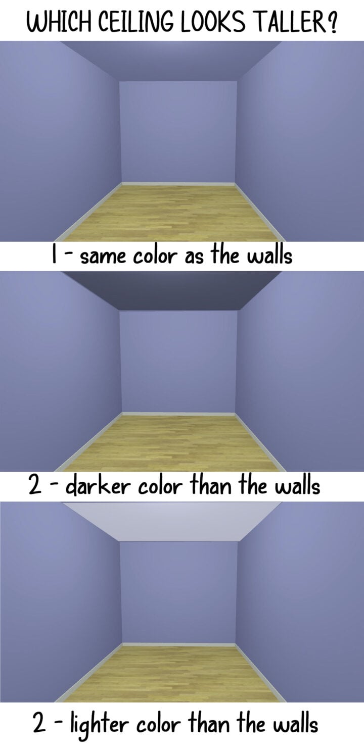
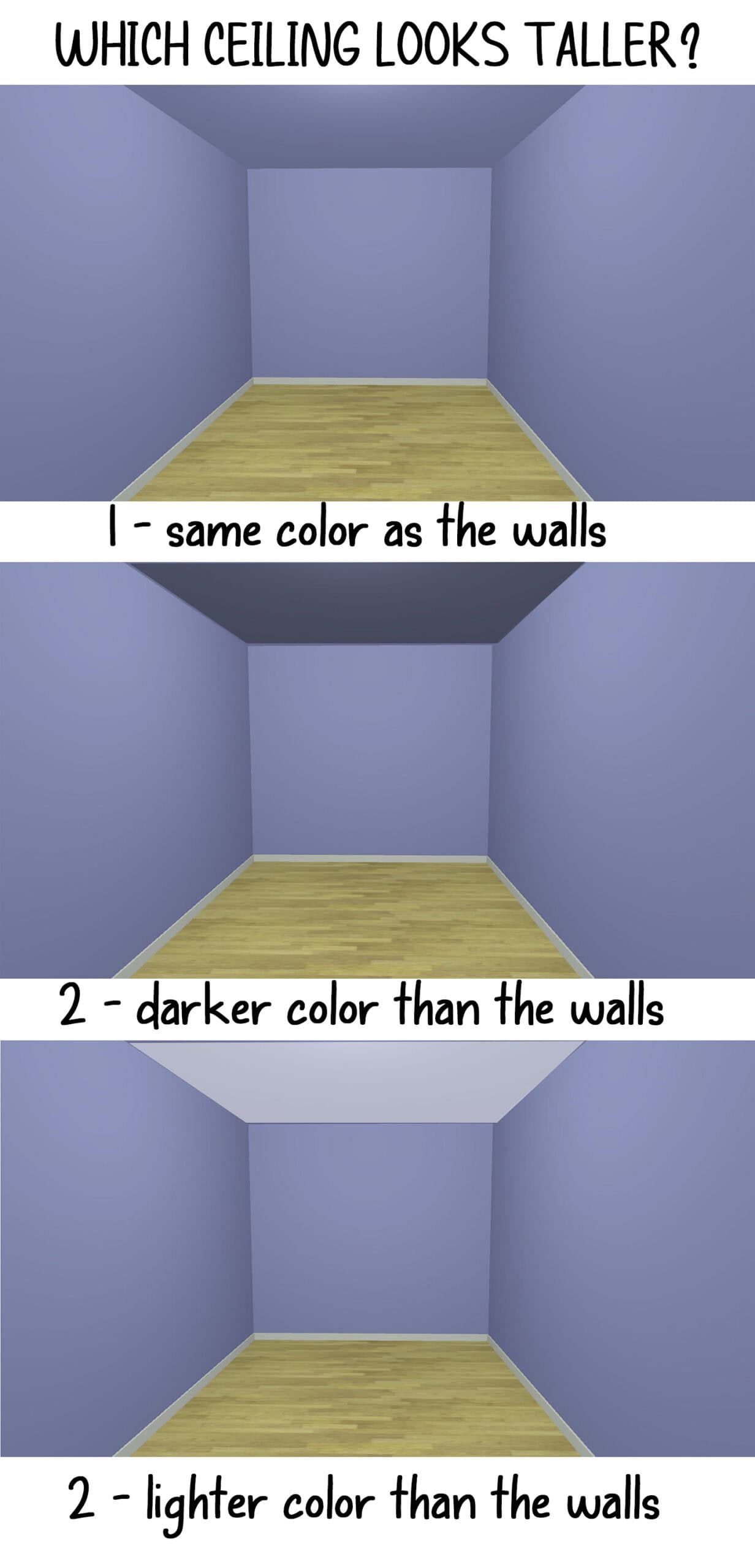
The ceiling, often called the “fifth wall,” plays a crucial role in how spacious a room feels. Here are some effective ceiling strategies.
The Classic Approach: A Lighter Color
Painting your ceiling a shade lighter than your walls creates the illusion of height. This traditional technique draws the eye upward and makes the ceiling appear to float above the room.
My Favorite Trick: Match the Walls
For rooms with average or low ceilings, painting the ceiling the same color as the walls can actually make the room feel larger by eliminating the harsh line where wall meets ceiling. This creates an enveloping, cocoon-like effect that actually feels more spacious.
For more information on this and some real-life examples, read Why You Should Paint Your Walls and Ceilings The Same Color.
The Designer Trick: High Gloss
Using a high-gloss or semi-gloss paint on the ceiling reflects light downward, creating depth and the illusion of height. This works particularly well with lighter colors.
Use matte paint if you have popcorn or uneven ceilings since any shine will draw unwanted attention to the bumpiness.
3 | Consider Paint Finishes Carefully
The sheen level of your paint affects how light interacts with your walls:
Flat or Matte Finishes
These absorb light and can help hide imperfections, but may make a small room feel somewhat closed in. Use sparingly in tiny spaces.
Eggshell and Satin Finishes
These offer a subtle sheen that reflects some light while still providing a soft, sophisticated look. They’re ideal for living rooms and bedrooms.
Semi-Gloss and Gloss Finishes
These highly reflective finishes bounce light around the room, creating depth and dimension. Use them on trim, doors, or accent walls to add visual interest without overwhelming the space.
Or go bold and use them on all the walls (like I did in my living room).
4 | Create Depth with Accent Walls
While it might seem counterintuitive, a strategically placed accent wall can actually make a room appear larger by creating depth and drawing the eye to a focal point.
Effective Accent Wall Strategies
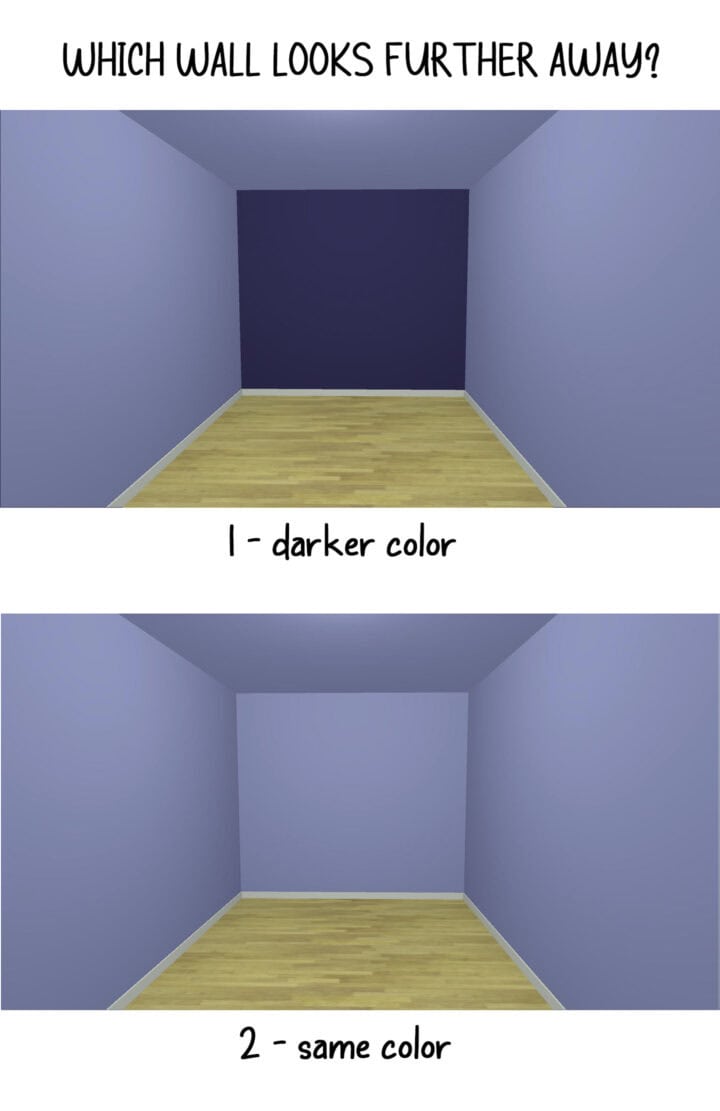
- Paint the farthest wall a slightly darker shade to create the illusion of depth.
- Consider a subtle ombre effect, transitioning from darker at the bottom to lighter at the top.
- Use the accent wall to highlight architectural features or create a focal point.
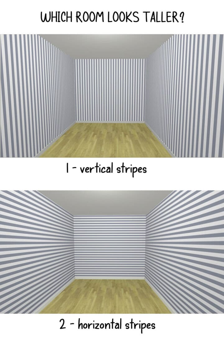
5 | Use Stripes to Manipulate Dimensions
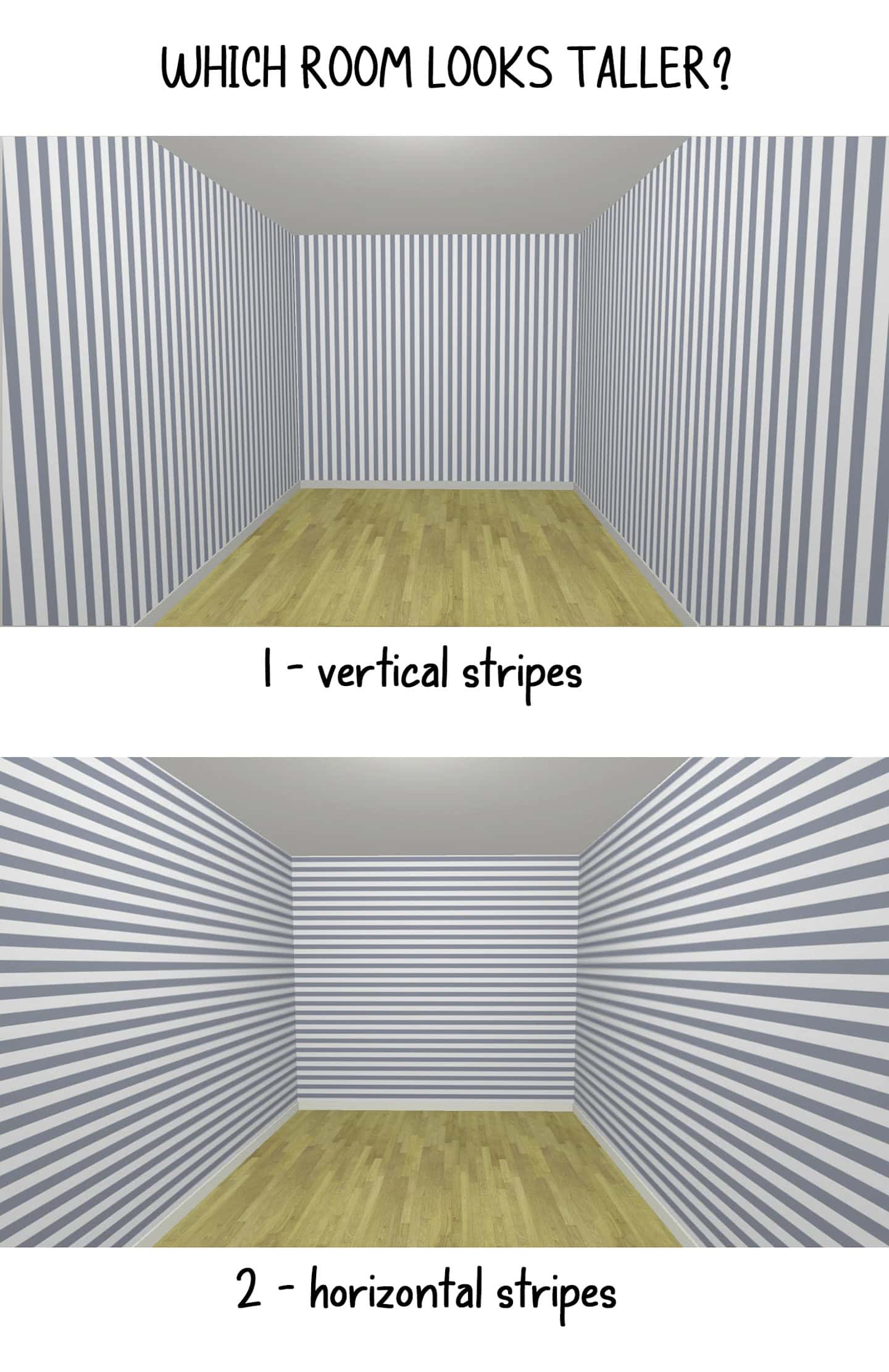
Stripes are one of the most powerful optical illusions you can create with paint, capable of dramatically altering how we perceive a room’s proportions. Like clothing, the direction and scale of stripes can make spaces appear taller, wider, or more balanced.
Vertical stripes for height
Vertical stripes draw the eye upward, making ceilings appear higher and rooms feel taller.
Technique Tips:
- Width matters: Wider stripes (6-12 inches) feel more modern and less busy.
- Color contrast: Subtle contrast (two shades of the same color) adds height without overwhelming.
- Ceiling continuation: Extend stripes slightly onto the ceiling for maximum height illusion.
- Odd numbers: Use an odd number of stripes across the wall for better visual balance.
For a step-by-step tutorial, read how to paint vertical stripes on the wall.
Horizontal stripes for width
Horizontal stripes make rooms appear wider and more spacious laterally.
Technique Tips:
- Variable widths: Alternating stripe widths adds visual interest.
- Color gradation: Gradually lightening stripes from bottom to top combines width and height benefits.
Different stripe choices
- Tone-on-tone: Use different sheens of the same color for subtle sophistication.
- Monochromatic: Various shades of one color family for gentle dimension
- High contrast: Bold alternating colors for dramatic impact.
- Gradient stripes: Gradually transitioning colors for a modern, artistic effect.
- Accent wall: To avoid overwhelming the space, consider using them only on a focal point accent wall.
6 | Paint Trim and Moldings Strategically
The color of your trim, baseboards, and crown molding also affects spatial perception.
Lighter Than Walls

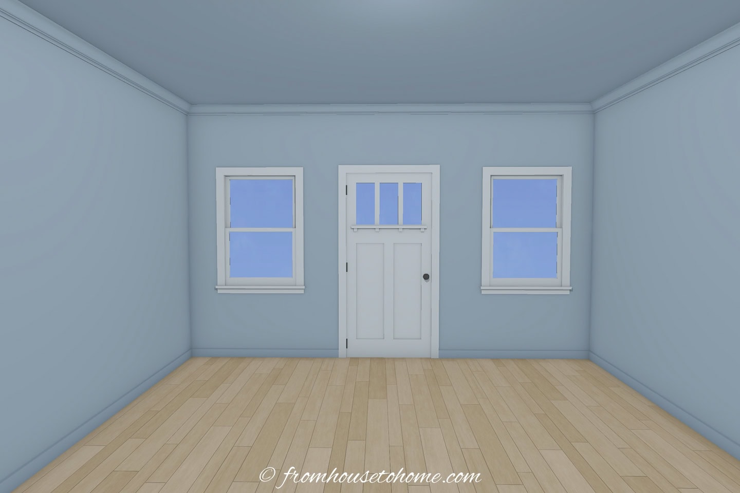
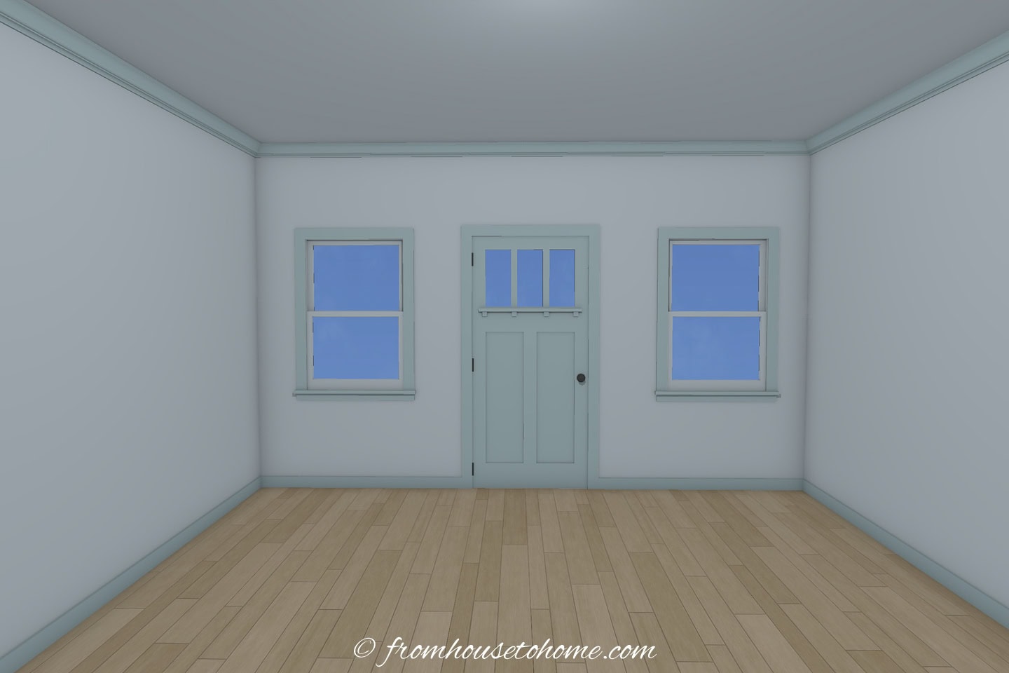
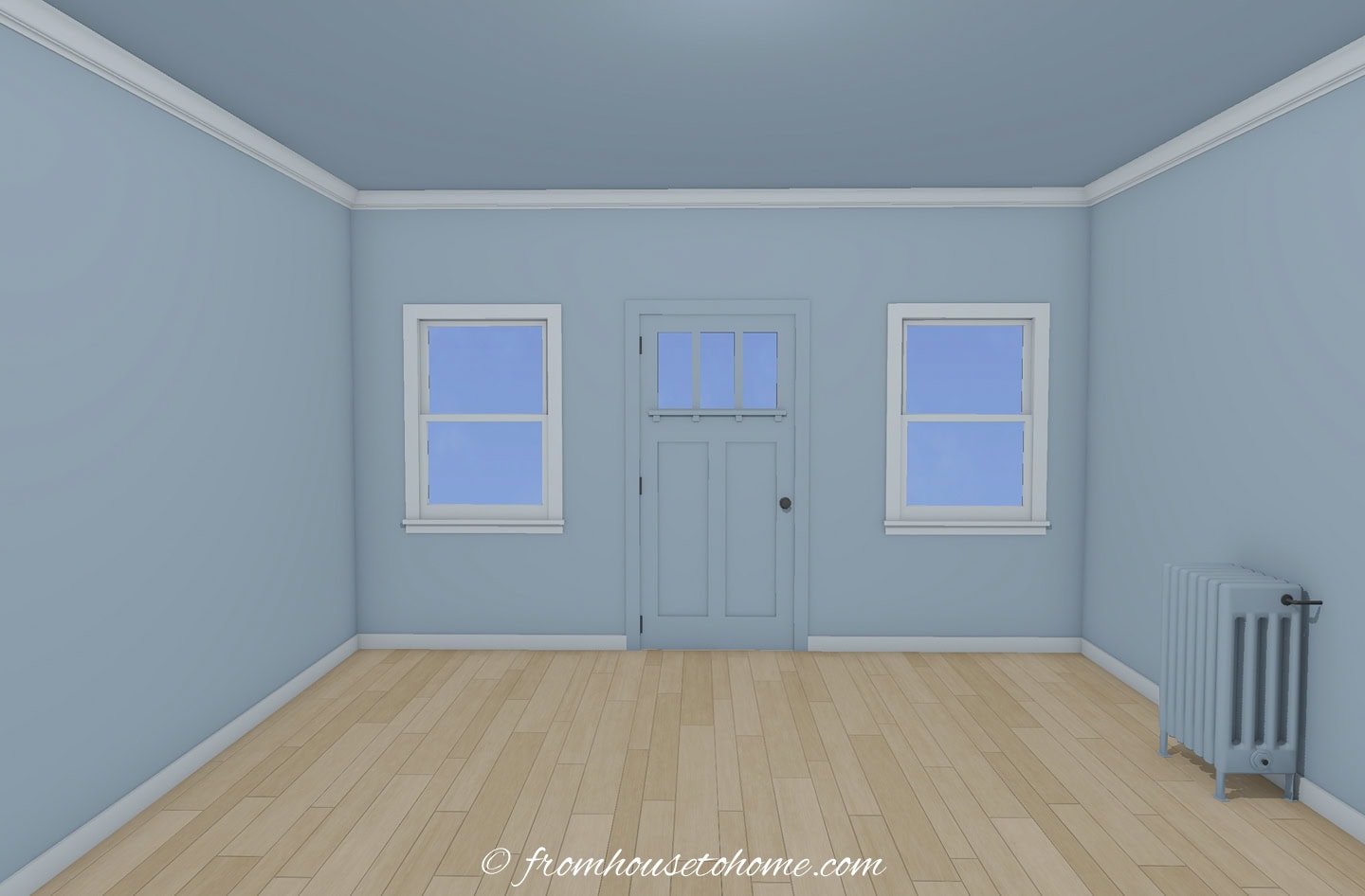
White or cream trim against slightly darker walls creates definition and makes walls appear to recede, enlarging the space.
Same as Walls
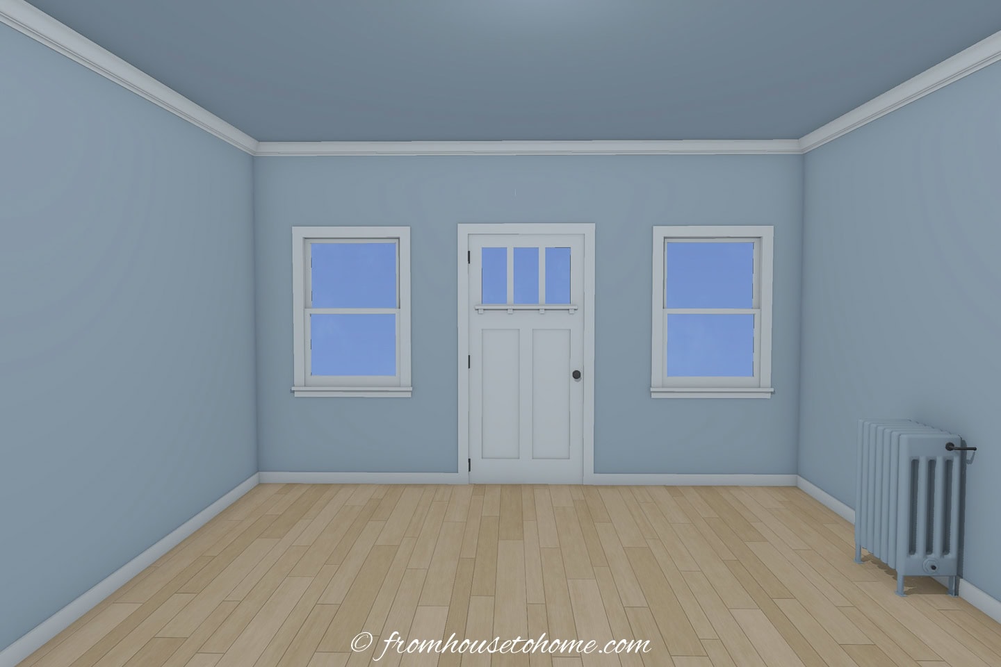
Painting trim the same color as walls creates a seamless look that eliminates visual breaks, making rooms feel larger and more cohesive.
Slightly Darker
In rooms with very light walls, trim that’s just a shade darker can add subtle definition without creating harsh contrasts that shrink the space.
If you have a low ceiling, keeping the trim and walls the same color usually creates the most spacious feel.
7 | Don’t Forget About Doors and Windows

These architectural elements can either expand or contract visual space:
- Doors: Paint them the same color as walls to help them disappear, or use a light, glossy color to reflect light.
- Window frames: Light colors make windows appear larger and let in more visual light.
8 | Disguise Distractions
If you have features in your home that visually “stick out” (things like vents, electrical panels, radiators, weird boxed-in corners, or random trim pieces), painting them the same color as the walls makes them blend right in.
When those elements stop demanding attention, the whole room instantly feels cleaner and more open.
If something isn’t meant to be a feature, don’t highlight it. Paint it out.
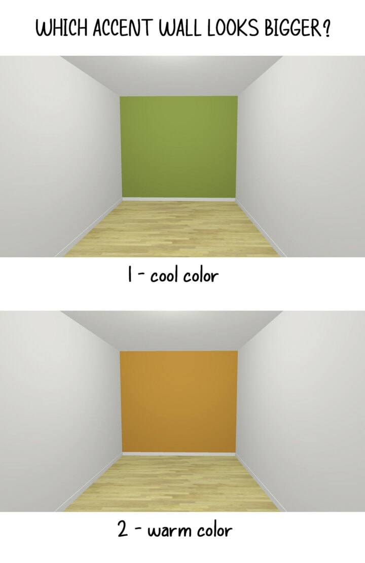
9 | Understanding Color Temperature and Depth
There also is a relationship between color and visual depth.
Cool vs Warm Colors
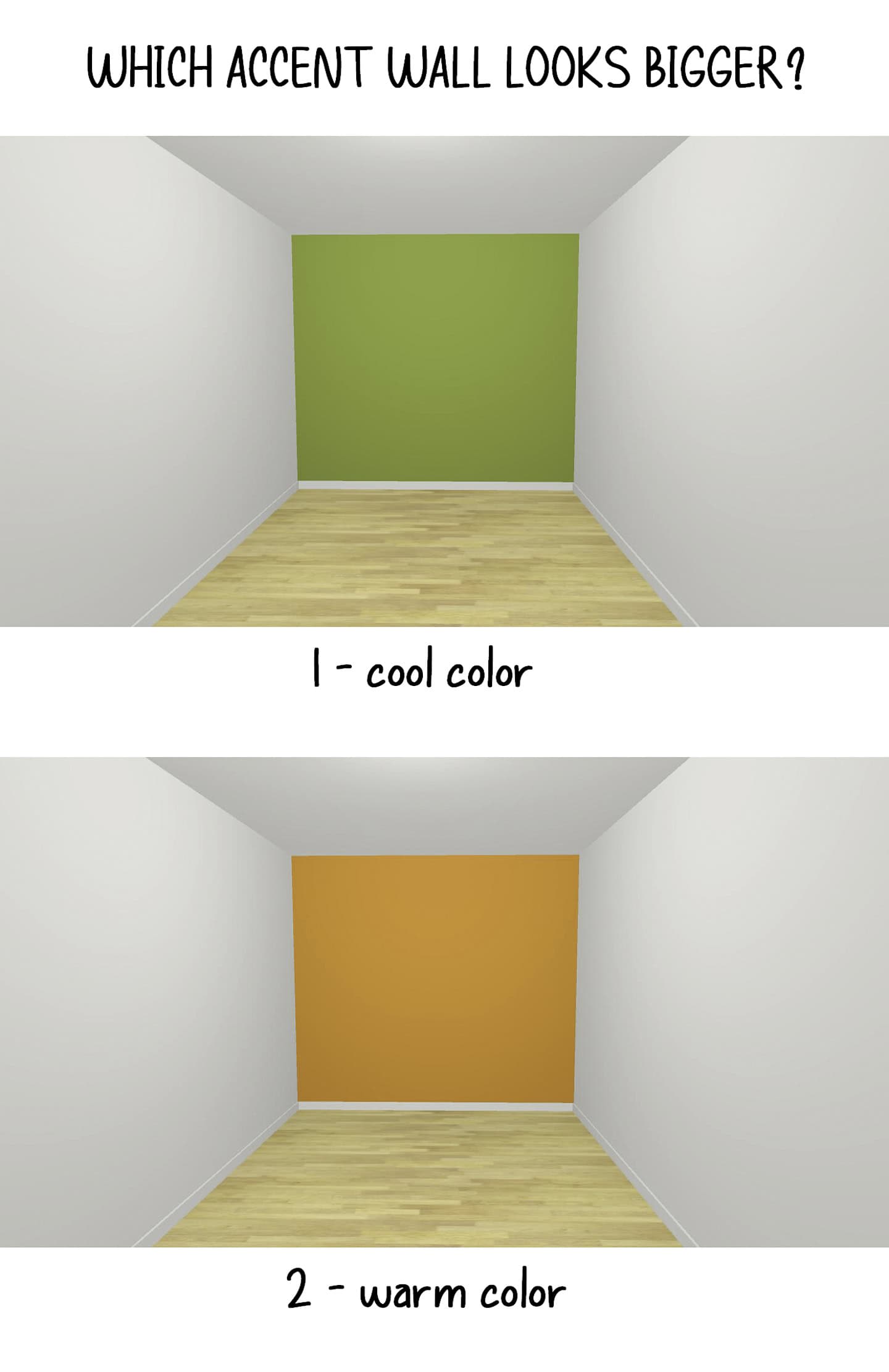
Cool colors like blues, greens, and lavenders tend to recede visually, making walls seem farther away. Warm colors such as red, yellow and orange tend to come forward visually, making walls seem closer.
For more about how colors change the way a room feels (and which ones are best for different areas of your house), read about room color psychology.
The Saturation Factor
However, the intensity and darkness of a color can be more important than its temperature:
- Deep, saturated colors (whether warm or cool) create depth by making it difficult to judge distance.
- Light, airy colors create spaciousness through brightness and reflection.
- Medium tones can go either way depending on lighting and finish.
Strategic Application
- Use deep colors in rooms with good artificial lighting to maintain the depth effect without gloominess.
- Apply dark colors to all walls for an enveloping effect, or to a single wall for dramatic depth.
- Combine dark walls with light ceilings to maintain height while making the space feel wider.
10 | Create Visual Flow Between Rooms
In smaller homes or apartments, using a consistent color palette throughout creates visual flow that makes the entire space feel larger.
This doesn’t mean everything must be identical, but maintaining color harmony helps spaces feel connected and expansive.
Tips for Color Flow
- Use variations of the same color family throughout.
- Keep trim and ceiling colors consistent between rooms.
- Use your accent color to tie different spaces together.
- Maintain similar paint finishes for cohesion.
For more details, read how to create a whole house color scheme.
Common Mistakes to Avoid
While experimenting with paint, watch out for these space-shrinking pitfalls:
- Too many colors: Multiple bold colors can fragment a small space.
- Poor lighting with dark colors: Dark colors need good lighting to create depth rather than gloom.
- Ignoring natural light: Consider how your paint will look at different times of day.
- Harsh contrasts: Strong contrast between walls and ceilings can emphasize low height.
- Forgetting primer: Proper priming ensures true color and can reduce the number of coats needed.
The bottom line
Transforming a small room into a seemingly larger space doesn’t require knocking down walls or expensive renovations.
With the strategic use of paint , you can create an optical illusion that makes any room feel more spacious, bright, and inviting.
And the best approach combines several of these techniques rather than relying on just one.
The beauty of using paint to enhance space is that it’s relatively inexpensive and completely reversible.
If something doesn’t work, you can always paint over it.
So grab your brushes, choose your colors wisely, and get ready to transform your small spaces into rooms that live large.
Have comments or questions about how to make a room look bigger with paint? Tell us in the section below.