
The Most Popular 2026 Paint Color Trends
If you’ve been wondering what the 2026 paint color trends look like across all the major brands, this will give you the quick, practical version. I went through all the Color of the Year announcements and organized them into real-world color families you can actually use.

Every year, I go through the Color of the Year announcements expecting to feel at least a little excited.
And as someone who genuinely loves color, I’ll be honest…2026 was a little disappointing.
Not because the colors are bad, but because so many of them play it very safe.
There are a lot of warmed-up neutrals, a lot of nature-inspired greens and most of the “color” this year comes from earthy undertones rather than saturation.
And for the first time in years, there isn’t a single blue in the list.
But if you happen to prefer neutral colors, this is definitely your year!
Here’s how I see the 2026 paint color trends, with both the designer logic and my personal take as someone who will always root for more color.
One quick note before we dive in…
I don’t look at trending paint colors because I think anyone should repaint a room just because a color is “in.”
That’s an expensive way to decorate, and trends move faster than most of us want to repaint.
I pay attention to these color picks because they’re a good signal of what’s about to show up everywhere else (pillows, artwork, rugs, furniture finishes, and decorative accessories).
So if you already love one of these colors (or were thinking about using it anyway), it’s going to be much easier to find decor that works with it while it’s trending.
Think of these palettes as a shopping advantage, not a decorating rulebook.
Get a FREE Room Makeover Workbook by signing up for our newsletter
You’ll also get access to our members-only resource library with all of our other printables.
We won’t send you spam. Unsubscribe at any time.
quick summary
If you just want the cliff notes version of the 2026 colors of the year, here it is…
This year leans heavily warm, muted, and safe.
Think soft whites, layered beiges, grounded greens, earthy reds, and a surprising number of brown and taupe tones.
Bright color barely makes an appearance, and true blue is almost completely missing (which as a color-lover and fan of blue makes me a little sad).
But there are a lot of different greens to choose from. Perfect if you are looking for something cool and relaxing.
The overall direction is cozy and livable rather than bold and trend-pushing, so if you like warm neutrals and nature-inspired shades, you’ll have plenty of good options.
If you prefer stronger color, you may need to dial it up a notch yourself when you put your room palette together.
#1 – White and off-white
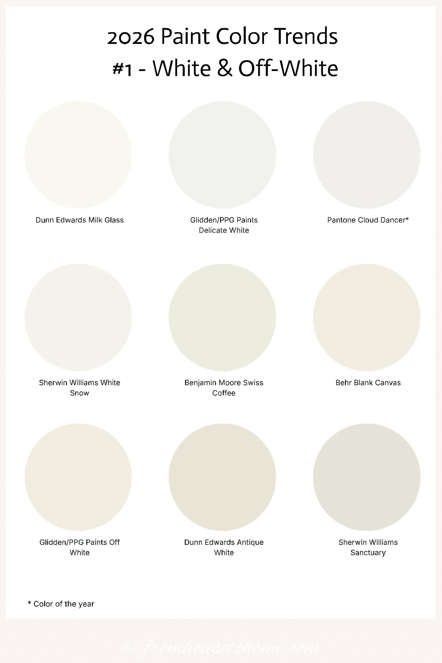
For the first time in many years, white climbed back to the top of the color list this year with Pantone naming “Cloud Dancer” as its 2026 Color of the Year.
This isn’t a stark, gallery-white look.
The whites highlighted this year lean warm and gentle (which does make them easier to live with).
And are designed to layer with other warm neutrals rather than create sharp contrast.
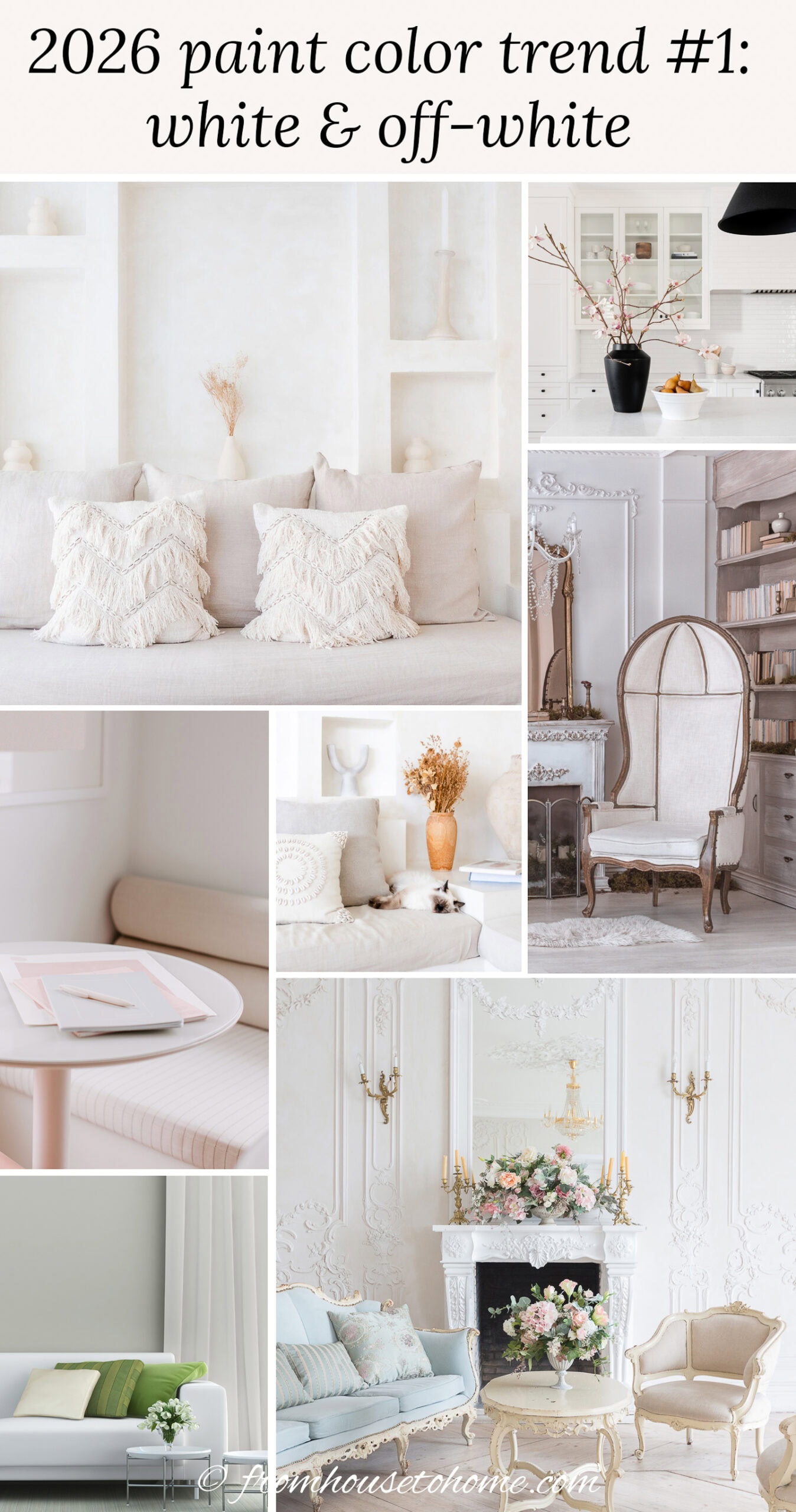
Soft white works especially well in living rooms and kitchens where you want maximum light bounce without the harshness of bright white.
It’s also ideal for whole-house palettes if you like pops of color rather than being immersed in color. It gives you flexibility to layer stronger colors and materials from room to room.
My personal take:
White may not be too exciting, but it is dependable. And dependability is clearly having a moment.
2 | Beige
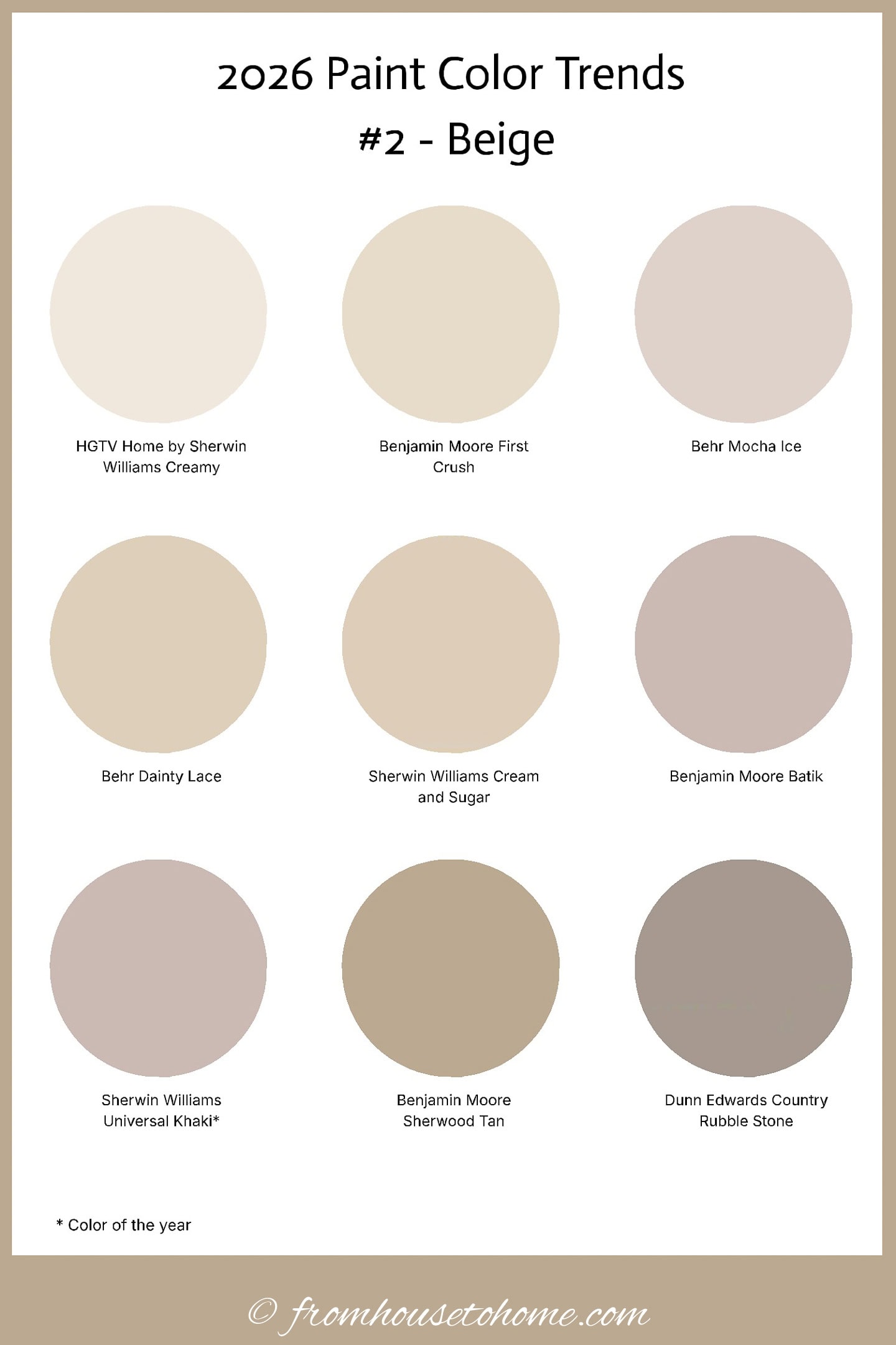
Beige is back. Again. With the Sherwin-Williams 2026 color of the year “Universal Khaki” leading the way.
These beiges are warmer and more layered than older builder beiges and work best when texture is part of the plan.
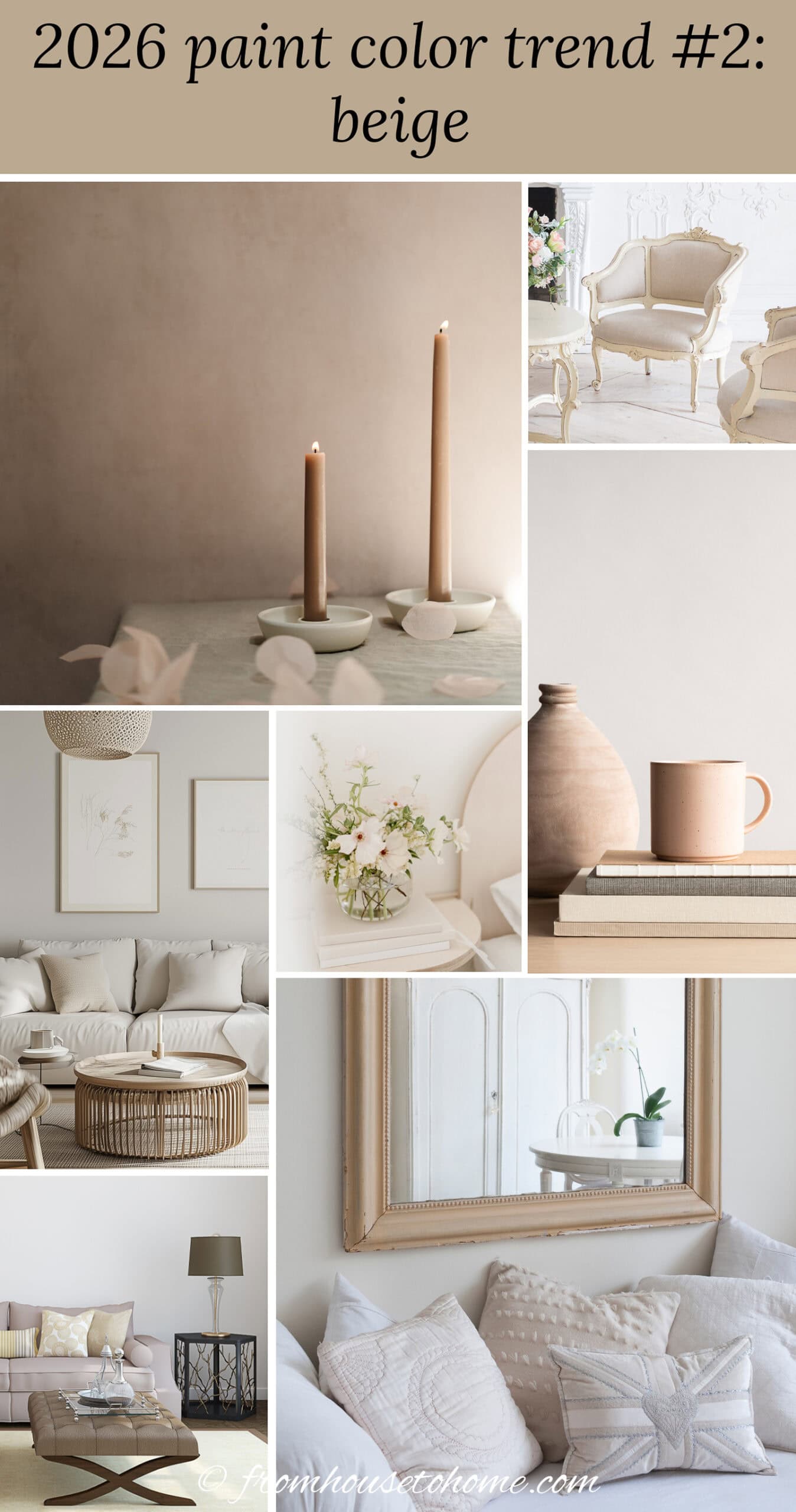
They’re a natural fit for living rooms and bedrooms where you want a soft backdrop that lets fabrics and finishes do the talking.
In entryways, warm beige creates an easy transition color that works with almost any other color in the house.
My personal take:
Better beige is still beige. And there’s a lot of it this year.
3 | Brown
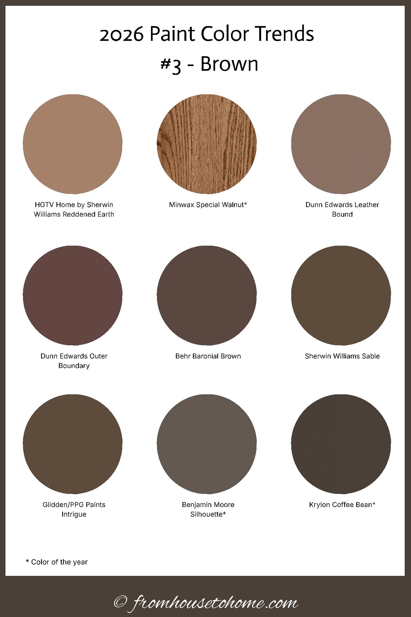
Brown made a stronger showing than many people expected, with 3 companies choosing it as their 2026 color of the year: Benjamin Moore “Silhouette“, Minwax “Special Walnut“, and Krylon “Coffee Bean“.
(Yep. That’s a paint, stain and spray paint company all picking the same color!)
These aren’t muddy or dated browns.
They’re rich, warm shades with depth. More like leather, coffee, and dark wood tones than the flat browns people remember from years ago.
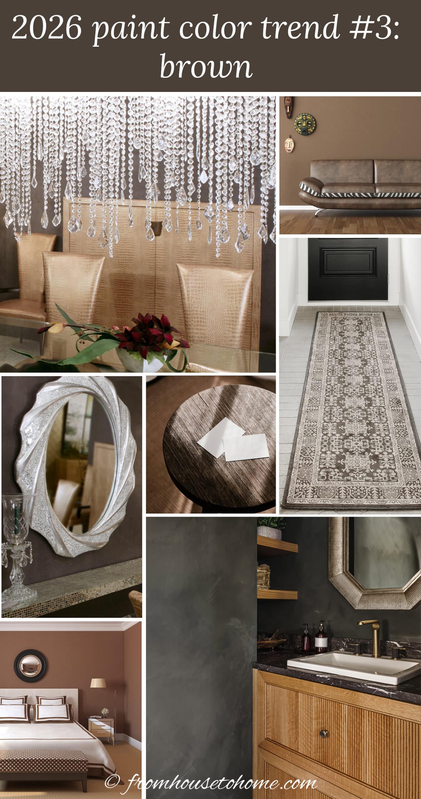
Brown is especially effective in dining rooms and libraries where darker walls create atmosphere and make artwork and lighting stand out.
In a primary bedroom, a warm brown accent wall can make the space feel grounded and cozy instead of cavernous.
My personal take:
Not my usual first pick, but these colors are gorgeous when used with confidence.
4 | Gray green
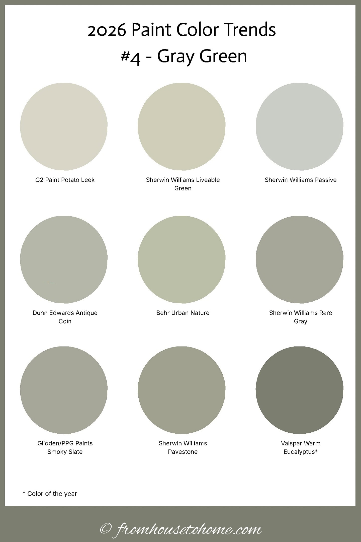
Gray green shows up on the trending colors list again this year, with Valspar’s “Warm Eucalyptus“ earning a Color of the Year nod.
It’s one of those shades that reads mostly neutral, but with a soft green undertone that keeps it from feeling cold or flat.
What makes gray green so useful is how easily it adapts to its surroundings.
Next to warm wood and brass, it looks warmer and more organic.
Paired with cooler finishes, it leans calmer and more subdued.
That range makes it an easy bridge color when a room has mixed materials.
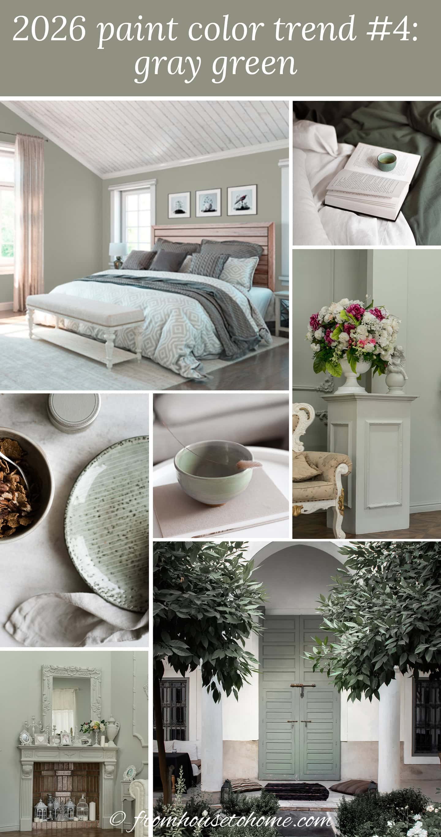
Gray green works especially well in open-concept living areas because it connects spaces without calling too much attention to itself.
In bedrooms, it gives you a hint of color while still feeling restful and low-contrast, which makes layering bedding and decor much easier.
My personal take:
Very usable and very forgiving. Just not the shade that makes a color-lover’s heart skip a beat.
5 | Moss green
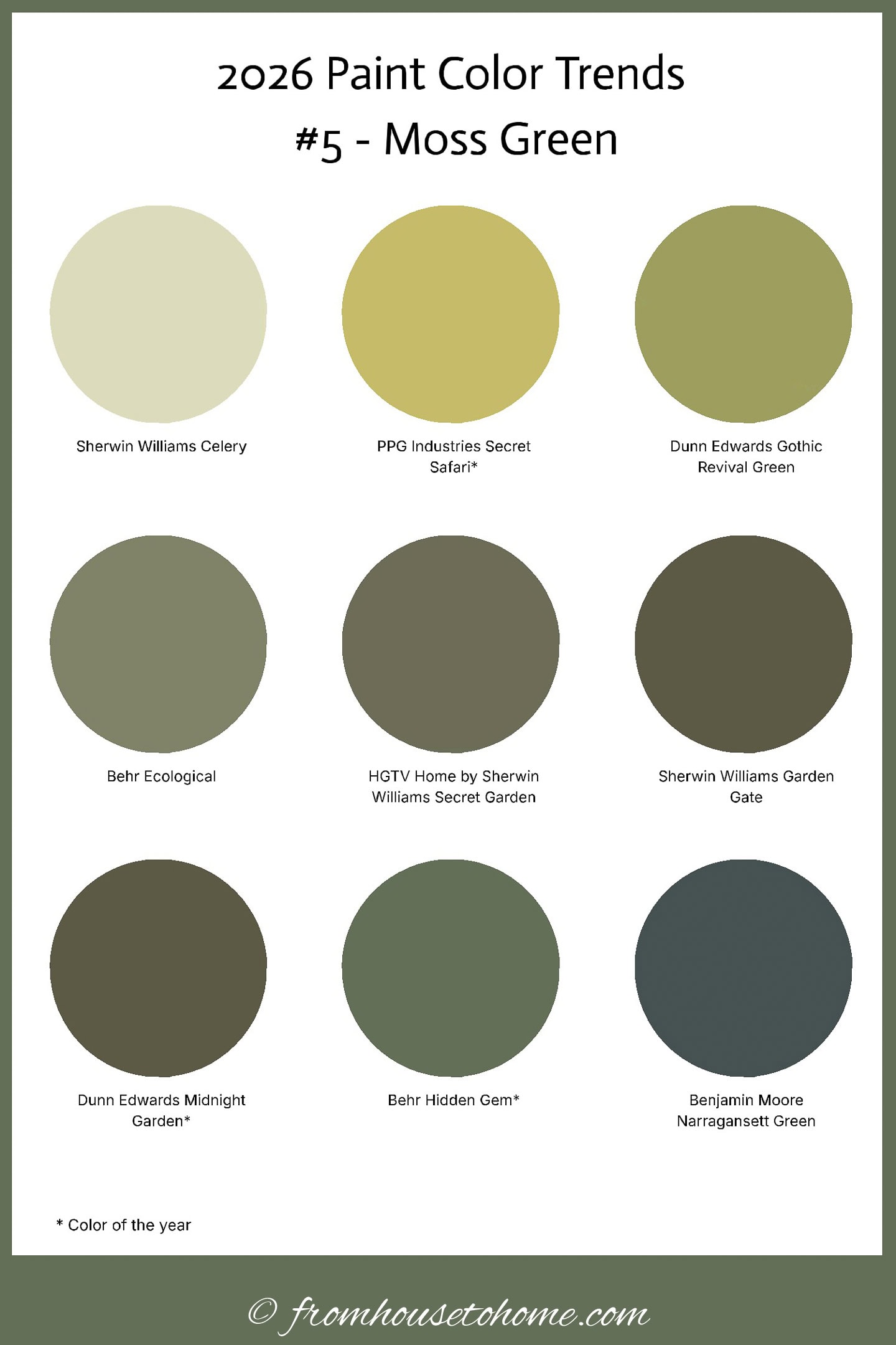
Moss Green shows up more than any other true color in this year’s selections. With PPG Secret Safari, Dunn Edwards Midnight Garden, and Behr Hidden Gem all named Colors of the Year, it’s clear that deeper, nature-inspired greens are where a lot of brands landed for 2026.
These aren’t bright or grassy greens. They’re softened with gray and brown undertones
Those muted undertones can make moss green much easier to use than clearer greens.
It has color and presence, but it doesn’t feel loud, and it pairs naturally with wood tones, leather, stone, and warm metals.
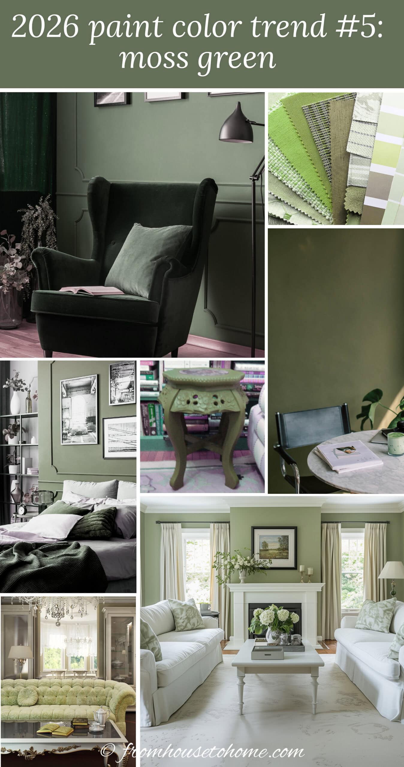
This green works especially well in living rooms and dining rooms because it adds color while still behaving almost like a neutral next to wood furniture and natural textures.
In a home office, deeper greens help cut glare and visual distraction, which can make the space feel calmer and more focused.
It’s also a strong choice for kitchens when you want color on cabinets without going bold.
My personal take:
I’ll never complain about green being included. But this year it’s doing most of the color work by itself.
6 | Blue green
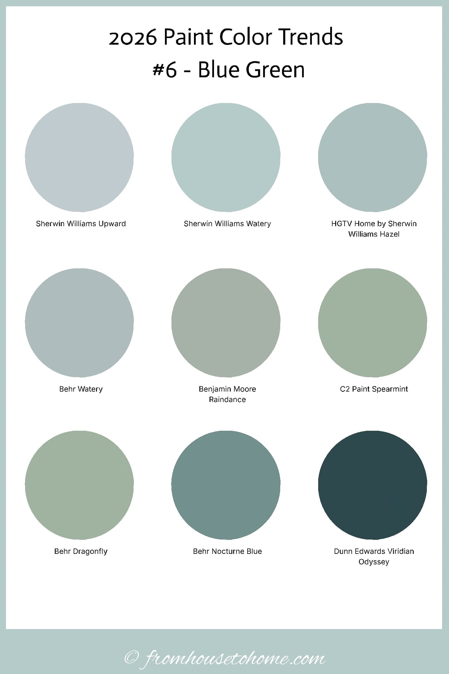
I couldn’t bring myself to publish a color trend roundup with no blue-related shades at all. So blue-green earns its place this year even without a specific Color of the Year title.
Several paint companies included blue-green tones in their 2026 palettes, even if they didn’t make the headline pick.
These shades sit in that middle zone between blue and green, usually softened with a bit of gray so they don’t feel tropical or bright.
The result is color that reads calm and livable rather than crisp or nautical.
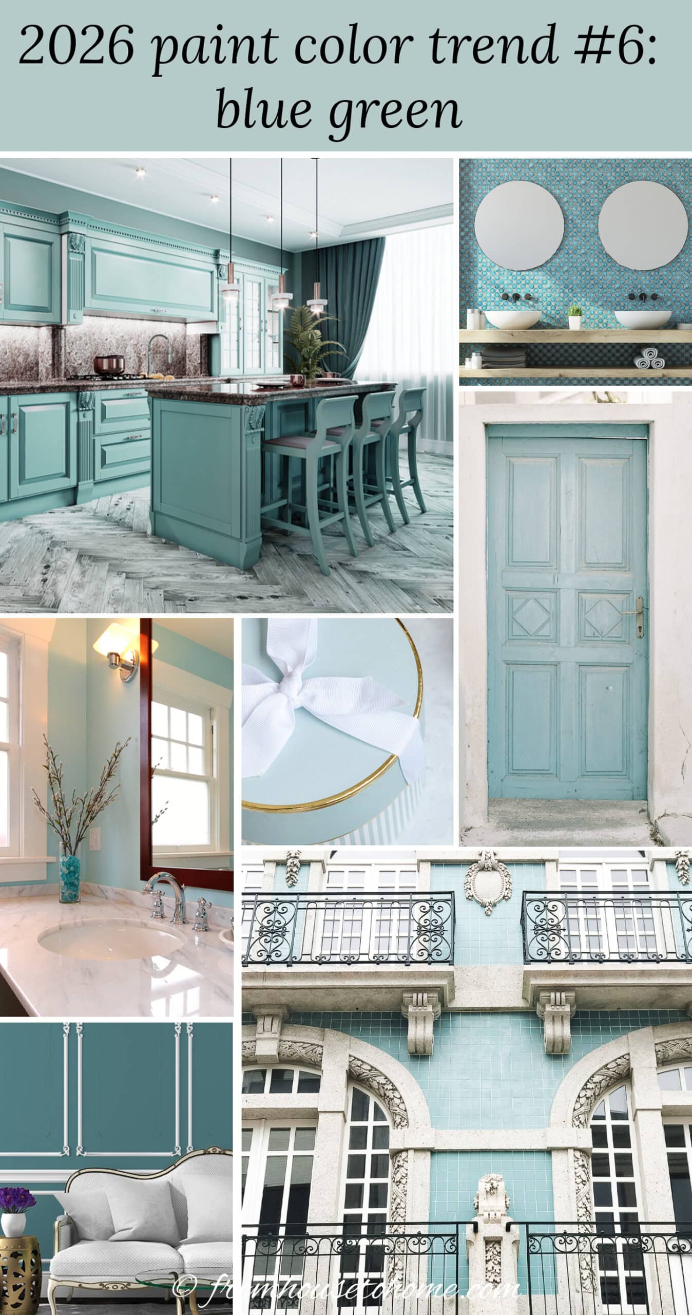
Blue-greens are especially nice in bedrooms and bathrooms because they bring in color while still feeling restful.
In living rooms, they work well when you want something cooler to balance all the warm neutrals showing up this year.
They’re also a good choice for painted furniture or cabinetry when you want color, but don’t want it to dominate the whole room.
My personal take:
If true blue wasn’t going to show up this year, this is the next best thing.
7 | Earthy red
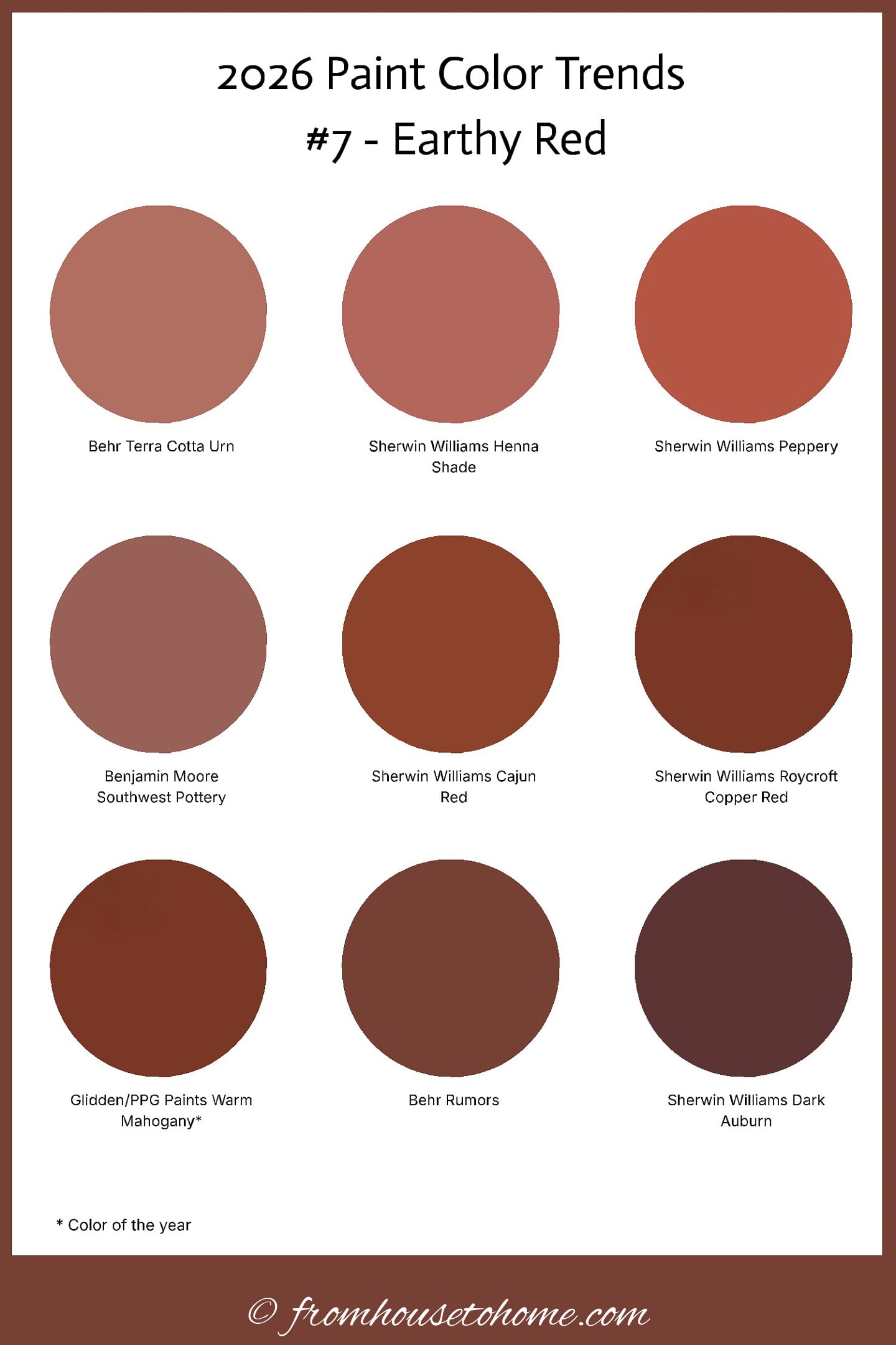
Red shows up this year in a warmer, more muted form, with PPG / Glidden “Warm Mahogany” named as a 2026 Color of the Year.
Instead of bold red, these shades lean clay, terracotta, brick, and rust. With enough brown mixed in to keep them from feeling loud.
That added warmth makes them much more usable on walls than a clearer red.
They bring color and depth to a space, but in a way that feels cozy rather than high-energy.
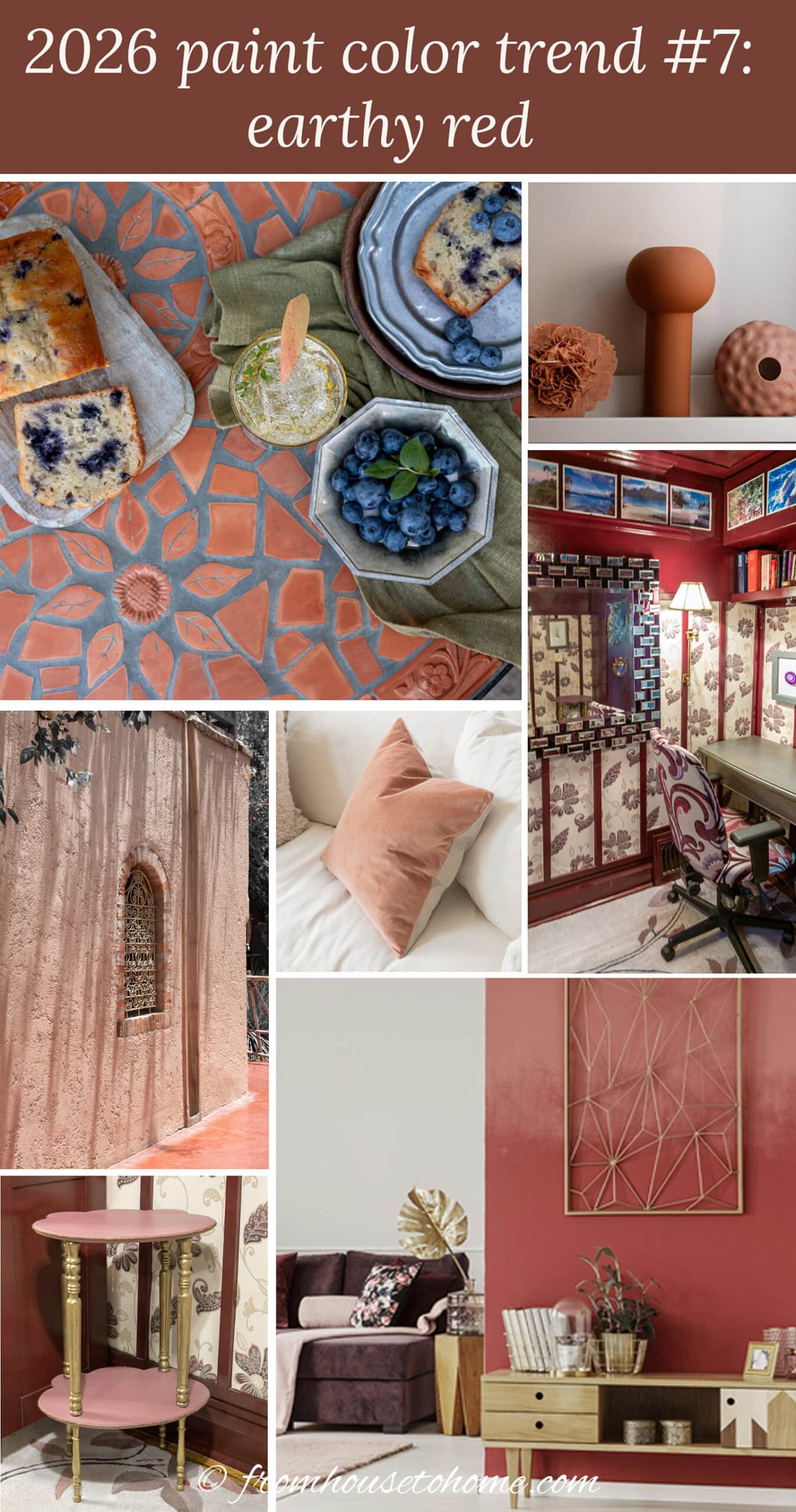
Earthy reds work especially well in dining rooms where warm wall color enhances evening lighting and makes the space feel more intimate.
They’re also a great fit for libraries and home offices, where the deeper tone helps the room feel settled and layered, especially alongside wood furniture and warm metals.
My personal take:
This is a good option if you would like to have red on the wall, but still want it to feel warm and livable rather than bold.
8 | Soft yellow
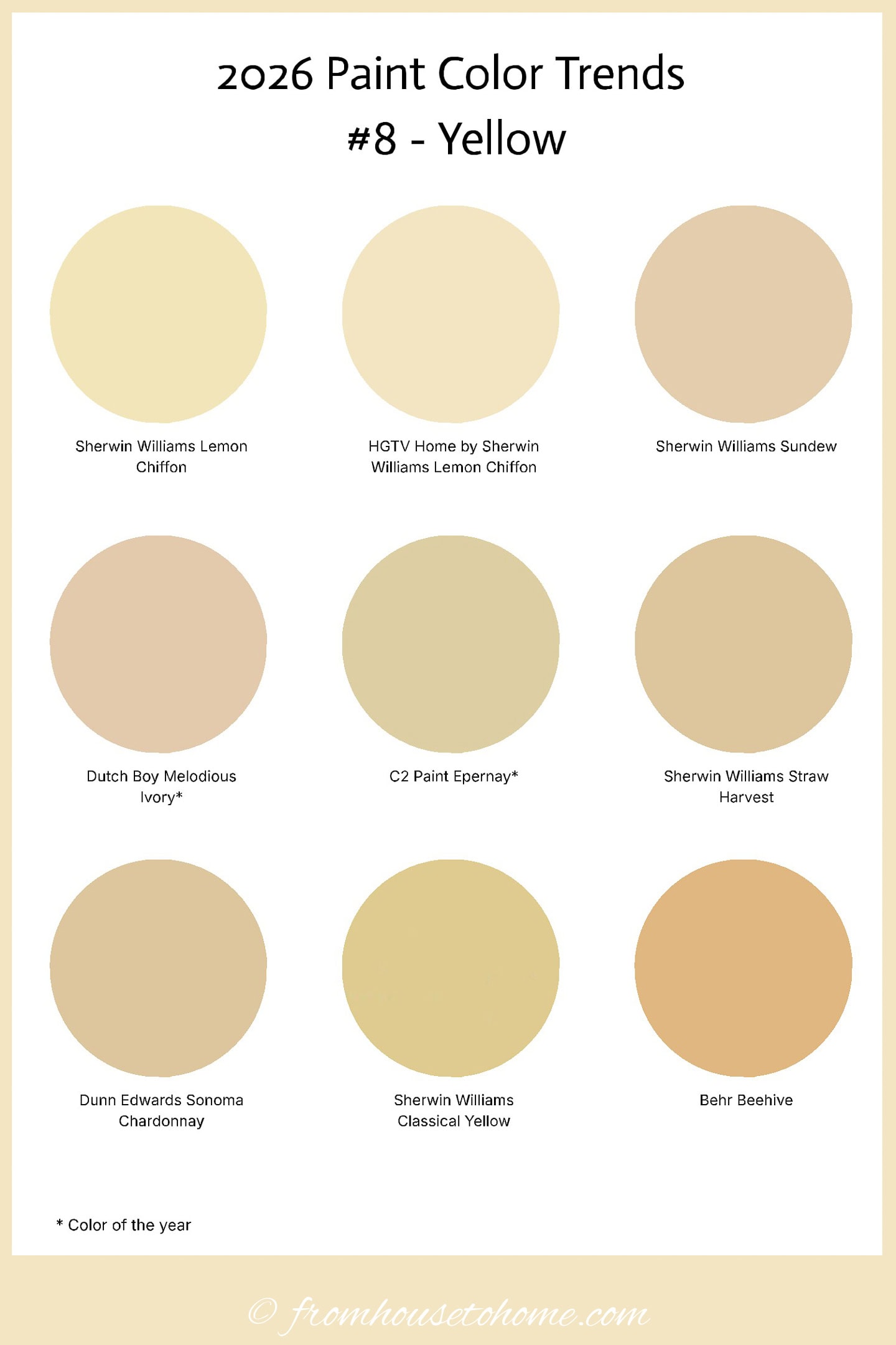
Yellow surprised me this year. Not because it’s bold, but because it isn’t.
It makes the list thanks to C2 Paint “Epernay“ being named a 2026 Color of the Year.
These yellows are soft, creamy, and barely-there, often reading more like warmed-up whites than actual yellow.
They really work as warm neutrals, especially in rooms that struggle with natural light.
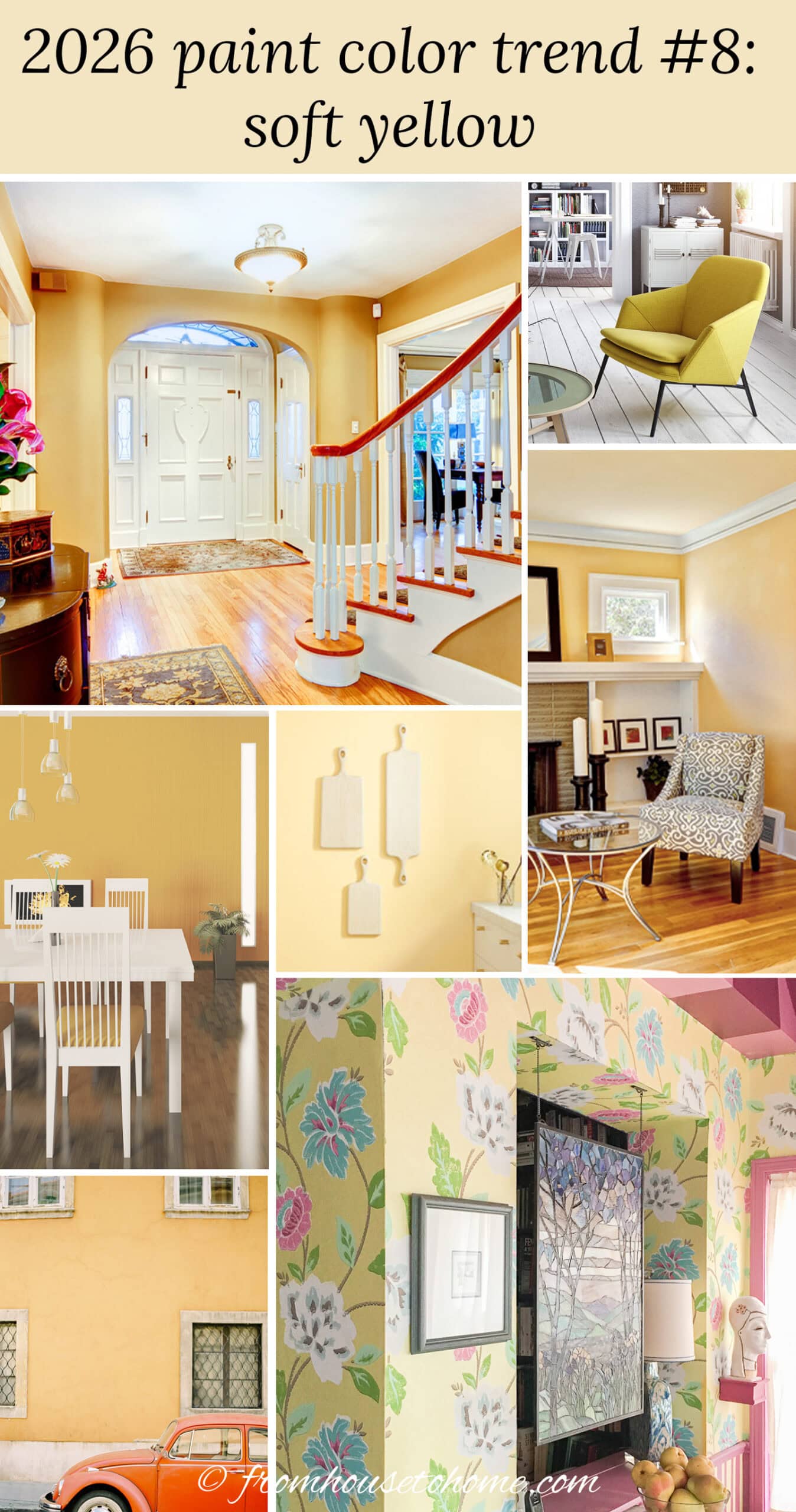
In kitchens and breakfast nooks, this kind of yellow adds warmth that makes the space feel welcoming without turning it bright or busy.
It also works especially well in north-facing rooms and long hallways because it reflects what little light you have and keeps the space from feeling cold or gray.
My personal take:
If you love yellow but have always been afraid it will be too overpowering on the walls, this softer version is the least risky way to do it.
Colors of the year
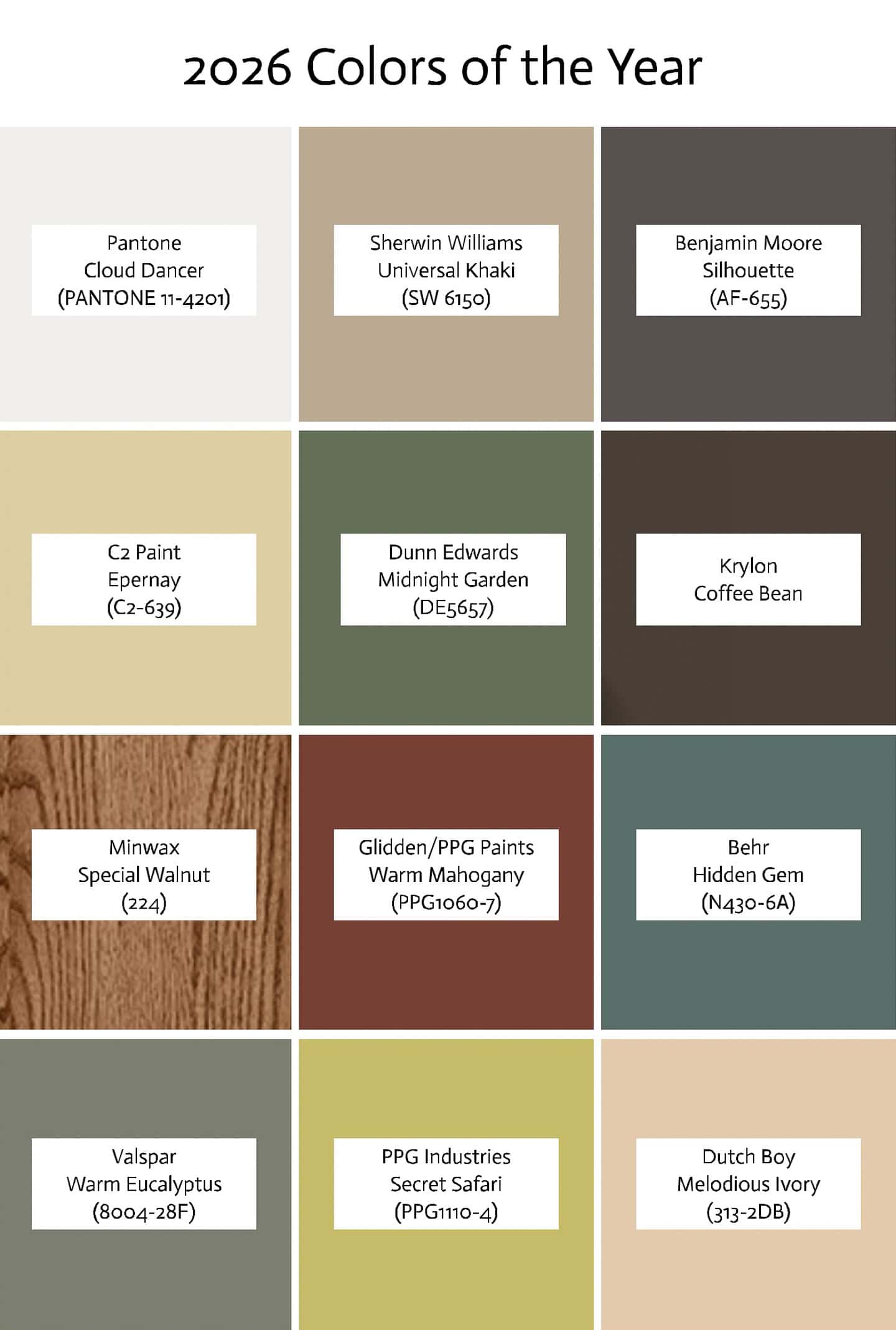
In case you want all of the 2026 colors of the year in one place, here’s the list:
- Pantone – Cloud Dancer (PANTONE 11-4201)
- Sherwin Williams – Universal Khaki (SW 6150)
- Benjamin Moore – Silhouette (AF-655)
- C2 Paint – Epernay (C2-639)
- Dunn Edwards – Midnight Garden (DE5657)
- Krylon – Coffee Bean
- Minwax – Special Walnut (224)
- Glidden/PPG Paints – Warm Mahogany (PPG1060-7)
- Behr – Hidden Gem (N430-6A)
- Valspar – Warm Eucalyptus (8004-28F)
- PPG Industries – Secret Safari (PPG1110-4)
- Dutch Boy – Melodious Ivory (313-2DB)
Final Thoughts
If I had to sum up the 2026 paint colors in one sentence, it would be this: it’s a warm, muted, neutral-leaning year.
There’s a lot of softness, a lot of earthiness, and not much bold color leading the conversation.
If you love warm neutrals and nature-inspired tones, you’ll have plenty of choices to work with.
If you’re a color-lover like I am, the picks may feel a little restrained.
That doesn’t mean you can’t create colorful rooms. It just means you may have to look a little harder for shades and decor pieces that match your style instead of pulling straight from the headline trend colors.
Paint Color Trends from other years
Have comments or questions about the 2026 paint color trends? Tell us in the section below.
This is really depressing! My color rooms are staying just as they are.
I agree, Mary Beth! It’s not a good year for color-lovers. Hopefully next year will be better 🙂
Well, just like I said, I’m keeping my house just the way it is, I just got it the way I wanted it! So that’s the way it’s gonna be. Good luck to you,!