All About Farrow & Ball Hague Blue Paint
It’s week 3 of my One Room Challenge office makeover. And this week was all about choosing paint colors.
I already knew that I wanted to paint the office blue.
And after looking at all my office idea pictures, I decided dark blue was the way to go.
But then comes the tricky part. Choosing exactly which shade of dark blue.
So I did what I always do in these situations. I found an inspiration piece to draw the colors from.
The selection process
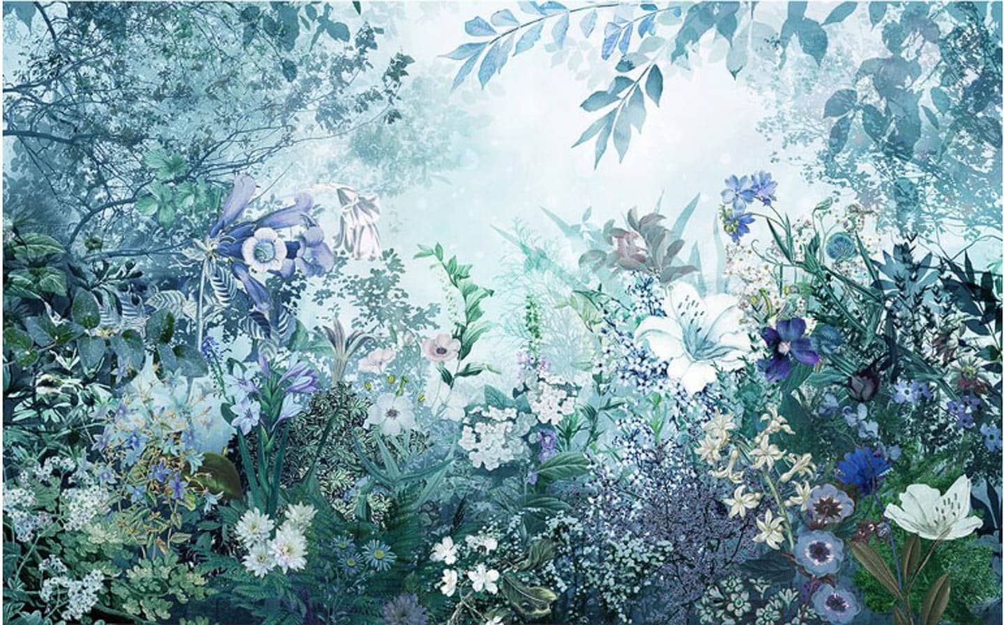
And that ended up being this mural* from Graham and Brown.
They custom print it to whatever size you need.
And I’m going to use for the large DIY artwork in the room.
So it’s the perfect thing to use for selecting colors.
I also narrowed my selection a lot by deciding to go with Farrow and Ball paint.
They have far fewer colors to choose from than most of the other paint companies.
But I love the depth that their colors have and how they look so different in different light.
Which brought my choices down to three – Hague Blue, Stiffkey Blue and Scotch Blue.
hague blue vs stiffkey blue vs scotch blue
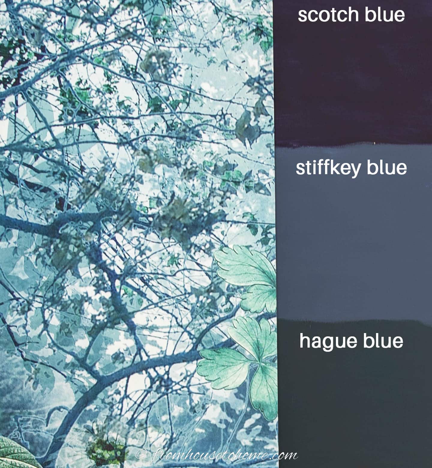
I ordered some sample pots (they deliver really quickly!) and painted swatches on the wall.
Then held up my mural so I could compare.
And wouldn’t you know it? All three colors look really good with it.
Which didn’t help my decision-making process at all.
However, Scotch Blue was a little darker and more on the purple side of blue than I wanted. So I decided to eliminate that option.
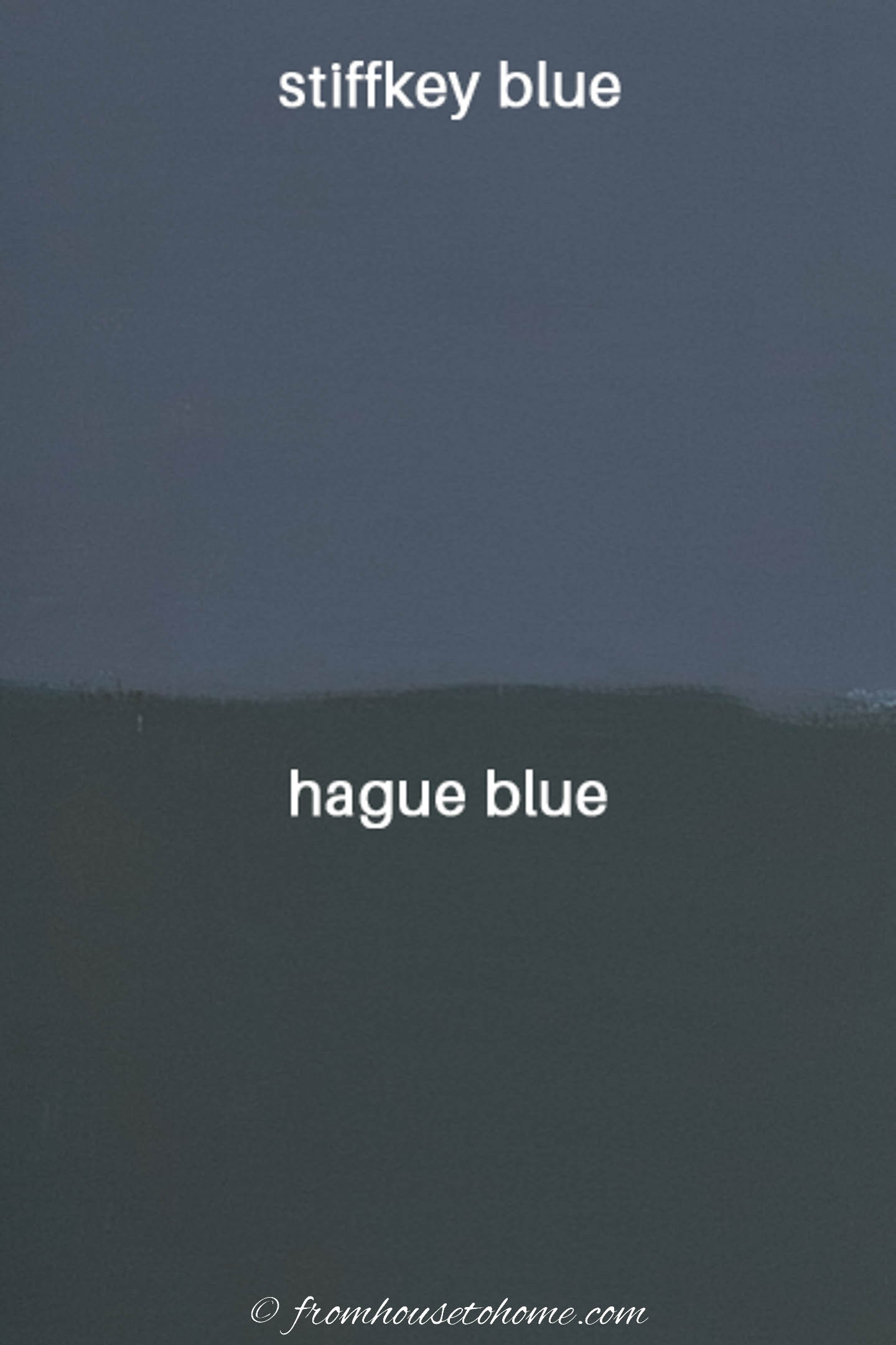
Bringing my choices down to two…Hague Blue vs Stiffkey Blue.
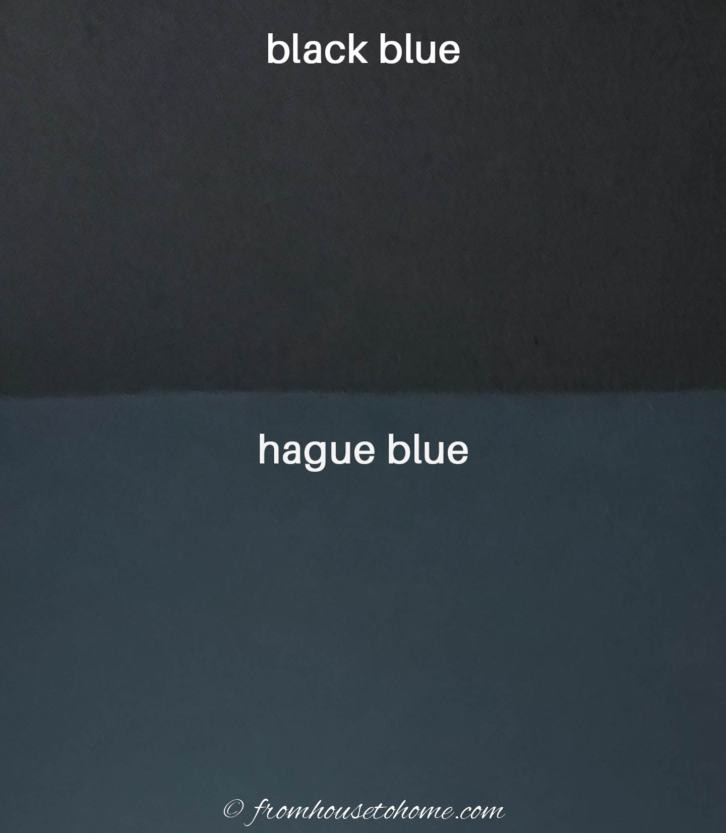
The main difference between the two is that Hague Blue has some green undertones, which makes it more like a dark teal color.
While Stiffkey blue is more of a true blue.
Both colors are dark blue. But Hague Blue is a little bit darker. Its LRV (Light reflective value) is 7%, where the LRV for Stiffkey Blue is about 10%.
They were the #1 (Hague Blue) and #2 (Stiffkey Blue) Instagrammable paint colors in 2021 according to House Beautiful. So apparently a lot of people like both of them.
After much humming and hawing and changing my mind, I decided that Hague Blue was the right choice for my walls. (Although I might still use Stiffkey Blue when I’m painting the bookshelves to change things up a bit).
But since Farrow & Ball colors always look different in different lights and rooms, I went to look for some room pictures of Hague Blue just to make sure I really liked it.
A note about pinning: Some of these images cannot be pinned because of copyright restrictions.
Hague Blue office
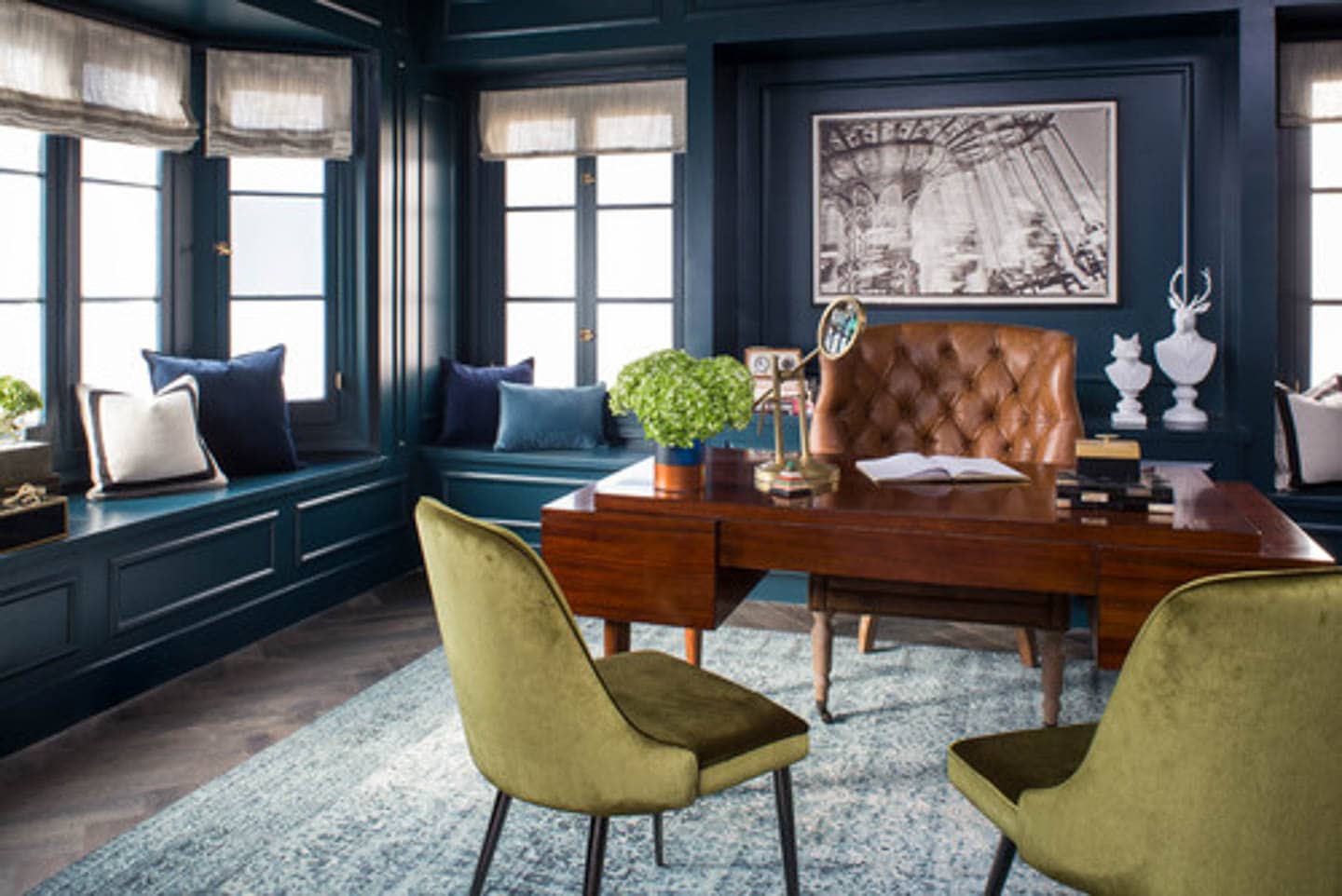
In this office, everything is painted with a glossy Hague Blue. The walls, the ceiling and the cabinets.
I love how great it looks with the whites, browns and greens in the room.
Kitchen cabinets
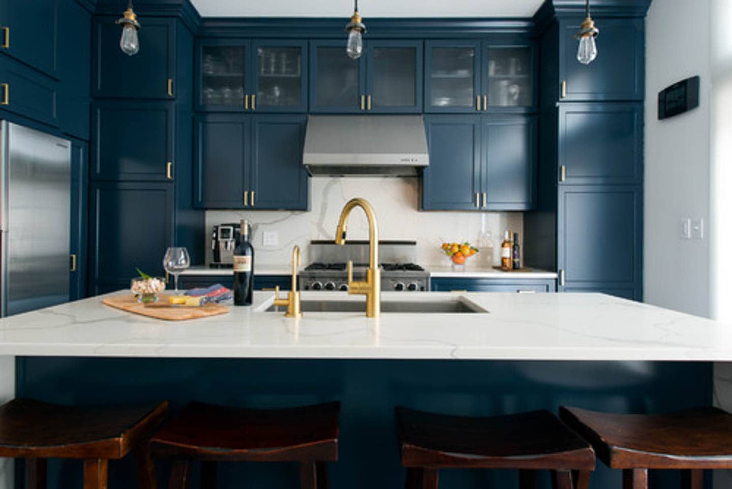
These kitchen cabinets also look beautiful painted in Hague Blue with gold handles.
Which I’m happy to see since I’m planning to use gold accents in my room.
bathrooms
This bathroom has Hague Blue on the walls with a more matte paint finish. Which is what I was planning to use in my office.
Notice how it looks quite a bit darker in this picture than it does in the two pictures above?
And I like the idea of painting the trim in the gloss version of the same color.
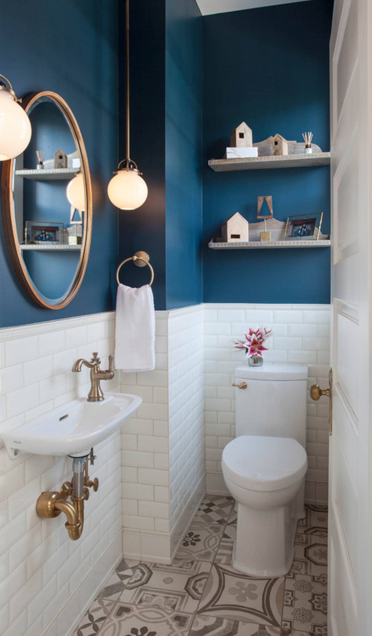
The teal coloring is definitely coming out in this bathroom.
It looks gorgeous with all the white and gold.
bedroom
Then there’s this blue and white bedroom painted with Hague Blue.
Which is absolutely stunning!
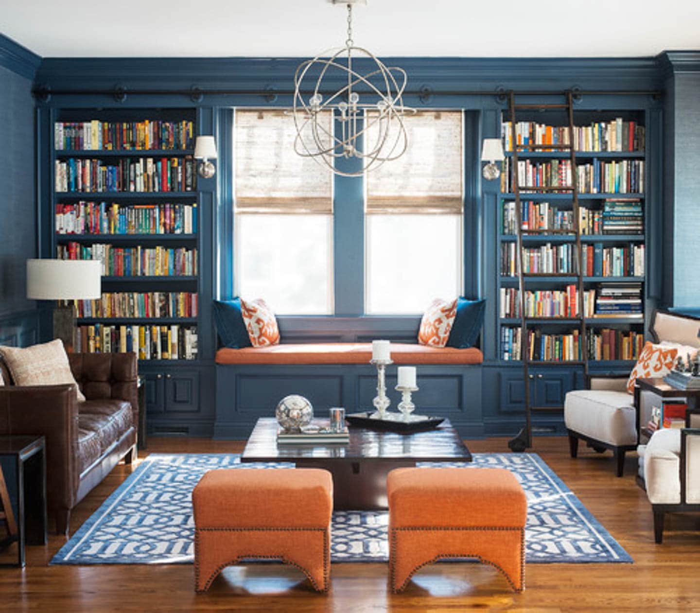
However, the picture that absolutely sold me on using Hague Blue was this one.
I love the matte paint finish on the walls, the gloss trim (painted in Farrow & Ball’s Black Blue), the glass door (I think I need one for my office!) and of course, the chandelier.
It’s just the right amount of sophistication with some glam thrown in.
My final paint color selections
So I ended up going with:
- Hague Blue in Estate Emulsion (Farrow and Ball’s matte finish) on the walls,
- Black Blue in Gloss for the trim
- And (because I can never leave the ceiling out of a design), black blue in Estate Emulsion on the ceiling.
I love how it turned out!
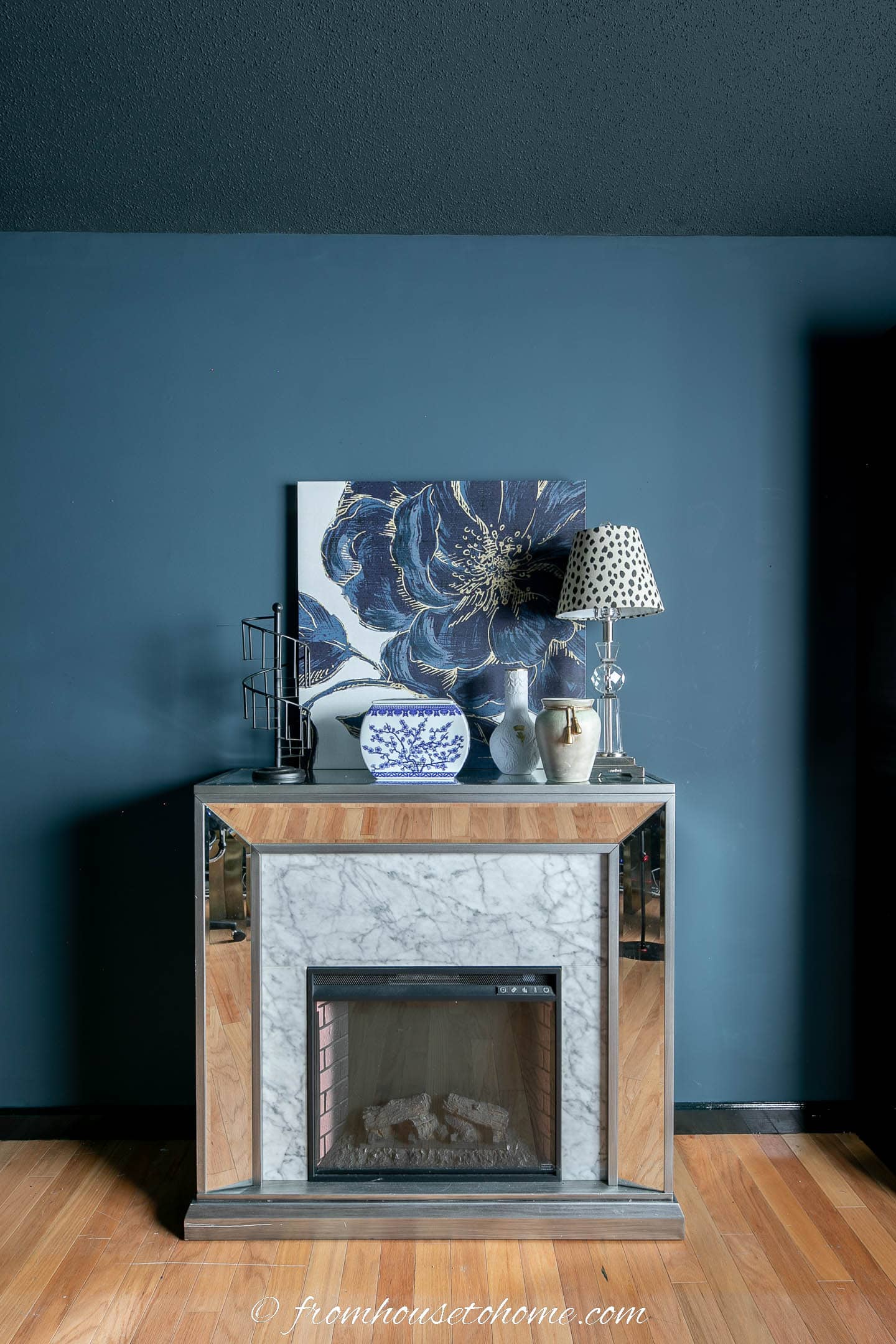
Plus a happy accident: I borrowed the picture from my guest bedroom to put over the fireplace, and it goes perfectly.
hague blue equivalents
While I don’t think you can get the same depth and rich look of Farrow and Ball’s paint by color matching it with another brand, it is fairly expensive.
So if you’re interested in using Hague Blue, but don’t want to pay Farrow and Ball prices, here are some alternatives from other paint companies:
- Benjamin Moore: Newburyport Blue (in the picture above), Brush Blue or Evening Dove
- Sherwin Williams: Indigo Batik, Sea Serpent, or Rain Cloud
- Behr: Harbour or Dark Night
Now that the room is painted, it’s time to move on to some DIY projects. So be sure to check back next week for those updates.
Read the rest of our blue home office makeover posts:
- Week 1: Blue home office ideas
- Week 2a: Blue home office mood board
- Week 2b: Home office layouts
- Week 3: Blue home office paint colors
- Week 4: DIY large wall art
- Week 5: Glam black and blue bookshelf makeover
- Week 6: DIY electric sit stand desk
- Week 7: How to hide wires on a desk
- Week 8: Hague blue and white home office makeover

Don’t forget to checkout this week’s makeovers from all the other guest participants on oneroomchallenge.com.
Have comments or questions about Farrow & Ball’s #30 Hague blue? Tell us in the section below.
This post was originally published on October 10, 2022 but was updated with new content on March 29, 2023.
I love your individuality! So many people going with the boring, popular all grey decor choices that are so prevalent now – no personality. I love your style!
Thanks, Joan! I love color, so you won’t find any white, grey or beige rooms in my house 🙂
Love the combinations Wanda. You are a braver lady than me as I couldn’t go the darker colours in my house, I tend to go pale shades. However, I’m watching your project with much interest.
Pauline
Thanks, Pauline! My dark color choices definitely aren’t for everyone 🙂 But I like the dramatic feeling they add to the room.
I love your choice of blue – it’s such a deep, moody color. I also am using a Graham & Brown wall mural in my room transformation – they have beautiful prints!
Thanks, Michelle! I love Graham and Brown, too! I had such a hard time picking just one pattern 🙂